FabCon is coming to Atlanta
Join us at FabCon Atlanta from March 16 - 20, 2026, for the ultimate Fabric, Power BI, AI and SQL community-led event. Save $200 with code FABCOMM.
Register now!Go To
- Power BI forums
- Get Help with Power BI
- Desktop
- Service
- Report Server
- Power Query
- Mobile Apps
- Developer
- DAX Commands and Tips
- Custom Visuals Development Discussion
- Health and Life Sciences
- Power BI Spanish forums
- Translated Spanish Desktop
- Training and Consulting
- Instructor Led Training
- Dashboard in a Day for Women, by Women
- Galleries
- Data Stories Gallery
- Themes Gallery
- Contests Gallery
- QuickViz Gallery
- Quick Measures Gallery
- Visual Calculations Gallery
- Notebook Gallery
- Translytical Task Flow Gallery
- TMDL Gallery
- R Script Showcase
- Webinars and Video Gallery
- Ideas
- Custom Visuals Ideas (read-only)
- Issues
- Issues
- Events
- Upcoming Events
Turn on suggestions
Auto-suggest helps you quickly narrow down your search results by suggesting possible matches as you type.
Showing results for
The Power BI Data Visualization World Championships is back! Get ahead of the game and start preparing now! Learn more
- Power BI forums
- Forums
- Get Help with Power BI
- Custom Visuals Development Discussion
- Apple watch's donut chart by DAX
Reply
Topic Options
- Subscribe to RSS Feed
- Mark Topic as New
- Mark Topic as Read
- Float this Topic for Current User
- Bookmark
- Subscribe
- Printer Friendly Page
- Mark as New
- Bookmark
- Subscribe
- Mute
- Subscribe to RSS Feed
- Permalink
- Report Inappropriate Content
Apple watch's donut chart by DAX
09-22-2022
06:03 PM
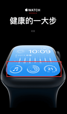
One day I saw apple's ads, these donut charts are amazing:
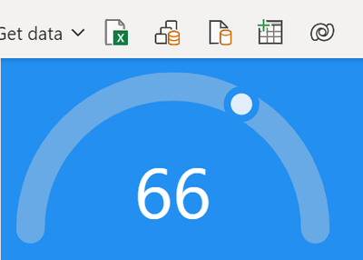
So, I put one of them (right one) in Power BI by DAX:
Here is the measure:
Chart =
VAR Pct=0.66 // repalce 0.66 with your percent measure
VAR SVG=
    "<svg viewbox='0 0 110 60' xmlns='http://www.w3.org/2000/svg'>
        <circle cx='55' cy='55' r='50' fill='none' stroke='LightGrey' stroke-opacity='0.4' stroke-width='10' stroke-linecap='round' stroke-dasharray='" & PI()*50 & "' stroke-dashoffset='" & PI()*50 & "'/>
         <g id='wujunmin'>
            <circle cx='55' cy='5' r='5' fill='White' fill-opacity='0.8' stroke='#228FF1'  stroke-width='2.5'/>
            <animateTransform attributeName='transform' type='rotate' from='-90 55 55' to='"&180*pct-90 &" 55 55' begin='0s' dur='3s' fill='freeze'/>
        </g>
        <text x='55' y='45' text-anchor='middle' dominant-baseline='middle' font-size='25' fill='white'>"&ROUND(Pct*100,0)&"</text>
    </svg>"
RETURN
  SVG
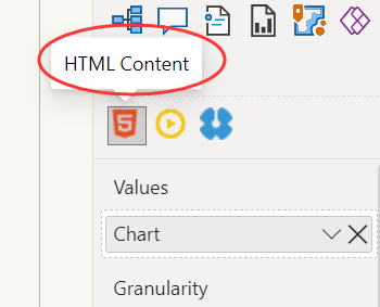
You need HTML Content to get the result:
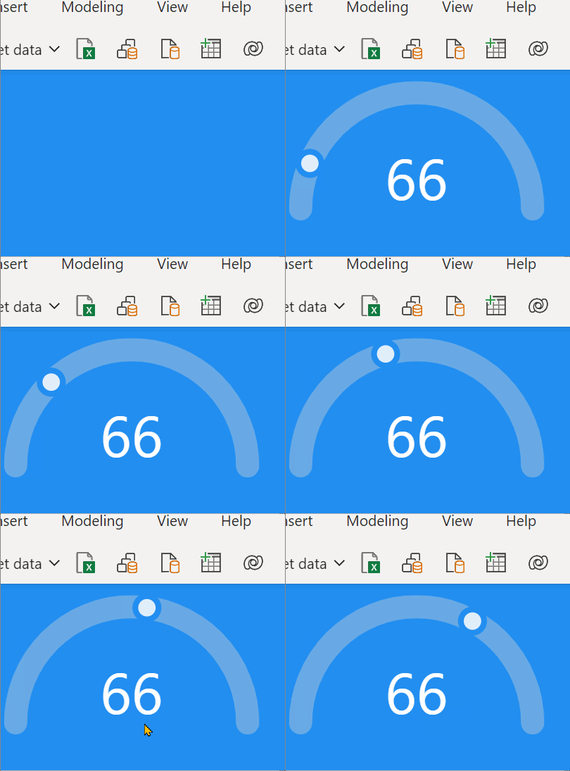
This chart even has some kind of animation:
0 REPLIES 0
Helpful resources
Announcements

Power BI Dataviz World Championships
The Power BI Data Visualization World Championships is back! Get ahead of the game and start preparing now!

Top Solution Authors
| User | Count |
|---|---|
| 1 | |
| 1 | |
| 1 | |
| 1 | |
| 1 |


