Join us at FabCon Vienna from September 15-18, 2025
The ultimate Fabric, Power BI, SQL, and AI community-led learning event. Save €200 with code FABCOMM.
Get registered- Power BI forums
- Get Help with Power BI
- Desktop
- Service
- Report Server
- Power Query
- Mobile Apps
- Developer
- DAX Commands and Tips
- Custom Visuals Development Discussion
- Health and Life Sciences
- Power BI Spanish forums
- Translated Spanish Desktop
- Training and Consulting
- Instructor Led Training
- Dashboard in a Day for Women, by Women
- Galleries
- Data Stories Gallery
- Themes Gallery
- Contests Gallery
- Quick Measures Gallery
- Notebook Gallery
- Translytical Task Flow Gallery
- TMDL Gallery
- R Script Showcase
- Webinars and Video Gallery
- Ideas
- Custom Visuals Ideas (read-only)
- Issues
- Issues
- Events
- Upcoming Events
Enhance your career with this limited time 50% discount on Fabric and Power BI exams. Ends August 31st. Request your voucher.
- Power BI forums
- Forums
- Get Help with Power BI
- Custom Visuals Development Discussion
- Add conditional formatting to sparkline by DAX
- Subscribe to RSS Feed
- Mark Topic as New
- Mark Topic as Read
- Float this Topic for Current User
- Bookmark
- Subscribe
- Printer Friendly Page
- Mark as New
- Bookmark
- Subscribe
- Mute
- Subscribe to RSS Feed
- Permalink
- Report Inappropriate Content
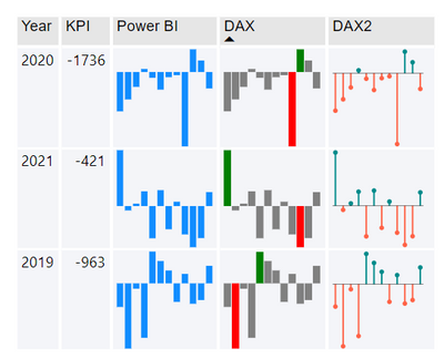
Add conditional formatting to sparkline by DAX
Measure1(mark it as image URL):
Sparkline =
VAR MaxValue =
MAXX ( VALUES ( 'table'[month]), [KPI])
VAR MinValue=
MINX ( VALUES ( 'table'[month]), [KPI])
VAR Max_Width=
IF(MinValue<0,IF(MaxValue<0, ABS(MinValue),MaxValue-MinValue),MaxValue)
VAR BarTable=
ADDCOLUMNS(
SUMMARIZE('table','table'[year],'table'[month],
"Color",IF([KPI]=MaxValue,"Green",IF([KPI]=MinValue,"Red","Grey"))),
"Rect", "<rect x='"&IF(MinValue>0,0, IF(MaxValue>0, IF([KPI]<0,120-120*(MaxValue-[KPI])/Max_Width,120*ABS(MinValue)/Max_Width),120-120*ABS([KPI])/Max_Width)) &"' y='" & ( [month] - 1 ) * 10 & "' width='" & 120*ABS([KPI]) / Max_Width & "' height='9' fill='" & [Color] & " '/>")
Return
"data:image/svg+xml;utf8,"&"
<svg xmlns='http://www.w3.org/2000/svg' width='120' height='120' > <g transform='rotate(-90,60,60)'>"&
CONCATENATEX(BarTable,[Rect])&"</g>
</svg> "
- Mark as New
- Bookmark
- Subscribe
- Mute
- Subscribe to RSS Feed
- Permalink
- Report Inappropriate Content
Hi, Can you post the SVG measure code for the lolipop sparkline in Dax 2 above? Thanks
- Mark as New
- Bookmark
- Subscribe
- Mute
- Subscribe to RSS Feed
- Permalink
- Report Inappropriate Content
Hello,
I'm a Power BI user who (unfortunately) doesn't know DAX. I need to conditionally format the columns on a sparkline bar graph. I was very happy to find your post on this topic and have tried to adapt your code to my use case...without success.
I have a sample .pbix file that illustrates my use case, but don't see any way to attach it to this message, so I've put some sample data in the below table and will try to describe what I need to do.
I need to create a table showing, by UNIQUE_ID, the Average of PCT_CHANGE_1WEEK by DATE in a sparkline bar graph...with a slicer allowing the user to choose multiple DATEs to present - that I can do. What I'd like to do is have the bars be green for positive values and red for negative values - this is what I haven't been able to figure out.
Any help would be greatly appreciated.
Thank you,
Marc
| DATE | UNIQUE_ID | PCT_CHANGE_1WEEK |
| 06/08/2023 | A | -0.349 |
| 06/01/2023 | A | -6.181 |
| 05/25/2023 | A | 0 |
| 06/08/2023 | B | 0.56 |
| 06/01/2023 | B | -0.11 |
| 05/25/2023 | B | 0 |
| 06/08/2023 | C | 1.493 |
| 06/01/2023 | C | -1.78 |
| 05/25/2023 | C | 0 |
- Mark as New
- Bookmark
- Subscribe
- Mute
- Subscribe to RSS Feed
- Permalink
- Report Inappropriate Content
I love your solution to conditonal formatting using DAX as it show min, maxc and a zero line. I was having a challenge getting your code to work...let me know if you would be able to help me troubleshoot.


