FabCon is coming to Atlanta
Join us at FabCon Atlanta from March 16 - 20, 2026, for the ultimate Fabric, Power BI, AI and SQL community-led event. Save $200 with code FABCOMM.
Register now!View all the Fabric Data Days sessions on demand. View schedule
- Microsoft Fabric Community
- Fabric community blogs
- Power BI Community Blog
- Icons & Data Labels on Top of the Bars with Condit...
- Subscribe to RSS Feed
- Mark as New
- Mark as Read
- Bookmark
- Subscribe
- Printer Friendly Page
- Report Inappropriate Content
- Subscribe to RSS Feed
- Mark as New
- Mark as Read
- Bookmark
- Subscribe
- Printer Friendly Page
- Report Inappropriate Content
"A day without a challenge, is a day without a learning!"
Today, I got a requirement from a client, where they asked for getting data labels along with icons along with conditional formatting, on top of the bars represented in a clustered column chart. Now this is something I had not done before, so started looking at various ways in Power BI until I achieved it.
Just to highlight here - conditional formatting is my favourite part of data visualisation in Power BI. I like to have challenges in this area as it keeps me to skill-up myself. There are many folks out there who have amazing blogs on conditional formatting tricks in Power BI, but there is a reason why I want to share my approach today related to this requirement.
Trying to find a workaround in implementing this requirement, I actually came across a visual formatting setting which I never saw before in clustered column chart. May be it is there from some time, but I never paid attention to it. So, let's start with the solution here.
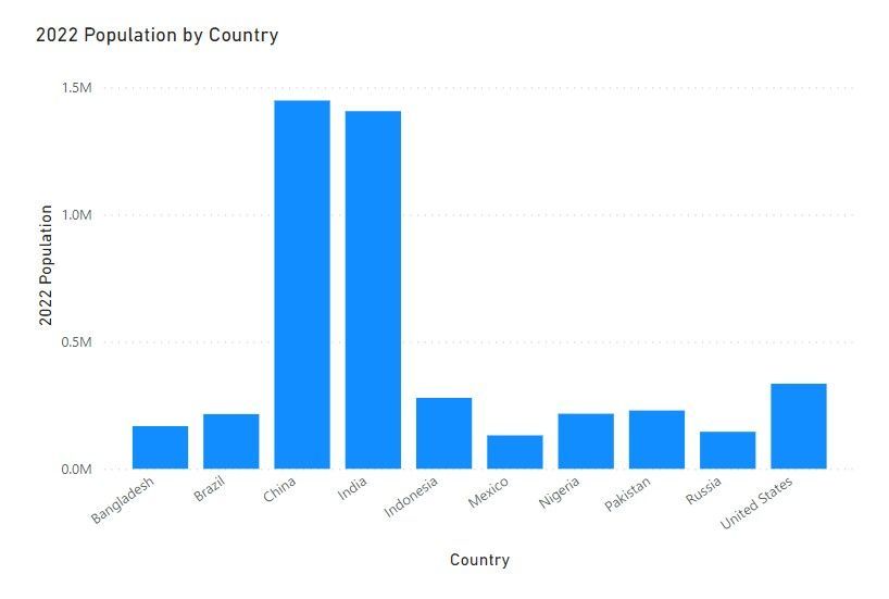
Let's represent a simple metric in a clustered column chart. Very simple chart showing 2022 population by countries.
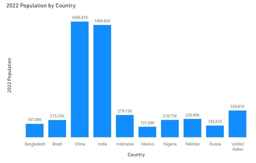
Now let's get the data labels ON and y-axis off in the above chart. (as per best practices of data visualization, either have Y-axis or data labels, never Both)
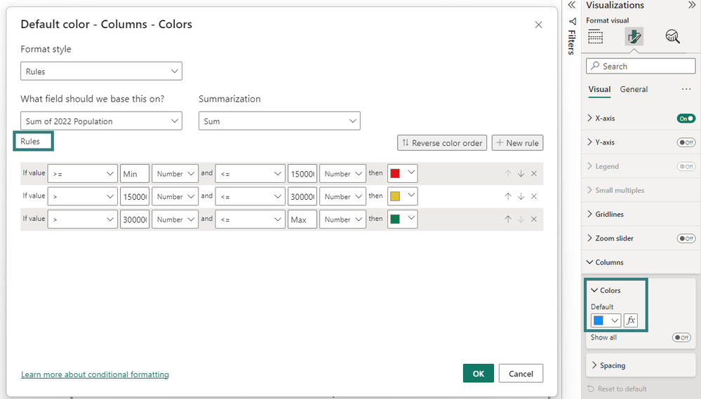
Now the ask here on this chart is we want to apply some conditional formatting in the bars based on the 2022 population value. This is easy, we can apply conditional formatting to bars easily.
I am not going to go in the details of conditional formatting on bars here. But when you apply it using some rules, you will get something like this:
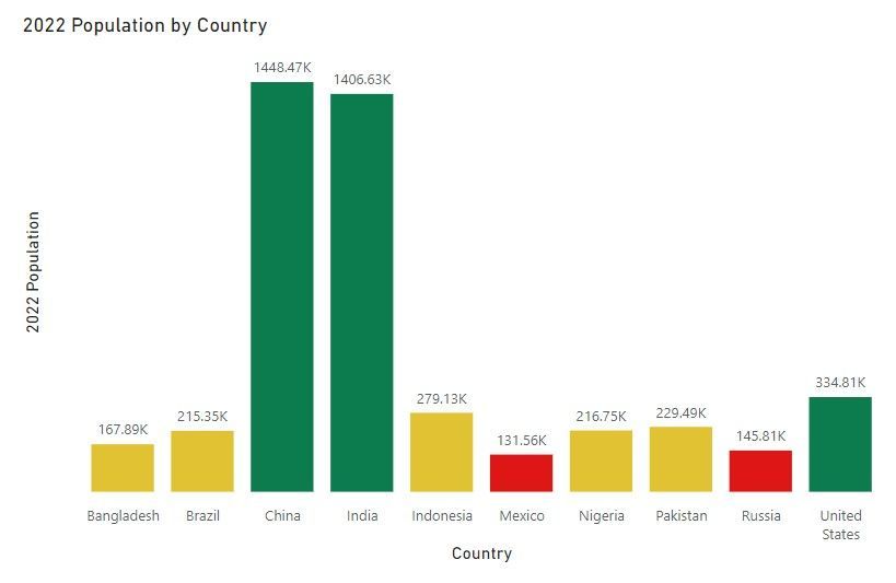
The above rules give following conditional formatting on the chart:
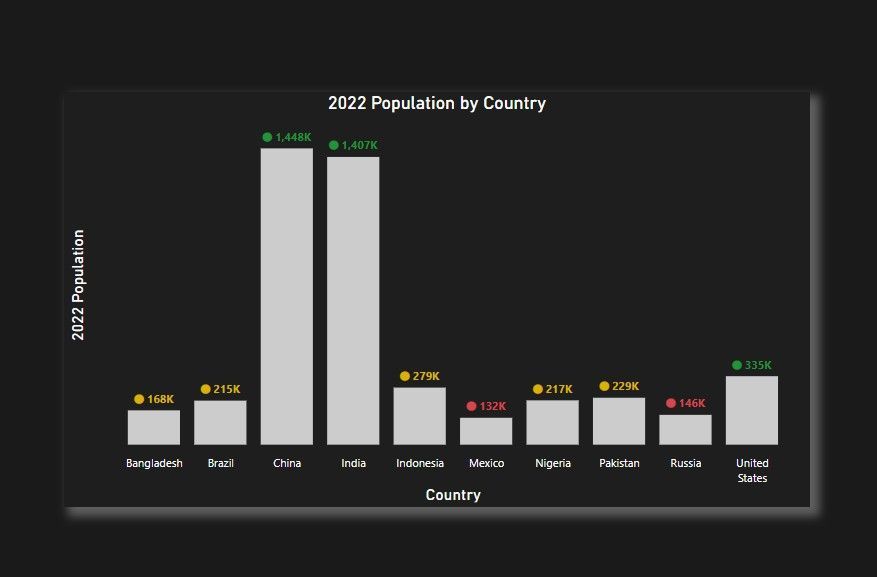
But this is not the required end result. The asked requirement is:
- All the bars on the chart should have same colours
- Like data labels at the top of bars, there should be an icon with these data labels
- Conditional formatting to be applied to [icon + data label] value
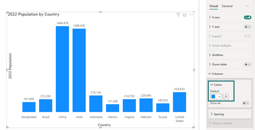
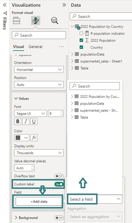
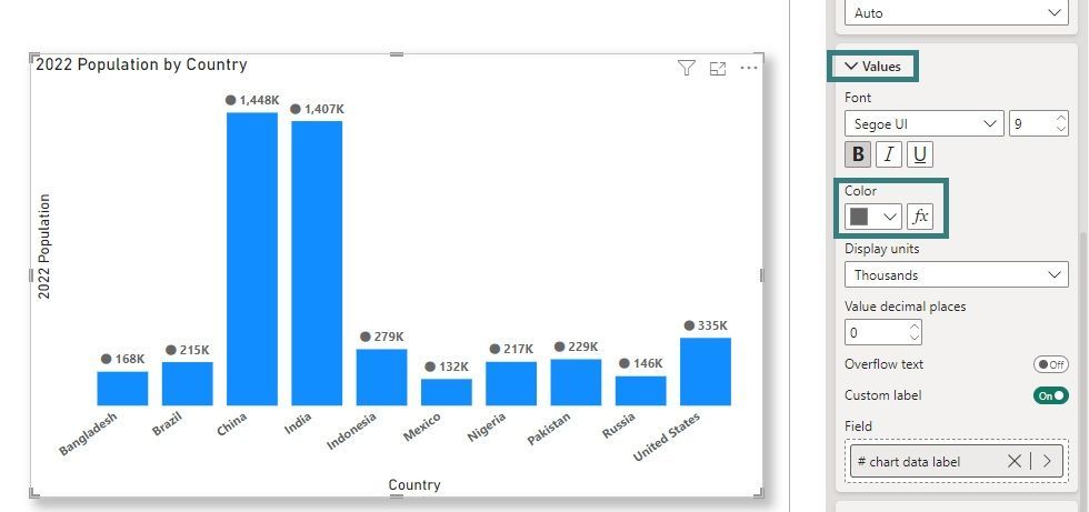
In order, to achieve this, I used a formatting setting in this visual called Custom Label. This setting can be found at:
Data Labels --> Values --> Custom Label
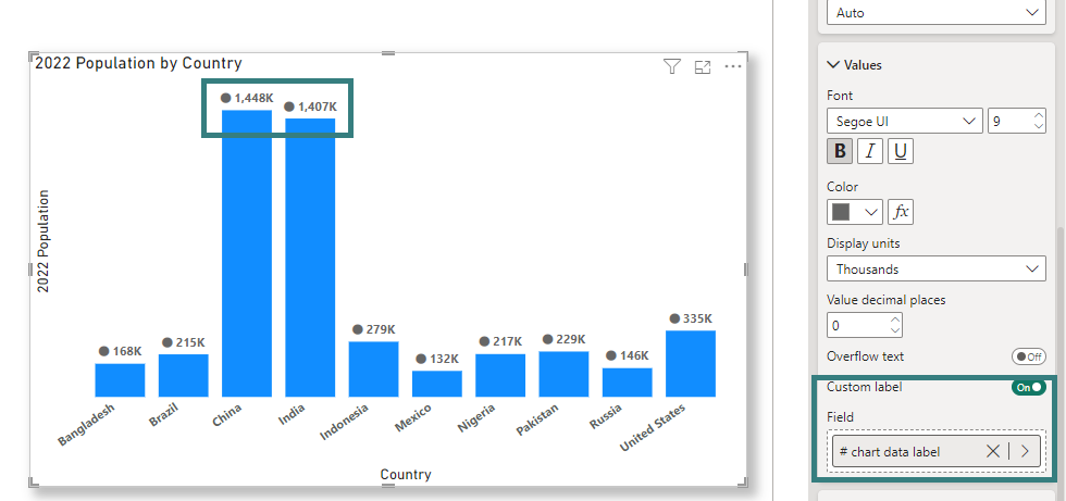
This setting allows me to create a custom data label for the bars on my chart. Currently I see default population values as data labels on this chart.
Once I turn-on custom label, I get the following window and has an option to select a column or a measure to be applied as a custom label to my bars on this visual:
I created a measure which concatenates an icon with the population data measure. I created a measure to get the total population for 2022 and used it in the below label measure to concatenate with the icon (currently shown on bars) as follows:
# chart data label = // concatenating icon with population value
    "⬤" & " "
    & FORMAT ([# population2022] , "#,##0,K" )
The above measure takes the "⬤" icon and concatenates it with the population value in the data. We can test this measure in a simple table visual, and it gives us the overall data label as shown below:
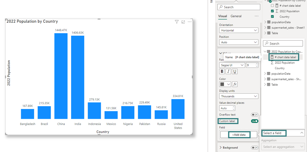
Perfect! The data label looks good. Let's move this custom data label using the custom label setting on the chart and see what it gives us. (I have removed the previous conditional formatting on the bars)
Once I select the chart data label measure, the data labels on the visual are shown as follow:
We can see the data labels on the top of the bars different to what we had previously. The data label now includes an icon. Ok we are nearly there as the conditional formatting is still remaining on these data labels. But again we can do that very easily.
In the clustered column chart, you have an option to apply conditional formatting to the data labels now.
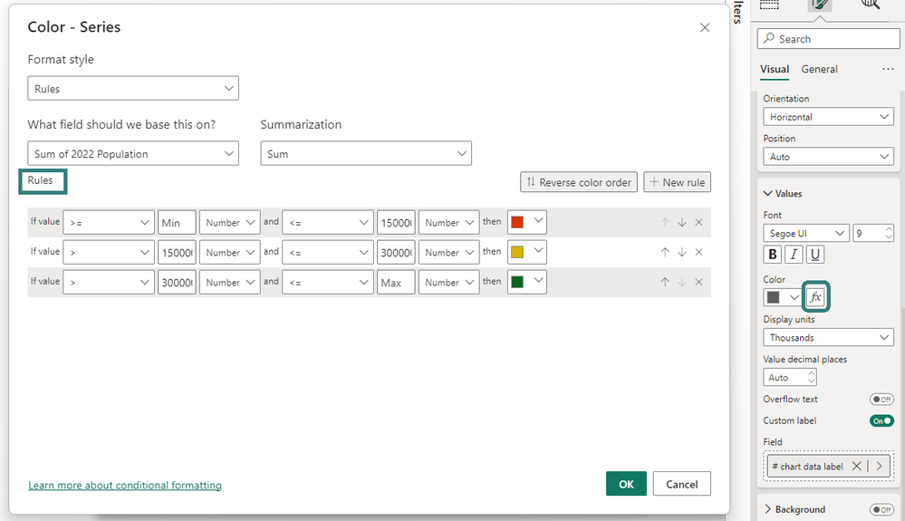
So, now we just go ahead, and write conditional formatting rules here.
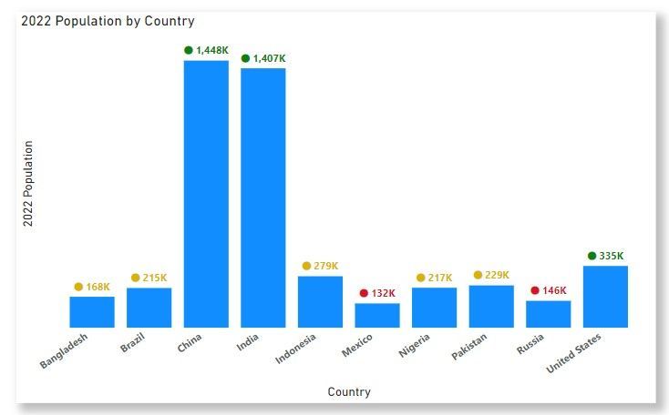
Once we apply these rules, bingo we get the conditional formatting on the custom data labels. 🙂
Sometimes the requirement from the client is not straight-forward, but there is always a workaround to achieving it.
Let me know your views on this trick. Have you used something like this before? If yes, don't forget to share your approach!
Pragati
You must be a registered user to add a comment. If you've already registered, sign in. Otherwise, register and sign in.
- QuickViz Challenge | Spotlight 🔦
- 🏆 Announcing the finalists of the Fabric Data Day...
- 🏆 Announcing the winner of the Fabric Data Days N...
- 🏆 Announcing the winners of the Fabric Data Days ...
- What Happens Actually When You Change Cross Filter...
- SQL's APPLY Clause in PowerBI DAX ?
- Power BI TMDL View: Tasks You Can Finally Do Witho...
- QuickViz Challenge | Matrix Magic 🪄
- Fabric Data Days | Digital Flair!
- Meet the Judges | Dataviz Contest for Pros | Fabri...
-
Mauro89
 on:
QuickViz Challenge | Spotlight 🔦
- Pink-Rose on: 🏆 Announcing the finalists of the Fabric Data Day...
- lahirucw on: 🏆 Announcing the winner of the Fabric Data Days N...
-
axlrn
 on:
🏆 Announcing the winners of the Fabric Data Days ...
-
EsraaKamal
 on:
What Happens Actually When You Change Cross Filter...
- Prosundas on: SQL's APPLY Clause in PowerBI DAX ?
-
Murtaza_Ghafoor
 on:
Power BI TMDL View: Tasks You Can Finally Do Witho...
-
 slindsay
on:
QuickViz Challenge | Matrix Magic 🪄
-
 slindsay
on:
Fabric Data Days | Digital Flair!
- maheshshinde on: QuickViz Challenge | Time traveler
-
How To
737 -
Tips & Tricks
717 -
Events
183 -
Support insights
121 -
Opinion
91 -
DAX
66 -
Power BI
65 -
Power Query
62 -
Power BI Dev Camp
45 -
Power BI Desktop
40 -
Roundup
38 -
Dataflow
31 -
Featured User Group Leader
27 -
Power BI Embedded
20 -
Time Intelligence
19 -
Tips&Tricks
18 -
Data Protection
16 -
PowerBI REST API
12 -
Power Query Tips & Tricks
8 -
finance
8 -
Power BI Service
8 -
Direct Query
7 -
Power BI REST API
6 -
Auto ML
6 -
financial reporting
6 -
Data Analysis
6 -
Power Automate
6 -
Data Visualization
6 -
Python
6 -
Tips and Tricks
6 -
Income Statement
5 -
Dax studio
5 -
powerbi
5 -
service
5 -
Power BI PowerShell
5 -
Machine Learning
5 -
RLS
4 -
M language
4 -
Life Sciences
4 -
Paginated Reports
4 -
External tool
4 -
Power BI Goals
4 -
Desktop
4 -
PowerShell
4 -
Bookmarks
4 -
Line chart
4 -
Group By
4 -
community
4 -
Data model
3 -
Conditional Formatting
3 -
Visualisation
3 -
Administration
3 -
M code
3 -
Visuals
3 -
SQL Server 2017 Express Edition
3 -
R script
3 -
Aggregation
3 -
Webinar
3 -
calendar
3 -
Gateways
3 -
R
3 -
M Query
3 -
CALCULATE
3 -
R visual
3 -
Reports
3 -
PowerApps
3 -
Data Science
3 -
Azure
3 -
inexact
2 -
Date Comparison
2 -
Power BI Premium Per user
2 -
Forecasting
2 -
REST API
2 -
Editor
2 -
Split
2 -
measure
2 -
Microsoft-flow
2 -
Paginated Report Builder
2 -
Working with Non Standatd Periods
2 -
powerbi.tips
2 -
Custom function
2 -
Reverse
2 -
PUG
2 -
Custom Measures
2 -
Filtering
2 -
Row and column conversion
2 -
Python script
2 -
Nulls
2 -
DVW Analytics
2 -
parameter
2 -
Industrial App Store
2 -
Week
2 -
Date duration
2 -
Formatting
2 -
Weekday Calendar
2 -
Support insights.
2 -
construct list
2 -
slicers
2 -
SAP
2 -
Power Platform
2 -
Workday
2 -
external tools
2 -
index
2 -
RANKX
2 -
Date
2 -
PBI Desktop
2 -
Date Dimension
2 -
Integer
2 -
Visualization
2 -
Power BI Challenge
2 -
Query Parameter
2 -
SharePoint
2 -
Power BI Installation and Updates
2 -
How Things Work
2 -
Tabular Editor
2 -
rank
2 -
ladataweb
2 -
Troubleshooting
2 -
Date DIFF
2 -
Transform data
2 -
Healthcare
2 -
Incremental Refresh
2 -
Number Ranges
2 -
Query Plans
2 -
Power BI & Power Apps
2 -
Random numbers
2 -
Day of the Week
2 -
Custom visual
2 -
VLOOKUP
2 -
pivot
2 -
calculated column
2 -
M
2 -
hierarchies
2 -
Power BI Anniversary
2 -
Language M
2 -
query
1 -
Dynamic Visuals
1 -
KPI
1 -
Intro
1 -
Icons
1 -
ISV
1 -
Ties
1 -
unpivot
1 -
Practice Model
1 -
Continuous streak
1 -
ProcessVue
1 -
Create function
1 -
Table.Schema
1 -
Acknowledging
1 -
Postman
1 -
Text.ContainsAny
1 -
Power BI Show
1 -
Get latest sign-in data for each user
1 -
Power Pivot
1 -
API
1 -
Kingsley
1 -
Merge
1 -
variable
1 -
Issues
1 -
function
1 -
stacked column chart
1 -
ho
1 -
ABB
1 -
KNN algorithm
1 -
List.Zip
1 -
optimization
1 -
Artificial Intelligence
1 -
Map Visual
1 -
Text.ContainsAll
1 -
Tuesday
1 -
help
1 -
group
1 -
Scorecard
1 -
Json
1 -
Tops
1 -
financial reporting hierarchies RLS
1 -
Featured Data Stories
1 -
MQTT
1 -
Custom Periods
1 -
Partial group
1 -
Reduce Size
1 -
FBL3N
1 -
Wednesday
1 -
Q&A
1 -
Quick Tips
1 -
data
1 -
PBIRS
1 -
Usage Metrics in Power BI
1 -
Multivalued column
1 -
Pipeline
1 -
Path
1 -
Yokogawa
1 -
Dynamic calculation
1 -
Data Wrangling
1 -
native folded query
1 -
transform table
1 -
UX
1 -
Cell content
1 -
General Ledger
1 -
Thursday
1 -
update
1 -
Table
1 -
Natural Query Language
1 -
Infographic
1 -
automation
1 -
Prediction
1 -
newworkspacepowerbi
1 -
Performance KPIs
1 -
HR Analytics
1 -
keepfilters
1 -
Connect Data
1 -
Financial Year
1 -
Schneider
1 -
dynamically delete records
1 -
Copy Measures
1 -
Friday
1 -
Training
1 -
Event
1 -
Custom Visuals
1 -
Free vs Pro
1 -
Format
1 -
Active Employee
1 -
Custom Date Range on Date Slicer
1 -
refresh error
1 -
PAS
1 -
certain duration
1 -
DA-100
1 -
bulk renaming of columns
1 -
Single Date Picker
1 -
Monday
1 -
PCS
1 -
Saturday
1 -
Slicer
1 -
Visual
1 -
forecast
1 -
Regression
1 -
CICD
1 -
Current Employees
1 -
date hierarchy
1 -
relationship
1 -
SIEMENS
1 -
Multiple Currency
1 -
Power BI Premium
1 -
On-premises data gateway
1 -
Binary
1 -
Power BI Connector for SAP
1 -
Sunday
1 -
Workspace
1 -
Announcement
1 -
Features
1 -
domain
1 -
pbiviz
1 -
sport statistics
1 -
Intelligent Plant
1 -
Circular dependency
1 -
GE
1 -
Exchange rate
1 -
Dendrogram
1 -
range of values
1 -
activity log
1 -
Decimal
1 -
Charticulator Challenge
1 -
Field parameters
1 -
deployment
1 -
ssrs traffic light indicators
1 -
SQL
1 -
trick
1 -
Scripts
1 -
Color Map
1 -
Industrial
1 -
Weekday
1 -
Working Date
1 -
Space Issue
1 -
Emerson
1 -
Date Table
1 -
Cluster Analysis
1 -
Stacked Area Chart
1 -
union tables
1 -
Number
1 -
Start of Week
1 -
Tips& Tricks
1 -
Theme Colours
1 -
Text
1 -
Flow
1 -
Publish to Web
1 -
Extract
1 -
Topper Color On Map
1 -
Historians
1 -
context transition
1 -
Custom textbox
1 -
OPC
1 -
Zabbix
1 -
Label: DAX
1 -
Business Analysis
1 -
Supporting Insight
1 -
rank value
1 -
Synapse
1 -
End of Week
1 -
Tips&Trick
1 -
Excel
1 -
Showcase
1 -
custom connector
1 -
Waterfall Chart
1 -
Power BI On-Premise Data Gateway
1 -
patch
1 -
Top Category Color
1 -
A&E data
1 -
Previous Order
1 -
Substring
1 -
Wonderware
1 -
Power M
1 -
Format DAX
1 -
Custom functions
1 -
accumulative
1 -
DAX&Power Query
1 -
Premium Per User
1 -
GENERATESERIES
1 -
Report Server
1 -
Audit Logs
1 -
analytics pane
1 -
step by step
1 -
Top Brand Color on Map
1 -
Tutorial
1 -
Previous Date
1 -
XMLA End point
1 -
color reference
1 -
Date Time
1 -
Marker
1 -
Lineage
1 -
CSV file
1 -
conditional accumulative
1 -
Matrix Subtotal
1 -
Check
1 -
null value
1 -
Show and Tell
1 -
Cumulative Totals
1 -
Report Theme
1 -
Bookmarking
1 -
oracle
1 -
mahak
1 -
pandas
1 -
Networkdays
1 -
Button
1 -
Dataset list
1 -
Keyboard Shortcuts
1 -
Fill Function
1 -
LOOKUPVALUE()
1 -
Tips &Tricks
1 -
Plotly package
1 -
Sameperiodlastyear
1 -
Office Theme
1 -
matrix
1 -
bar chart
1 -
Measures
1 -
powerbi argentina
1 -
Canvas Apps
1 -
total
1 -
Filter context
1 -
Difference between two dates
1 -
get data
1 -
OSI
1 -
Query format convert
1 -
ETL
1 -
Json files
1 -
Merge Rows
1 -
CONCATENATEX()
1 -
take over Datasets;
1 -
Networkdays.Intl
1 -
refresh M language Python script Support Insights
1 -
Tutorial Requests
1 -
Governance
1 -
Fun
1 -
Power BI gateway
1 -
gateway
1 -
Elementary
1 -
Custom filters
1 -
Vertipaq Analyzer
1 -
powerbi cordoba
1 -
Model Driven Apps
1 -
REMOVEFILTERS
1 -
XMLA endpoint
1 -
translations
1 -
OSI pi
1 -
Parquet
1 -
Change rows to columns
1 -
remove spaces
1 -
Get row and column totals
1 -
Retail
1 -
Power BI Report Server
1 -
School
1 -
Cost-Benefit Analysis
1 -
DIisconnected Tables
1 -
Sandbox
1 -
Honeywell
1 -
Combine queries
1 -
X axis at different granularity
1 -
ADLS
1 -
Primary Key
1 -
Microsoft 365 usage analytics data
1 -
Randomly filter
1 -
Week of the Day
1 -
Azure AAD
1
- 11-30-2025 - 12-05-2025
- 11-23-2025 - 11-29-2025
- 11-16-2025 - 11-22-2025
- 11-09-2025 - 11-15-2025
- 11-02-2025 - 11-08-2025
- 10-26-2025 - 11-01-2025
- 10-19-2025 - 10-25-2025
- 10-12-2025 - 10-18-2025
- 10-05-2025 - 10-11-2025
- 09-28-2025 - 10-04-2025
- 09-21-2025 - 09-27-2025
- 09-14-2025 - 09-20-2025
- 09-07-2025 - 09-13-2025
- View Complete Archives
