FabCon is coming to Atlanta
Join us at FabCon Atlanta from March 16 - 20, 2026, for the ultimate Fabric, Power BI, AI and SQL community-led event. Save $200 with code FABCOMM.
Register now!To celebrate FabCon Vienna, we are offering 50% off select exams. Ends October 3rd. Request your discount now.
- Microsoft Fabric Community
- Fabric community blogs
- Power BI Community Blog
- Dynamically change the information within a visual...
- Subscribe to RSS Feed
- Mark as New
- Mark as Read
- Bookmark
- Subscribe
- Printer Friendly Page
- Report Inappropriate Content
- Subscribe to RSS Feed
- Mark as New
- Mark as Read
- Bookmark
- Subscribe
- Printer Friendly Page
- Report Inappropriate Content
If you have ever found yourself running out of room on a report page for all the information you have, then this is a great technique to use.
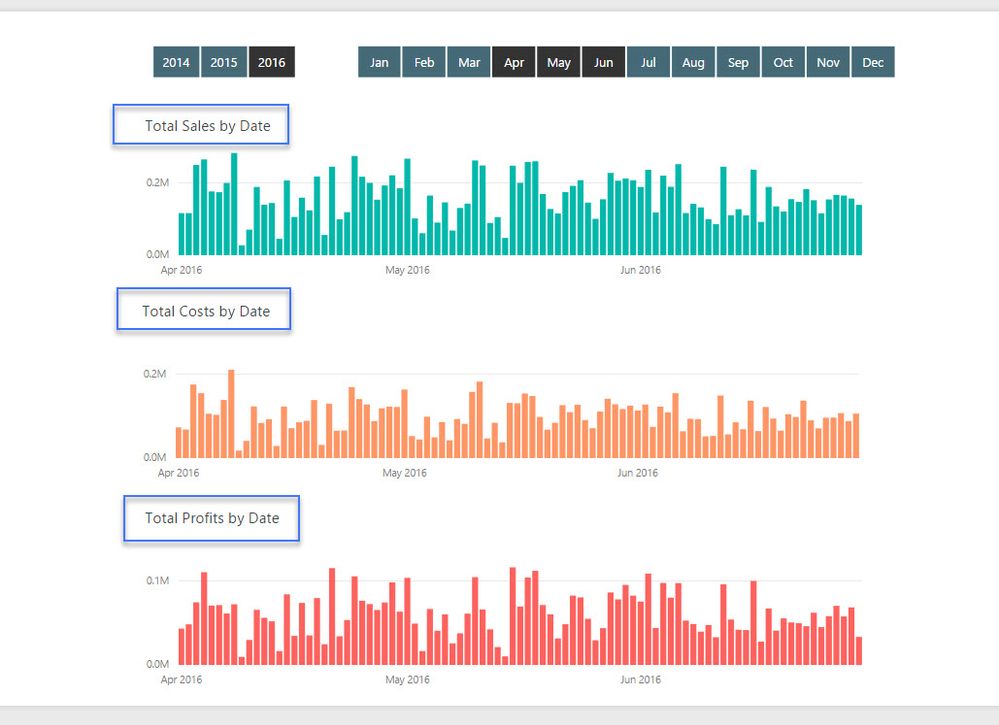
Check out what we a trying to achieve below.
It's always good to at least have a small plan of what you are looking to place into your report pages before you get started. This way you can actually design the data model and measures around that look and feel that you want to achieve.
I like to always complete a quick sketch of my reports, as then I'll quickly know if I have to utilise this technique in particular in my model build.
Ok, so it's a common occurrence to see reports like the below where we have similar charts all in one reports. Sometimes this might be for a legitimate reason, but it does take up quite a bit of room.
What if we wanted to free up some real estate and place this in one visual? Then dynamically flick between sales/costs/profits using a slicer.
Here's how you do it.
Obviously, we need to first start with are measure that we want evaluated.
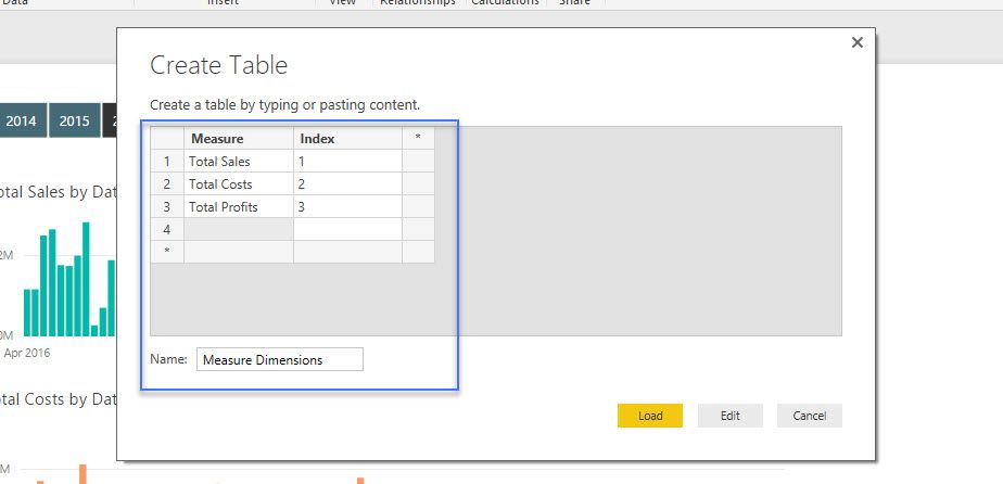
Now we need to create a slicer which can hold the dimensions of 'sales', 'costs' and 'profits'. We create a table manually within Power BI using the 'Enter Data' button.
We give each measure dimension an index number as that is what we are going to sort them by in the slicer.
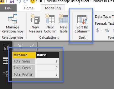
Once this is loaded into the data model, you want to make sure that the measures are actually sorted correctly. You want these to show up in your slicer in a sequential order.
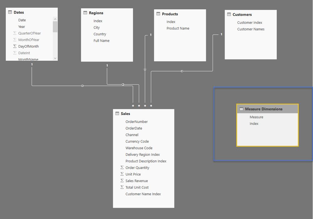
Next, let's check the data model.
This table does not need to have a relationship to any other table, so make sure that it doesn't (you can also call this a disconnected table). You may get weird filtering results on some of your measures if the index column in this new table somehow has a relationship with an unrelated table.
Let's create a slicer out of our new measure table dimensions.
Now for the magic of the SWITCH function.
Using the SWITCH function (similar to nested IFs) we are able to write an expression that evaluates all of our inputs and then if one evaluates to TRUE then that measure and only that measure is returned.
This is pretty cool. Think of the applications here for your report designs. It brings immense design flexibility which I personally quite like.
Now, couple of considerations...
What if nothing is selected? Well, that is what the BLANK() is for. You need to make a decision here. You can put this to a default, like 'Total Sales' for example. But totally up to you. I like BLANK() as it quickly shows the user that something is not right and they need to select something. It reduces any ambiguity over what story you are attempting to show in the report.
Currently, you can also not have different formats within the same chart. So you only want to group similar numeric types like currency, decimals numbers, whole numbers etc. Looking forward to the day this gets changed on a monthly update!
Download the pbix file at the link below.
This is a truly great design technique I use quite a bit. It will open your mind to numerous possibilities. Good luck with it.
Sam McKay, CFA
Enterprise Power BI (LinkedIn Group)
- « Previous
-
- 1
- 2
- 3
- Next »
You must be a registered user to add a comment. If you've already registered, sign in. Otherwise, register and sign in.
- 🏆 Announcing the winners of the Notebooks for Pow...
- 🏆 Announcing the winners of the Translytical Task...
- Join the FabCon Hackathon!
- Visualizing an Entire Year with a Power BI Calenda...
- DAX Variables vs. Repeated Expressions: Why VAR Ma...
- One-Click Pause: How to Stop All Power BI Dataset ...
- Setting up Power BI REST API for the First Time
- ⚡ Power BI Performance Optimizations: From Minutes...
- Getting Started with Copilot in Power BI Desktop: ...
- Sorting Date & Month Columns in Descending Order i...
-
oberthju
 on:
⚡ Power BI Performance Optimizations: From Minutes...
- _Abhilash on: Getting Started with Copilot in Power BI Desktop: ...
-
Peter_23
 on:
🏆 Announcing the judges' favorites from the Power...
-
 bhanu_gautam
on:
🏆 Announcing the finalists of the Power BI DataVi...
-
Abhilash_P
 on:
Power BI Copilot: Write DAX Measures Fast
-
 v-csrikanth
on:
Set a visual to allow report users dynamically sel...
-
wardy912
 on:
August 2025 Power BI Update: Features That Matter ...
-
Shubham_rai955
 on:
Create a custom role in Power BI Report Server (SS...
-
Olayemi_Awofe
 on:
Do Not Use Web.BrowserContents (2/2)
-
Shahid12523
 on:
Calculation Groups and Field Parameters
-
How to
698 -
Tips & Tricks
676 -
Events
162 -
Support insights
121 -
Opinion
84 -
DAX
66 -
Power BI
65 -
Power Query
62 -
Power BI Dev Camp
45 -
Power BI Desktop
40 -
Roundup
38 -
Dataflow
26 -
Featured User Group Leader
24 -
Power BI Embedded
20 -
Time Intelligence
19 -
Tips&Tricks
18 -
Data Protection
13 -
PowerBI REST API
12 -
Power Query Tips & Tricks
8 -
finance
8 -
Power BI Service
8 -
Direct Query
7 -
Power BI REST API
6 -
Auto ML
6 -
financial reporting
6 -
Data Analysis
6 -
Power Automate
6 -
Data Visualization
6 -
Python
6 -
Tips and Tricks
6 -
Machine Learning
5 -
Income Statement
5 -
Dax studio
5 -
powerbi
5 -
service
5 -
Power BI PowerShell
5 -
Line chart
4 -
Group By
4 -
community
4 -
RLS
4 -
M language
4 -
Paginated Reports
4 -
External tool
4 -
Power BI Goals
4 -
Desktop
4 -
PowerShell
4 -
Bookmarks
4 -
Data Science
3 -
Azure
3 -
Data model
3 -
Conditional Formatting
3 -
Visualisation
3 -
Life Sciences
3 -
Administration
3 -
M code
3 -
Visuals
3 -
SQL Server 2017 Express Edition
3 -
R script
3 -
Aggregation
3 -
Webinar
3 -
calendar
3 -
Gateways
3 -
R
3 -
M Query
3 -
CALCULATE
3 -
R visual
3 -
Reports
3 -
PowerApps
3 -
rank
2 -
ladataweb
2 -
Troubleshooting
2 -
Date DIFF
2 -
Transform data
2 -
Healthcare
2 -
Incremental Refresh
2 -
Number Ranges
2 -
Query Plans
2 -
Power BI & Power Apps
2 -
Random numbers
2 -
Day of the Week
2 -
Custom Visual
2 -
VLOOKUP
2 -
pivot
2 -
calculated column
2 -
M
2 -
hierarchies
2 -
Power BI Anniversary
2 -
Language M
2 -
inexact
2 -
Date Comparison
2 -
Power BI Premium Per user
2 -
Forecasting
2 -
REST API
2 -
Editor
2 -
Split
2 -
measure
2 -
Microsoft-flow
2 -
Paginated Report Builder
2 -
Working with Non Standatd Periods
2 -
powerbi.tips
2 -
Custom function
2 -
Reverse
2 -
PUG
2 -
Custom Measures
2 -
Filtering
2 -
Row and column conversion
2 -
Python script
2 -
Nulls
2 -
DVW Analytics
2 -
parameter
2 -
Industrial App Store
2 -
Week
2 -
Date duration
2 -
Formatting
2 -
Weekday Calendar
2 -
Support insights.
2 -
construct list
2 -
slicers
2 -
SAP
2 -
Power Platform
2 -
Workday
2 -
external tools
2 -
index
2 -
RANKX
2 -
Date
2 -
PBI Desktop
2 -
Date Dimension
2 -
Integer
2 -
Visualization
2 -
Power BI Challenge
2 -
Query Parameter
2 -
SharePoint
2 -
Power BI Installation and Updates
2 -
How Things Work
2 -
Tabular Editor
2 -
Show and Tell
1 -
Cumulative Totals
1 -
Report Theme
1 -
Bookmarking
1 -
oracle
1 -
mahak
1 -
pandas
1 -
Networkdays
1 -
Button
1 -
Dataset list
1 -
Keyboard Shortcuts
1 -
Fill Function
1 -
LOOKUPVALUE()
1 -
Tips &Tricks
1 -
Plotly package
1 -
Sameperiodlastyear
1 -
Office Theme
1 -
matrix
1 -
bar chart
1 -
Measures
1 -
powerbi argentina
1 -
Canvas Apps
1 -
total
1 -
Filter context
1 -
Difference between two dates
1 -
get data
1 -
OSI
1 -
Query format convert
1 -
ETL
1 -
Json files
1 -
Merge Rows
1 -
CONCATENATEX()
1 -
take over Datasets;
1 -
Networkdays.Intl
1 -
refresh M language Python script Support Insights
1 -
Tutorial Requests
1 -
Governance
1 -
Fun
1 -
Power BI gateway
1 -
gateway
1 -
Elementary
1 -
Custom filters
1 -
Vertipaq Analyzer
1 -
powerbi cordoba
1 -
Model Driven Apps
1 -
REMOVEFILTERS
1 -
XMLA endpoint
1 -
translations
1 -
OSI pi
1 -
Parquet
1 -
Change rows to columns
1 -
remove spaces
1 -
Get row and column totals
1 -
Retail
1 -
Power BI Report Server
1 -
School
1 -
Cost-Benefit Analysis
1 -
DIisconnected Tables
1 -
Sandbox
1 -
Honeywell
1 -
Combine queries
1 -
X axis at different granularity
1 -
ADLS
1 -
Primary Key
1 -
Microsoft 365 usage analytics data
1 -
Randomly filter
1 -
Week of the Day
1 -
Azure AAD
1 -
query
1 -
Dynamic Visuals
1 -
KPI
1 -
Intro
1 -
Icons
1 -
ISV
1 -
Ties
1 -
unpivot
1 -
Practice Model
1 -
Continuous streak
1 -
ProcessVue
1 -
Create function
1 -
Table.Schema
1 -
Acknowledging
1 -
Postman
1 -
Text.ContainsAny
1 -
Power BI Show
1 -
Get latest sign-in data for each user
1 -
Power Pivot
1 -
API
1 -
Kingsley
1 -
Merge
1 -
variable
1 -
Issues
1 -
function
1 -
stacked column chart
1 -
ho
1 -
ABB
1 -
KNN algorithm
1 -
List.Zip
1 -
optimization
1 -
Artificial Intelligence
1 -
Map Visual
1 -
Text.ContainsAll
1 -
Tuesday
1 -
help
1 -
group
1 -
Scorecard
1 -
Json
1 -
Tops
1 -
financial reporting hierarchies RLS
1 -
Featured Data Stories
1 -
MQTT
1 -
Custom Periods
1 -
Partial group
1 -
Reduce Size
1 -
FBL3N
1 -
Wednesday
1 -
Q&A
1 -
Quick Tips
1 -
data
1 -
PBIRS
1 -
Usage Metrics in Power BI
1 -
Multivalued column
1 -
Pipeline
1 -
Path
1 -
Yokogawa
1 -
Dynamic calculation
1 -
Data Wrangling
1 -
native folded query
1 -
transform table
1 -
UX
1 -
Cell content
1 -
General Ledger
1 -
Thursday
1 -
update
1 -
Table
1 -
Natural Query Language
1 -
Infographic
1 -
automation
1 -
Prediction
1 -
newworkspacepowerbi
1 -
Performance KPIs
1 -
HR Analytics
1 -
keepfilters
1 -
Connect Data
1 -
Financial Year
1 -
Schneider
1 -
dynamically delete records
1 -
Copy Measures
1 -
Friday
1 -
Training
1 -
Event
1 -
Custom Visuals
1 -
Free vs Pro
1 -
Format
1 -
Active Employee
1 -
Custom Date Range on Date Slicer
1 -
refresh error
1 -
PAS
1 -
certain duration
1 -
DA-100
1 -
bulk renaming of columns
1 -
Single Date Picker
1 -
Monday
1 -
PCS
1 -
Saturday
1 -
Slicer
1 -
Visual
1 -
forecast
1 -
Regression
1 -
CICD
1 -
Current Employees
1 -
date hierarchy
1 -
relationship
1 -
SIEMENS
1 -
Multiple Currency
1 -
Power BI Premium
1 -
On-premises data gateway
1 -
Binary
1 -
Power BI Connector for SAP
1 -
Sunday
1 -
Workspace
1 -
Announcement
1 -
Features
1 -
domain
1 -
pbiviz
1 -
sport statistics
1 -
Intelligent Plant
1 -
Circular dependency
1 -
GE
1 -
Exchange rate
1 -
Dendrogram
1 -
range of values
1 -
activity log
1 -
Decimal
1 -
Charticulator Challenge
1 -
Field parameters
1 -
deployment
1 -
ssrs traffic light indicators
1 -
SQL
1 -
trick
1 -
Scripts
1 -
Color Map
1 -
Industrial
1 -
Weekday
1 -
Working Date
1 -
Space Issue
1 -
Emerson
1 -
Date Table
1 -
Cluster Analysis
1 -
Stacked Area Chart
1 -
union tables
1 -
Number
1 -
Start of Week
1 -
Tips& Tricks
1 -
Theme Colours
1 -
Text
1 -
Flow
1 -
Publish to Web
1 -
Extract
1 -
Topper Color On Map
1 -
Historians
1 -
context transition
1 -
Custom textbox
1 -
OPC
1 -
Zabbix
1 -
Label: DAX
1 -
Business Analysis
1 -
Supporting Insight
1 -
rank value
1 -
Synapse
1 -
End of Week
1 -
Tips&Trick
1 -
Excel
1 -
Showcase
1 -
custom connector
1 -
Waterfall Chart
1 -
Power BI On-Premise Data Gateway
1 -
patch
1 -
Top Category Color
1 -
A&E data
1 -
Previous Order
1 -
Substring
1 -
Wonderware
1 -
Power M
1 -
Format DAX
1 -
Custom functions
1 -
accumulative
1 -
DAX&Power Query
1 -
Premium Per User
1 -
GENERATESERIES
1 -
Report Server
1 -
Audit Logs
1 -
analytics pane
1 -
step by step
1 -
Top Brand Color on Map
1 -
Tutorial
1 -
Previous Date
1 -
XMLA End point
1 -
color reference
1 -
Date Time
1 -
Marker
1 -
Lineage
1 -
CSV file
1 -
conditional accumulative
1 -
Matrix Subtotal
1 -
Check
1 -
null value
1
- 09-14-2025 - 09-18-2025
- 09-07-2025 - 09-13-2025
- 08-31-2025 - 09-06-2025
- 08-24-2025 - 08-30-2025
- 08-17-2025 - 08-23-2025
- 08-10-2025 - 08-16-2025
- 08-03-2025 - 08-09-2025
- 07-27-2025 - 08-02-2025
- 07-20-2025 - 07-26-2025
- 07-13-2025 - 07-19-2025
- 07-06-2025 - 07-12-2025
- 06-29-2025 - 07-05-2025
- 06-22-2025 - 06-28-2025
- 06-15-2025 - 06-21-2025
- View Complete Archives


