A new Data Days event is coming soon!
This time we’re going bigger than ever. Fabric, Power BI, SQL, AI and more. We're covering it all. You won't want to miss it.
Learn moreDid you hear? There's a new SQL AI Developer certification (DP-800). Start preparing now and be one of the first to get certified. Register now
- Microsoft Fabric Community
- Fabric community blogs
- Power BI Community Blog
- Creating Value Dynamic Formatting using Calculatio...
- Subscribe to RSS Feed
- Mark as New
- Mark as Read
- Bookmark
- Subscribe
- Printer Friendly Page
- Report Inappropriate Content
- Subscribe to RSS Feed
- Mark as New
- Mark as Read
- Bookmark
- Subscribe
- Printer Friendly Page
- Report Inappropriate Content
- What you can do and why you should
- Implementing in your reports
- Datamodel
- What's an Calculation Group
- The usage of Calculation Groups to format values
- But you also need to know this
- Safe usage untill the bugs are fixed
- Creating the Calculation Group
- Step 1. Create a Calculation group
- Step 2. Create the Calculation Items
- Step 3. Configure the formatting for the simple Calculation Items
- Step 4. Test the three configured Configuration Items
- Step 5. Configure the formatting for the "Precision 3" Calculation Item
- Calculation Group Precedence
- Behind the scene
What you can do and why you should
Have you ever been facing the problem of showing small and large numbers together (e.g. 123,456, 789.99 and 34.56) in a nice way, lets say with a 3 digit precison as 34.5 and 123G (or 123E6).
When working with large numbers you can divide them with 1,000 or 1,000,000 and round them to zero (or two decimal points), but then small values could be presented as “0”.
You can also add bars and colors to the background (or text colors) reflecting the size of the values... But usually when you have a design you think will work, the user will filter down the data to something you haven’t expected and then again, things are not showing as you and your users would expect. So all work for nothing.
Wouldn’t it be nice to be able to show values like this, in this case using a 3 digit precision:
And on-top of that, you can also give the user the possibility to choose how the formatting shall be done using standard filter
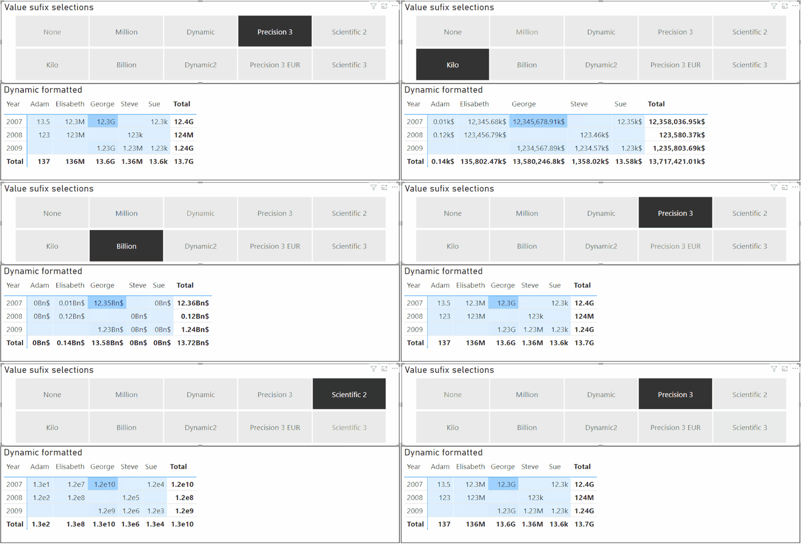
The alternative could have been one of the two formattings below:


As can be seen above:
- In Matrix 2a, not reducing the number of digits makes it hard to read, even though I'm using background color and thousand separators.
- In Matrix 2b values less than 10'000 are "hidden" as 0.00M.
Note that simple user-defined formatting in kilo, Mega, etc, using a filter has been possible before, but with some side-effects like
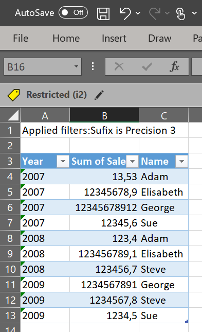
- Exported values (to excel or CSV) beeing reduced by 1'000, 1'000'000, etc
- Hovering over values in diagrams will show values reduced with 1'000, 1'000'000, etc.
Both (1) and (2) above might in some cases be the intention, but then the user needs to be aware of what the numbers means.
The method described here doesn't have the side-effects above, i.e. for side-effect (2), see the exported Excel below, keeping the exported numbers at their original precision:
And maybe most importantly, using the method described here, diagrams like the bar-chart below will show the values formatted as you decide:

This (and more) is possible using advanced formatting string and some simple DAX in Calculation Groups.
Microsoft has already described how to do dynamic formatting, and the SQLBI guys has very good articles as well (here and here). This post goes beyond that and shows how to format dynamically even based on the values.
Note/Warning: At the time of writing, some bugs exist in the standard visuals for Power BI, but Matrixes and Multicard visuals seams to work and should be safe to use (chart diagrams are not ok even though I have showed one chart diagram above). The bugs are confirmed by Microsoft although no ETA has yet been confirmed. External ticket number is "2104200050002054" if someone would like to refere to it. I have also created a idea to fix the formatting issues, please vote.
Implementing in your reports
Implementing Value Dynamic Formatting requires a Calculation Group. But I will start with showing how this can be implemented in the reports if you alread have this Calculation Group created. The reason for this is that creating Calculation Groups requires 3'rd party tools (i.e. the Tabular Editor) and this could be seen as a bit complex if you haven't done it before. So instead, please use my already prepared PBIX file and determin if this is for you. For information on how to create the needed Calculation Group, please see "Creating the Calculation Group" below.
Datamodel
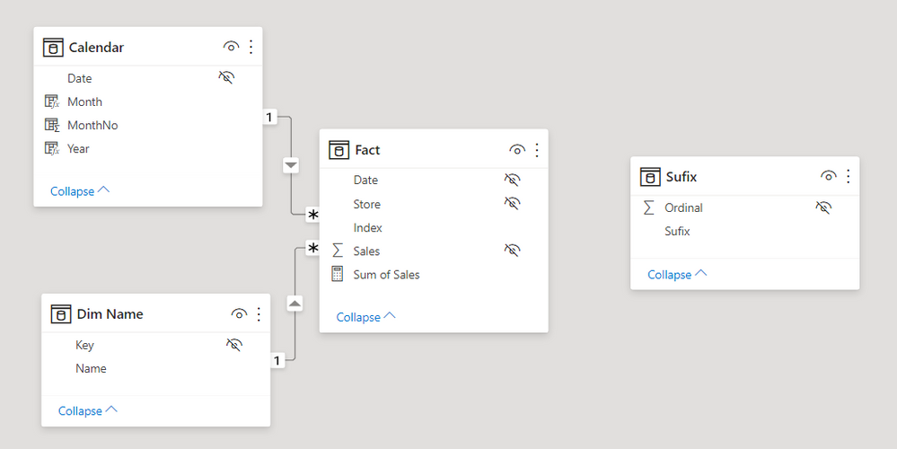
The datamodel used in this example is very simple, a super small Fact table, one Calendar dimension an a Dim Name table (this could also have been just one flat table). But most importantly, there's also a disconnected table called Sufix, and this is a table of the special type "Calculation Group".
What's an Calculation Group
A Calculation Group looks just like a regular table, having two columns. One index column (called "Ordinal") controling the sort ordering, and one content column (in this case renamed to "Sufix"). Each row in the Calculation Group represents a Calculation Item (i.e. "Kilo", "Million", "Precision 3", etc). Using the data view in Power BI the Calculation Group table looks like below:

For now, we can see each row in the Calculation Group (i.e. each Calculation Item) as something capable of overiding explicit measures with new code, and owerwriting existing formatting with new formatting. In simple cases like in "Kilo", the Calculation Items overrides the measures with a formatting of "#,0,.##k$", but in case of "Dynamic1", "Precision 3", etc, it's more complex codes involved. The only thing we need to know at this point in time is that the sequence of ",." in the formatting string (a comma just before the decimal point) means divide with 1,000 before displaying. The same way a sequence of ",,." (two commas just before the decimal point) means divide with 1,000,000 before displaying, etc.
The usage of Calculation Groups to format values
To activate this formatting we simply filter a Calculation Item (i.e. a single row from the Calculation Group) for a visual. This can be done as either a visual level filter, a cross filter on the canvas, a page level filter, or a report level filter. This can also be done explicitly within a measure, but that is not so relevant in this case.
So as of now, the only thing you need to do when changing this original matrix:

Into this matrix using 3 digit precisions:
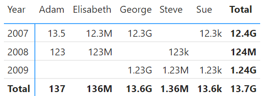
Is to apply a filter on the Calculation Group to the visual, e.g. like below:
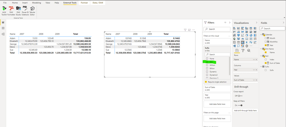
To have the formatting affecting all visuals on the canvas, just place the Calculation Item as page level filter. To let the user decide how to format, place the filter as a visual filter on the canvas like below:
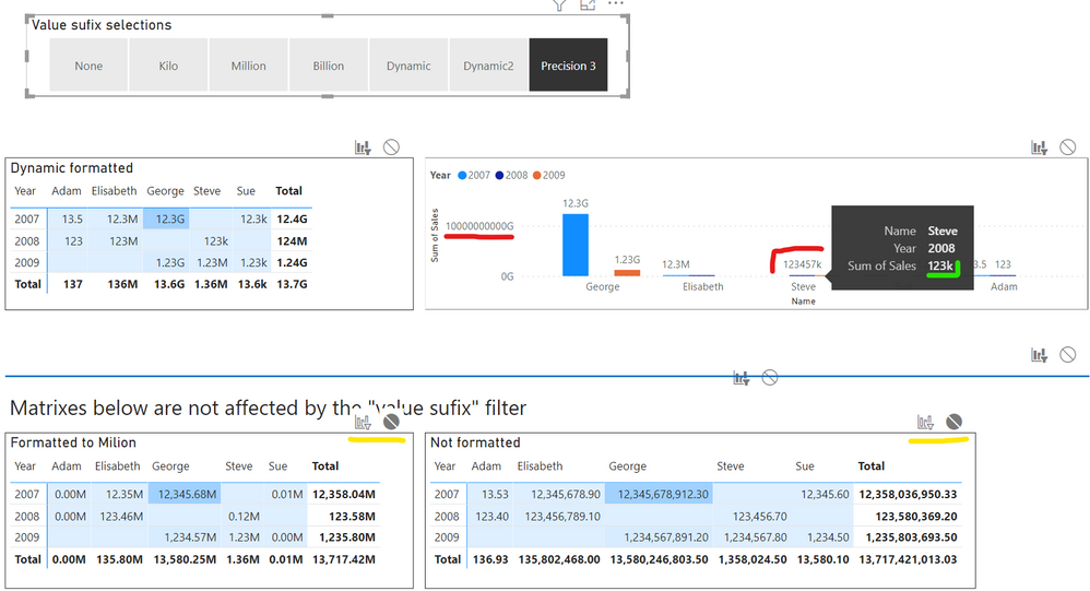
Some notes about what configurations has been needed for the page above.
- I have intendendly turned of the interaction from the filter visual to the two lower matrixes (marked with yellow in the diagram above). For these matrixes I have instead in the left matrix used the built-in Field Formatting setting to change the Display unit to Millions.
- Please also note that for all visuals affected with this formatting Calculation Group, you need to make sure that the "Display unit" configuration setting is set to "None". Sometimes this setting has a default value of "Auto" and this will cause problems sometimes hard to see before releasing the report.
You find this setting under different setting categories depending on the visual, e.g. under "Field formatting" for matrixes and under "X/Y axis" as well as under the "Legend" settingsfor bar/column charts.
But you also need to know this
That was almost everything you need to know about using Calculation Groups to format values in your visuals, but there are things to point out.
- The Y-axis scale does not work (marked with red in the picture above). It's showing 1,000,000,000G instead of simply 1G. This is due to confirmed bug. The axis gets the "G" from the formatting but forgets to divide the value with 1'000'000'000 as it should since the formatting string contains ",,,.".
- The legend value for Steve is not correct (marked with red in the picture above). It shows 123457k instead of 123k. There's many fault here since the raw value is 123'456.70. (where's the "6" and where's the decimal point?).
- The tooltip value shown when hovering (marked in green) is correct even though the lgend values are not, see (2).
Safe usage untill the bugs are fixed
For Multiline card visuals and Matrix visuals I have not seen any bugs, so I woud consider them safe to use. For the other visuals we can still benefit a bit from this formatting method, and there are two methods I would recomend:
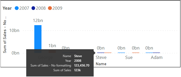
- Turn of Y-axis and legend values in your bar/column chart visuals (and also set the "Display unit" settings to "None"). Since it's only the Y-axis and the legend values that are not showing correct values, the diagrams will still show the correct size of the bars and the corect formatted values for the tooltips.
- As an alternative, if showing the Y-axis (and/or showing the legend values) is a requirement, you can create an explicit measure, maybe called "measure1_format" and make sure that the Calculation Item formatting only affects this measure. This can be done by adding code to the Calculation Group formatting to only affect measures ending with _format. Then add this measure as an explicit tooltip measure. Now the diagram will work like it did before you started to use the Calculation Groups, but with the addition that the tooltip will be formatted in a better way.
Creating the Calculation Group
Disclaimer: Before working with Calculation Groups, make sure you read and understand what it means, and make sure you take a backup of your PBIX file. Everything described here is safe, but you will be dealing with 3'rd party tools not supported by Microsoft, although the API the tools are using are supported by Microsoft.
Creating a Calculation Group requires for now the 3'rd party tool called Tabular Editor. The SQLBI guys has some very good articles on what Calculation Groups are and how to create them using Tabular Editor, so I will not dig that deep into that. Instead I will create a step-by-step instruction for how to create the calculation items used in this post, and a pre-requsit is that the Tabular Editor is installed.
Step 1. Create a Calculation group
- From the External Tools tab in Power BI Desktop, click on "Tabular Editor".
- In Tabular Editor, right-click on the Tables folder and choose "Create New" and then "Calculation Group".
- Give it the name "Sufix".
- Expand the Calculation Group and rename the column called "Name" to "Sufix".
You have now created an empty Calculation Group and renamed the column to "Sufix".
Step 2. Create the Calculation Items
- Right-click on Calculation Items and choose (New Calculation Item), give it the name "None".
- In the editor window, write: SELECTEDMEASURE().
- Repeat the same steps (1) and (2) for the calculation items "Kilo", "Million", and "Precision 3".
You have now creted the four Calculation Items "None", "Kilo", "Million", and "Precision 3", and configured them with the DAX code SELECTEDMEASURE(). This will make sure that the Calculation Group will work for all explicit measures. Without the SELECTEDMEASURE(), you will only see blank values.
Step 3. Configure the formatting for the simple Calculation Items
- Klick on Kilo and in the preference dropdown window in the editor windows, choose "Format string expression" instead of "Expression". Now you can write the formatting code.
- Write exactly this, including the double quotes: "#,0,.##k"
This will format the values with thousand separators, and with two possible decimal digits and add a "k" after all values. This will also divide the value with 1'000 due to ",.". - Now do the same but for the Calculation Item "Million". Use this exact formatting string: "#,0,.##M".
You have now configured the two simple Calculation Items with the formatting string. The Configuration Item "None" does not need a formatting string, so if configured, you could also just add the DAX-code BLANK() instead of not configuring it, the result will be the same.
Step 4. Test the three configured Configuration Items
Before proceeding with the more complex Configuration Item "Precision 3", we should test what we have done.
- Save the data model by pressing Ctrl-s or push the save cube icon in the ribbon.
- Switch back to Power BI Desktop and push the "Refresh now" button. You see this button since you added/changed a Calculation Group and the Calculation Items.
- You now see the newly created Calculation Group besides your other tables. Just add the "Sufix" column from the "Sufix" Table (Calculation Group) as a visual level filter as in the picture below.
- Check the "Require Single Selection" checkbox and then select e.g. "Kilo".

Test both "None", "Kilo", and "Million" to make sure all works. Also add the Calculation Item as a filter on the canvas, but then also remember to remove the same as a visual level filter.
Step 5. Configure the formatting for the "Precision 3" Calculation Item
Repeat the previous steps for creating the three simple Configuration Items, but this time use this code as the "Format string expression":
VAR V = ABS( SELECTEDMEASURE () )
RETURN
    SWITCH (
        TRUE (),
        V >= 1E10, "0,,,.0G",
        V >= 1E9, "0,,,.00G",
        V >= 1E8, "0,,.M",
        V >= 1E7, "0,,.0M",
        V >= 1E6, "0,,.00M",
        V >= 1E5, "0,.k",
        V >= 1E4, "0,.0k",
        V >= 1E3, "0,.00k",
        V >= 1E2, "0.",
        V >= 1E1, "0.0",
        V >= 1E0, "0.00",
        "#,0.00"
    ),
    BLANK ()
)
This is a bit more complex formatting code, but still very simple. Depending on the absolute value returned from the explicit measure, different formatting strings will be used, all delivering a 3 digit precision.
To test this, repeat the steps you used when testing the three other Configuration Items
Note: The formatting codes showed hera are a bit simplified compared with the code you would used in your report. In your report you would like to protect the Calculation Group so it doesn't "fire" for unwanted measures. Analysing the PBIX file in this blog you will see how that could be done, but below you see one simple example that only "fires" the formatting whenever the measure name starts with "Sum ":
IF (
    SEARCH ( "Sum ", SELECTEDMEASURENAME (), 1, 0 ) = 1,
    "#,0,.##k$",
    BLANK ()
)
Calculation Group Precedence
Please also note that more than one Calculation Group can be applied on one single visual and you can/must control the execution order. As I can't think of any Calculation Group that you would like to apply before the formatting Calculation Group (i.e. you would like this to be the most outer CALCULATE() when the applied Calculation Groups are re-written) I strongly recomend to set the Calculation Group's Precedence to 10'000 or higher.
Behind the scene
To understand more what's happening when applying the formatting strings using Calculation Groups, we can use the tool "DAX Studio" provided by SQLB.com. Using this tool we can see that for e.g. the bar chart diagram, the data sent to the visual looks like below:
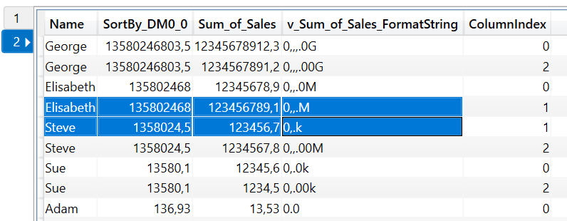
As can be seen above, the formatting string is added as an extra column to all rows. If more than one values was to be shown in the visual, one extra column will been added for each value columns. Note that since I'm here using the "Precision 3" dynamic method, the formatting is specific for each row.
You must be a registered user to add a comment. If you've already registered, sign in. Otherwise, register and sign in.
- Accessibility as a Design Framework in Power BI
- 📢 Announcing the Winners of the Fabric Semantic L...
- Turning a Real‑World Lesson into PBIX A11y for Pow...
- Designing a Reusable Power BI Semantic Model for M...
- What really happens when you publish a Power BI re...
- Migrating From Power Pivot For Excel Data to Power...
- Microsoft Fabric: A Complete Guide to Item-Level S...
- pbi-cli Gi Claude Code the Power BI Skills It Need...
- 5 Things I Wish I Knew Before Using Microsoft Powe...
- Power BI — Stop Writing Format Strings for Every M...
-
 SamsonTruong
on:
📢 Announcing the Winners of the Fabric Semantic L...
-
Juless
 on:
Turning a Real‑World Lesson into PBIX A11y for Pow...
-
oussamahaimoud
 on:
5 Things I Wish I Knew Before Using Microsoft Powe...
-
 Rufyda
on:
📢 Announcing the Fabric Semantic Link Developer E...
- Aarti_Zikre on: 📢Announcing our first Data Factory & Data Integra...
-
bariscihan
 on:
Understanding Modern Data File Formats: Why Parque...
- iorantes on: Use Cases of Remote Power BI MCP Server
-
bariscihan
 on:
Common Power BI + Snowflake headache that kept me ...
- Smartvpro10 on: What Is a Power BI MCP Server? (Explained for Begi...
- G_Sathish_Kumar on: Model Context Protocol (MCP) Explained - In Simple...
-
How to
781 -
Tips & Tricks
769 -
Events
195 -
Support insights
121 -
Opinion
112 -
DAX
66 -
Power BI
65 -
Power Query
62 -
Power BI Dev Camp
45 -
Roundup
40 -
Power BI Desktop
40 -
Dataflow
33 -
Featured User Group Leader
29 -
Data Protection
22 -
Power BI Embedded
20 -
Time Intelligence
19 -
Tips&Tricks
18 -
PowerBI REST API
12 -
Power Query Tips & Tricks
8 -
finance
8 -
Power BI Service
8 -
Direct Query
7 -
Power BI REST API
6 -
Auto ML
6 -
financial reporting
6 -
Data Analysis
6 -
Power Automate
6 -
Data Visualization
6 -
Python
6 -
Tips and Tricks
6 -
Income Statement
5 -
Dax studio
5 -
powerbi
5 -
service
5 -
Power BI PowerShell
5 -
Machine Learning
5 -
RLS
4 -
M language
4 -
Life Sciences
4 -
Paginated Reports
4 -
External tool
4 -
Power BI Goals
4 -
Desktop
4 -
PowerShell
4 -
Bookmarks
4 -
Line chart
4 -
Group By
4 -
Community
4 -
Data model
3 -
Conditional Formatting
3 -
Visualisation
3 -
Administration
3 -
M code
3 -
Visuals
3 -
SQL Server 2017 Express Edition
3 -
R script
3 -
Aggregation
3 -
Webinar
3 -
calendar
3 -
Gateways
3 -
R
3 -
M Query
3 -
CALCULATE
3 -
R visual
3 -
Reports
3 -
PowerApps
3 -
Data Science
3 -
Azure
3 -
Number Ranges
2 -
Query Plans
2 -
Power BI & Power Apps
2 -
Random numbers
2 -
Day of the Week
2 -
Custom visual
2 -
VLOOKUP
2 -
pivot
2 -
calculated column
2 -
M
2 -
hierarchies
2 -
Power BI Anniversary
2 -
Language M
2 -
inexact
2 -
Date Comparison
2 -
Power BI Premium Per user
2 -
Forecasting
2 -
REST API
2 -
Editor
2 -
Split
2 -
measure
2 -
Microsoft-flow
2 -
Paginated Report Builder
2 -
Working with Non Standatd Periods
2 -
powerbi.tips
2 -
Custom function
2 -
Reverse
2 -
PUG
2 -
Custom Measures
2 -
Filtering
2 -
Row and column conversion
2 -
Python script
2 -
Nulls
2 -
DVW Analytics
2 -
parameter
2 -
Industrial App Store
2 -
Week
2 -
Date duration
2 -
Formatting
2 -
Weekday Calendar
2 -
Support insights.
2 -
construct list
2 -
slicers
2 -
SAP
2 -
Power Platform
2 -
Workday
2 -
external tools
2 -
index
2 -
RANKX
2 -
Date
2 -
PBI Desktop
2 -
Date Dimension
2 -
Integer
2 -
Visualization
2 -
Power BI Challenge
2 -
Query Parameter
2 -
SharePoint
2 -
Power BI Installation and Updates
2 -
How Things Work
2 -
Tabular Editor
2 -
rank
2 -
ladataweb
2 -
Troubleshooting
2 -
Date DIFF
2 -
Transform data
2 -
Healthcare
2 -
Incremental Refresh
2 -
Tutorial Requests
1 -
Governance
1 -
Fun
1 -
Power BI gateway
1 -
gateway
1 -
Elementary
1 -
Custom filters
1 -
Vertipaq Analyzer
1 -
powerbi cordoba
1 -
Model Driven Apps
1 -
REMOVEFILTERS
1 -
XMLA endpoint
1 -
translations
1 -
OSI pi
1 -
Parquet
1 -
Change rows to columns
1 -
remove spaces
1 -
Get row and column totals
1 -
Retail
1 -
Power BI Report Server
1 -
School
1 -
Cost-Benefit Analysis
1 -
DIisconnected Tables
1 -
Sandbox
1 -
Honeywell
1 -
Combine queries
1 -
X axis at different granularity
1 -
ADLS
1 -
Primary Key
1 -
Microsoft 365 usage analytics data
1 -
Randomly filter
1 -
Week of the Day
1 -
Azure AAD
1 -
query
1 -
Dynamic Visuals
1 -
KPI
1 -
Intro
1 -
Icons
1 -
ISV
1 -
Ties
1 -
unpivot
1 -
Practice Model
1 -
Continuous streak
1 -
ProcessVue
1 -
Create function
1 -
Table.Schema
1 -
Acknowledging
1 -
Postman
1 -
Text.ContainsAny
1 -
Power BI Show
1 -
Get latest sign-in data for each user
1 -
Power Pivot
1 -
API
1 -
Kingsley
1 -
Merge
1 -
variable
1 -
Issues
1 -
function
1 -
stacked column chart
1 -
ho
1 -
ABB
1 -
KNN algorithm
1 -
List.Zip
1 -
optimization
1 -
Artificial Intelligence
1 -
Map Visual
1 -
Text.ContainsAll
1 -
Tuesday
1 -
Help
1 -
group
1 -
Scorecard
1 -
Json
1 -
Tops
1 -
financial reporting hierarchies RLS
1 -
Featured Data Stories
1 -
MQTT
1 -
Custom Periods
1 -
Partial group
1 -
Reduce Size
1 -
FBL3N
1 -
Wednesday
1 -
Data Engineering
1 -
Q&A
1 -
Quick Tips
1 -
data
1 -
PBIRS
1 -
Usage Metrics in Power BI
1 -
Multivalued column
1 -
Pipeline
1 -
Path
1 -
Yokogawa
1 -
Dynamic calculation
1 -
Data Wrangling
1 -
native folded query
1 -
transform table
1 -
UX
1 -
Cell content
1 -
General Ledger
1 -
Thursday
1 -
Notebook
1 -
update
1 -
Table
1 -
Natural Query Language
1 -
Infographic
1 -
automation
1 -
Prediction
1 -
newworkspacepowerbi
1 -
Performance KPIs
1 -
HR Analytics
1 -
keepfilters
1 -
Connect Data
1 -
Financial Year
1 -
Schneider
1 -
dynamically delete records
1 -
Copy Measures
1 -
Friday
1 -
Lakehouse
1 -
Training
1 -
Event
1 -
Custom Visuals
1 -
Free vs Pro
1 -
Format
1 -
Active Employee
1 -
Custom Date Range on Date Slicer
1 -
refresh error
1 -
PAS
1 -
certain duration
1 -
DA-100
1 -
bulk renaming of columns
1 -
Single Date Picker
1 -
Monday
1 -
PCS
1 -
Saturday
1 -
Data Pipeline
1 -
Slicer
1 -
Visual
1 -
forecast
1 -
Regression
1 -
CICD
1 -
Current Employees
1 -
date hierarchy
1 -
relationship
1 -
SIEMENS
1 -
Multiple Currency
1 -
Power BI Premium
1 -
On-premises data gateway
1 -
Binary
1 -
Power BI Connector for SAP
1 -
Sunday
1 -
User Data Functions
1 -
Workspace
1 -
Announcement
1 -
Features
1 -
domain
1 -
pbiviz
1 -
sport statistics
1 -
Intelligent Plant
1 -
Circular dependency
1 -
GE
1 -
Exchange rate
1 -
Dendrogram
1 -
range of values
1 -
activity log
1 -
Decimal
1 -
Charticulator Challenge
1 -
Field parameters
1 -
deployment
1 -
ssrs traffic light indicators
1 -
SQL
1 -
trick
1 -
Scripts
1 -
Color Map
1 -
Industrial
1 -
Weekday
1 -
Working Date
1 -
Space Issue
1 -
Emerson
1 -
Date Table
1 -
Cluster Analysis
1 -
Stacked Area Chart
1 -
union tables
1 -
Number
1 -
Start of Week
1 -
Tips& Tricks
1 -
Theme Colours
1 -
Text
1 -
Flow
1 -
Publish to Web
1 -
Extract
1 -
Topper Color On Map
1 -
Historians
1 -
context transition
1 -
Custom textbox
1 -
OPC
1 -
Zabbix
1 -
Label: DAX
1 -
Business Analysis
1 -
Supporting Insight
1 -
rank value
1 -
Synapse
1 -
End of Week
1 -
Tips&Trick
1 -
Excel
1 -
Showcase
1 -
custom connector
1 -
Waterfall Chart
1 -
Power BI On-Premise Data Gateway
1 -
patch
1 -
Top Category Color
1 -
A&E data
1 -
Previous Order
1 -
Substring
1 -
Wonderware
1 -
Power M
1 -
Format DAX
1 -
Custom functions
1 -
accumulative
1 -
DAX&Power Query
1 -
Premium Per User
1 -
GENERATESERIES
1 -
Report Server
1 -
Audit Logs
1 -
analytics pane
1 -
step by step
1 -
Top Brand Color on Map
1 -
Tutorial
1 -
Previous Date
1 -
XMLA End point
1 -
color reference
1 -
Date Time
1 -
Marker
1 -
Lineage
1 -
CSV file
1 -
conditional accumulative
1 -
Matrix Subtotal
1 -
Check
1 -
null value
1 -
Show and Tell
1 -
Cumulative Totals
1 -
Report Theme
1 -
Bookmarking
1 -
oracle
1 -
mahak
1 -
pandas
1 -
Networkdays
1 -
Button
1 -
Dataset list
1 -
Keyboard Shortcuts
1 -
Fill Function
1 -
LOOKUPVALUE()
1 -
Tips &Tricks
1 -
Plotly package
1 -
Sameperiodlastyear
1 -
Office Theme
1 -
matrix
1 -
bar chart
1 -
Measures
1 -
powerbi argentina
1 -
Canvas Apps
1 -
total
1 -
Filter context
1 -
Difference between two dates
1 -
get data
1 -
OSI
1 -
Query format convert
1 -
ETL
1 -
Json files
1 -
Merge Rows
1 -
CONCATENATEX()
1 -
take over Datasets;
1 -
Networkdays.Intl
1 -
refresh M language Python script Support Insights
1
- 05-03-2026 - 05-09-2026
- 04-26-2026 - 05-02-2026
- 04-19-2026 - 04-25-2026
- 04-12-2026 - 04-18-2026
- 04-05-2026 - 04-11-2026
- 03-29-2026 - 04-04-2026
- 03-22-2026 - 03-28-2026
- 03-15-2026 - 03-21-2026
- 03-08-2026 - 03-14-2026
- 03-01-2026 - 03-07-2026
- 02-22-2026 - 02-28-2026
- 02-15-2026 - 02-21-2026
- 02-08-2026 - 02-14-2026
- View Complete Archives
