FabCon is coming to Atlanta
Join us at FabCon Atlanta from March 16 - 20, 2026, for the ultimate Fabric, Power BI, AI and SQL community-led event. Save $200 with code FABCOMM.
Register now!- Power BI forums
- Get Help with Power BI
- Desktop
- Service
- Report Server
- Power Query
- Mobile Apps
- Developer
- DAX Commands and Tips
- Custom Visuals Development Discussion
- Health and Life Sciences
- Power BI Spanish forums
- Translated Spanish Desktop
- Training and Consulting
- Instructor Led Training
- Dashboard in a Day for Women, by Women
- Galleries
- Data Stories Gallery
- Themes Gallery
- Contests Gallery
- Quick Measures Gallery
- Notebook Gallery
- Translytical Task Flow Gallery
- TMDL Gallery
- R Script Showcase
- Webinars and Video Gallery
- Ideas
- Custom Visuals Ideas (read-only)
- Issues
- Issues
- Events
- Upcoming Events
To celebrate FabCon Vienna, we are offering 50% off select exams. Ends October 3rd. Request your discount now.
- Power BI forums
- Forums
- Get Help with Power BI
- Service
- Y axis issue on combined graph in PowerBI Report (...
- Subscribe to RSS Feed
- Mark Topic as New
- Mark Topic as Read
- Float this Topic for Current User
- Bookmark
- Subscribe
- Printer Friendly Page
- Mark as New
- Bookmark
- Subscribe
- Mute
- Subscribe to RSS Feed
- Permalink
- Report Inappropriate Content
Y axis issue on combined graph in PowerBI Report (web)
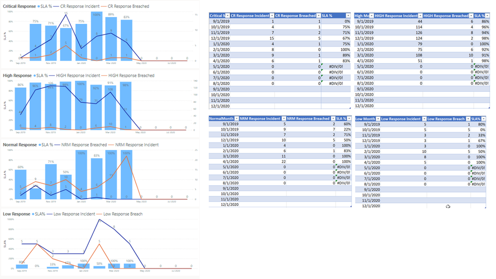
I have created 4 charts utilizing data syncing from Excel tables. The tables for the 4 reports are identical (the first table was used to format and initially the other 3 via copy/paste). The reports were generated in PowerBI reports after data import. In the charts, the column values are percentages (0%-100%) and the line values are numbers (0-XXX).
I created the first report to appear how I wanted it, then I duplicated the report and replaced the data with the data from the other 3 tables. This resulted in 4 reports based on the 4 tables. The first 3 reports function as intended and designed. They utilize the SLA% as the Y axis on the left and show values 0-100%. The alternate Y axis on the right is for the line data and has the values 0-XXX. The X axis is dates, and functions correctly in all 4 reports.
In the 4th report, the Y axis on the right scales from 9-1000% and there is no right axis. You will see the difference this makes in the appearance of the chart. There is no % value above 100%. Additonally, in the Y axis settings, I only have the Linear setting, not the Log setting. The other 3 charts have Log as an option. I have read posts concerning zeroes and negative numbers removing the Log option, however, there are zeroes in all 4 data sets and the 4th chart is the only one that exhibits this behavior.
Although the chart was initially duplicated from the first chart, I deleted it and recreated from scratch in order to rule out any issues with the duplication process. I receive the same result. I removed the initial table and recreated it to rule out issues with the table, and again, I received the same result. I am unable to determine the cause of this behavior. While the chart works, it appears so different from the others as to cause question and concern amongst others viewing the data.
Attached are samples below of the charts and the associated tables. Looking for any insight into why this 4th chart might be acting the way it is.
Solved! Go to Solution.
- Mark as New
- Bookmark
- Subscribe
- Mute
- Subscribe to RSS Feed
- Permalink
- Report Inappropriate Content
Hi @cnsrvative
Let's start with the simple solutions (you've probably already tried these):
- You're sure that you've turned on the second Y axis? (Show Secondary is ON)
- Secondary Y axis is set to start at 0 and end at "Auto"
- all charts are same type of combo chart
- all are formatted to start at zero and end at "Auto"
- You've played around with the Axis settings for both Y axes
- Clear the error fields -- maybe the errors are messing things up?
If none of these suggestions work (especialy #1), let me know. Maybe you can share the Excel data?
Thanks
Michele
- Mark as New
- Bookmark
- Subscribe
- Mute
- Subscribe to RSS Feed
- Permalink
- Report Inappropriate Content
Second set of eyes and all that - completely overlooked the secondary axis trigger. Many thanks for the time!


