FabCon is coming to Atlanta
Join us at FabCon Atlanta from March 16 - 20, 2026, for the ultimate Fabric, Power BI, AI and SQL community-led event. Save $200 with code FABCOMM.
Register now!- Power BI forums
- Get Help with Power BI
- Desktop
- Service
- Report Server
- Power Query
- Mobile Apps
- Developer
- DAX Commands and Tips
- Custom Visuals Development Discussion
- Health and Life Sciences
- Power BI Spanish forums
- Translated Spanish Desktop
- Training and Consulting
- Instructor Led Training
- Dashboard in a Day for Women, by Women
- Galleries
- Data Stories Gallery
- Themes Gallery
- Contests Gallery
- QuickViz Gallery
- Quick Measures Gallery
- Visual Calculations Gallery
- Notebook Gallery
- Translytical Task Flow Gallery
- TMDL Gallery
- R Script Showcase
- Webinars and Video Gallery
- Ideas
- Custom Visuals Ideas (read-only)
- Issues
- Issues
- Events
- Upcoming Events
The Power BI Data Visualization World Championships is back! Get ahead of the game and start preparing now! Learn more
- Power BI forums
- Forums
- Get Help with Power BI
- Service
- Sankey chart visualizaion issue
- Subscribe to RSS Feed
- Mark Topic as New
- Mark Topic as Read
- Float this Topic for Current User
- Bookmark
- Subscribe
- Printer Friendly Page
- Mark as New
- Bookmark
- Subscribe
- Mute
- Subscribe to RSS Feed
- Permalink
- Report Inappropriate Content
Sankey chart visualizaion issue
Hi all, I am trying to get a Sequential visualization forming kind of a path where there are source and destination nodes(a kind of replica as Google Analytics's Behavioral Flow). Hence I used Sankey Chart to visualize but after certain number of rows of data(around 10000) the sequence in the Sankey Chart is appearing wrong.Please help to solve the problem and I would be happy to receive any suggestions.
- Mark as New
- Bookmark
- Subscribe
- Mute
- Subscribe to RSS Feed
- Permalink
- Report Inappropriate Content
- Mark as New
- Bookmark
- Subscribe
- Mute
- Subscribe to RSS Feed
- Permalink
- Report Inappropriate Content
Hi @Anonymous ,
I cannot reproduce your issue. Please give me more details such as screenshoots of the result actual and what the result should be.
Best Regards,
Icey
- Mark as New
- Bookmark
- Subscribe
- Mute
- Subscribe to RSS Feed
- Permalink
- Report Inappropriate Content
Hi @Icey
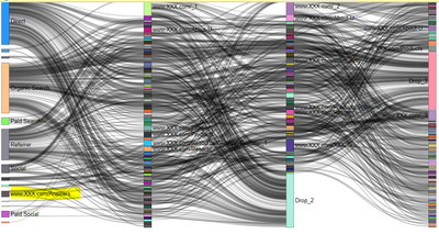
Please find the chart when the number of rows in the data is less (around 2000 rows), where first column is not having any URLs but when the datapoints are more,around 12000( previous 2000 rows+ additional 10000 rows) then URLs are occurring in the first column,which is not expected as per the data.


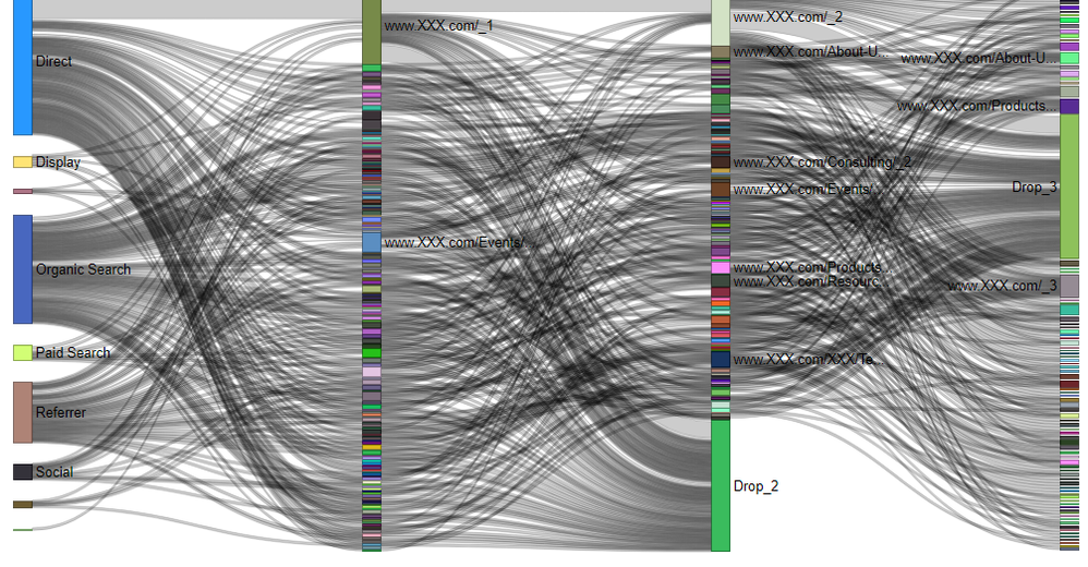
But if I visualize only those 10000 rows of data, then also the visualization is coming correct as follows.

Hence, as I can see there is no issue in the data, but while populating it into the Power BI visualization, this issue occurs
- Mark as New
- Bookmark
- Subscribe
- Mute
- Subscribe to RSS Feed
- Permalink
- Report Inappropriate Content
Hi @Anonymous ,
This is too strange, so far I can't find any possible solutions.
If you have Power BI Pro license, I suggest you create a support ticket to get further help.
Best Regards,
Icey
If this post helps, then please consider Accept it as the solution to help the other members find it more quickly.
Helpful resources

Power BI Dataviz World Championships
The Power BI Data Visualization World Championships is back! Get ahead of the game and start preparing now!

| User | Count |
|---|---|
| 58 | |
| 56 | |
| 35 | |
| 18 | |
| 14 |


