Join us at the 2025 Microsoft Fabric Community Conference
Microsoft Fabric Community Conference 2025, March 31 - April 2, Las Vegas, Nevada. Use code FABINSIDER for a $400 discount.
Register now- Power BI forums
- Get Help with Power BI
- Desktop
- Service
- Report Server
- Power Query
- Mobile Apps
- Developer
- DAX Commands and Tips
- Custom Visuals Development Discussion
- Health and Life Sciences
- Power BI Spanish forums
- Translated Spanish Desktop
- Training and Consulting
- Instructor Led Training
- Dashboard in a Day for Women, by Women
- Galleries
- Webinars and Video Gallery
- Data Stories Gallery
- Themes Gallery
- Power BI DataViz World Championships Gallery
- Quick Measures Gallery
- R Script Showcase
- COVID-19 Data Stories Gallery
- Community Connections & How-To Videos
- 2021 MSBizAppsSummit Gallery
- 2020 MSBizAppsSummit Gallery
- 2019 MSBizAppsSummit Gallery
- Events
- Ideas
- Custom Visuals Ideas (read-only)
- Issues
- Issues
- Events
- Upcoming Events
The Power BI DataViz World Championships are on! With four chances to enter, you could win a spot in the LIVE Grand Finale in Las Vegas. Show off your skills.
- Power BI forums
- Forums
- Get Help with Power BI
- Service
- Re: Rolling timelines past AND future
- Subscribe to RSS Feed
- Mark Topic as New
- Mark Topic as Read
- Float this Topic for Current User
- Bookmark
- Subscribe
- Printer Friendly Page
- Mark as New
- Bookmark
- Subscribe
- Mute
- Subscribe to RSS Feed
- Permalink
- Report Inappropriate Content
Rolling timelines past AND future
Hello,
I would like to create a bar chart using 12 rolling months as the X-axis timeline. This is easy with relative date filters for either last 12 months or next 12 months. However, I'd like to show 6 past months AND 6 future months on the same graph. Is there a way or workaround how to do this?
Solved! Go to Solution.
- Mark as New
- Bookmark
- Subscribe
- Mute
- Subscribe to RSS Feed
- Permalink
- Report Inappropriate Content
Hi, @Anonymous
According to your description, you want to show TODAY() on the bar chart as the basis for judgment, showing the values of the past 6 months and the next 6 months. Right?
Here are the steps you can follow:
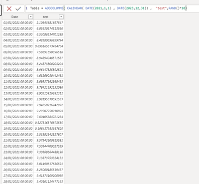
(1)This is my test data:
(2)We can click “New measure” to create a measure used to override the Y axis: “value”
value = CALCULATE( SUM('Table'[test]) , 'Table'[Date] < EOMONTH( TODAY() ,6)+1 && 'Table'[Date] >EOMONTH(TODAY(),-7)+1)
(3)We can put the [Date] in X axis of the bar chart (Keep the year and month) and we put the [value] measure in the Y axis:
If this method does not meet your needs, you can provide us with your special sample data and the desired output sample data in the form of tables, so that we can better help you solve the problem.
Best Regards,
Aniya Zhang
If this post helps, then please consider Accept it as the solution to help the other members find it more quickly
- Mark as New
- Bookmark
- Subscribe
- Mute
- Subscribe to RSS Feed
- Permalink
- Report Inappropriate Content
Ok,
looks like this would work. However it looks quite complicated as I'd need to create new measures for each and every field I want to show on this 6+6 month time frame.
This give me an idea though. I could probably add a calculated true/false column in my date table telling if the date is in the desired range. Then I could use this new field as a filter on all the visuals.
- Mark as New
- Bookmark
- Subscribe
- Mute
- Subscribe to RSS Feed
- Permalink
- Report Inappropriate Content
Hi, @Anonymous
According to your description, you want to show TODAY() on the bar chart as the basis for judgment, showing the values of the past 6 months and the next 6 months. Right?
Here are the steps you can follow:
(1)This is my test data:
(2)We can click “New measure” to create a measure used to override the Y axis: “value”
value = CALCULATE( SUM('Table'[test]) , 'Table'[Date] < EOMONTH( TODAY() ,6)+1 && 'Table'[Date] >EOMONTH(TODAY(),-7)+1)
(3)We can put the [Date] in X axis of the bar chart (Keep the year and month) and we put the [value] measure in the Y axis:
If this method does not meet your needs, you can provide us with your special sample data and the desired output sample data in the form of tables, so that we can better help you solve the problem.
Best Regards,
Aniya Zhang
If this post helps, then please consider Accept it as the solution to help the other members find it more quickly
- Mark as New
- Bookmark
- Subscribe
- Mute
- Subscribe to RSS Feed
- Permalink
- Report Inappropriate Content
Ok,
looks like this would work. However it looks quite complicated as I'd need to create new measures for each and every field I want to show on this 6+6 month time frame.
This give me an idea though. I could probably add a calculated true/false column in my date table telling if the date is in the desired range. Then I could use this new field as a filter on all the visuals.
Helpful resources

Join us at the Microsoft Fabric Community Conference
March 31 - April 2, 2025, in Las Vegas, Nevada. Use code MSCUST for a $150 discount!

Power BI Monthly Update - February 2025
Check out the February 2025 Power BI update to learn about new features.

| User | Count |
|---|---|
| 44 | |
| 37 | |
| 32 | |
| 25 | |
| 24 |
| User | Count |
|---|---|
| 34 | |
| 33 | |
| 21 | |
| 21 | |
| 15 |


