FabCon is coming to Atlanta
Join us at FabCon Atlanta from March 16 - 20, 2026, for the ultimate Fabric, Power BI, AI and SQL community-led event. Save $200 with code FABCOMM.
Register now!- Power BI forums
- Get Help with Power BI
- Desktop
- Service
- Report Server
- Power Query
- Mobile Apps
- Developer
- DAX Commands and Tips
- Custom Visuals Development Discussion
- Health and Life Sciences
- Power BI Spanish forums
- Translated Spanish Desktop
- Training and Consulting
- Instructor Led Training
- Dashboard in a Day for Women, by Women
- Galleries
- Data Stories Gallery
- Themes Gallery
- Contests Gallery
- QuickViz Gallery
- Quick Measures Gallery
- Visual Calculations Gallery
- Notebook Gallery
- Translytical Task Flow Gallery
- TMDL Gallery
- R Script Showcase
- Webinars and Video Gallery
- Ideas
- Custom Visuals Ideas (read-only)
- Issues
- Issues
- Events
- Upcoming Events
The Power BI Data Visualization World Championships is back! Get ahead of the game and start preparing now! Learn more
- Power BI forums
- Forums
- Get Help with Power BI
- Service
- Report Visual on Web Differs from Report Visual in...
- Subscribe to RSS Feed
- Mark Topic as New
- Mark Topic as Read
- Float this Topic for Current User
- Bookmark
- Subscribe
- Printer Friendly Page
- Mark as New
- Bookmark
- Subscribe
- Mute
- Subscribe to RSS Feed
- Permalink
- Report Inappropriate Content
Report Visual on Web Differs from Report Visual in Power BI Desktop - Secondary Axis
Hi all, I just found a new issue which did not occur before.
So, I have built several visual reports in my Power BI Desktop, and have published them to the BI web without any issue.
Today, I found that all reports' (Old Publication and New Publication) visuals in the website, changed abnormally (without I did any change to my PBIX file and without having it re-published).
Such as, a chart in my report does not use double axis (secondary axis), but the outcome in the web, showed as if the line-chart is standing on secondary axis, without displaying the secondary axis itself.
Those issues just arose today, and only to the web visual.
The visual in PB desktop has no issue at all.
Anyone face the same issue?
Thank you.
- Mark as New
- Bookmark
- Subscribe
- Mute
- Subscribe to RSS Feed
- Permalink
- Report Inappropriate Content
I'm getting the same issue. Graph looks perfect in desktop, but the Shared Axis is no longer working in the service. Notice that the line 152K is being displayed above a value of 188K
- Mark as New
- Bookmark
- Subscribe
- Mute
- Subscribe to RSS Feed
- Permalink
- Report Inappropriate Content
Turning on "Show Secondary" under "Y-Axis" seems to indicate that this visual no longer lets the columns and lines share the same Y Axis values. Turning it off again doesn't restore the correct display.
Here is what it looks like with the 2nd axis showing, confirming what it is doing.
- Mark as New
- Bookmark
- Subscribe
- Mute
- Subscribe to RSS Feed
- Permalink
- Report Inappropriate Content
I've posted this as an issue, link below
- Mark as New
- Bookmark
- Subscribe
- Mute
- Subscribe to RSS Feed
- Permalink
- Report Inappropriate Content
I have located a potential fix.
In my example the Y-Axis has been set to start at 0, rather than auto. The end is set to Auto though. Something has changed on the service which has carried through this Start at 0 into the secondary Y-Axis. The Service see's this setting and is choosing to use the secondary axis, regardless of whether it is toggled on.
By change the secondary Y-Axis settings to both be "Auto", then toggling the secondary Y-Axis off again, the graph goes back to displaying correctly.
- Mark as New
- Bookmark
- Subscribe
- Mute
- Subscribe to RSS Feed
- Permalink
- Report Inappropriate Content
Hi @Anonymous ,
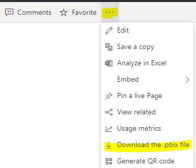
Do you download the pbix from Service? Does it work fine?
I searched in Issues. But there is not similar topics about this. What data source do you use? Can you please share a dummy pbix file that we can test. If you can't share, please share a few screenshots? Then we can understand clearly.
Xue Ding
If this post helps, then please consider Accept it as the solution to help the other members find it more quickly.
Helpful resources

Power BI Monthly Update - November 2025
Check out the November 2025 Power BI update to learn about new features.

Fabric Data Days
Advance your Data & AI career with 50 days of live learning, contests, hands-on challenges, study groups & certifications and more!


