Fabric Data Days starts November 4th!
Advance your Data & AI career with 50 days of live learning, dataviz contests, hands-on challenges, study groups & certifications and more!
Get registered- Power BI forums
- Get Help with Power BI
- Desktop
- Service
- Report Server
- Power Query
- Mobile Apps
- Developer
- DAX Commands and Tips
- Custom Visuals Development Discussion
- Health and Life Sciences
- Power BI Spanish forums
- Translated Spanish Desktop
- Training and Consulting
- Instructor Led Training
- Dashboard in a Day for Women, by Women
- Galleries
- Data Stories Gallery
- Themes Gallery
- Contests Gallery
- QuickViz Gallery
- Quick Measures Gallery
- Visual Calculations Gallery
- Notebook Gallery
- Translytical Task Flow Gallery
- TMDL Gallery
- R Script Showcase
- Webinars and Video Gallery
- Ideas
- Custom Visuals Ideas (read-only)
- Issues
- Issues
- Events
- Upcoming Events
Get Fabric Certified for FREE during Fabric Data Days. Don't miss your chance! Request now
- Power BI forums
- Forums
- Get Help with Power BI
- Service
- Map visual overlapping event coordinates resulting...
- Subscribe to RSS Feed
- Mark Topic as New
- Mark Topic as Read
- Float this Topic for Current User
- Bookmark
- Subscribe
- Printer Friendly Page
- Mark as New
- Bookmark
- Subscribe
- Mute
- Subscribe to RSS Feed
- Permalink
- Report Inappropriate Content
Map visual overlapping event coordinates resulting in incorrect data values
I am using the map visual to display bubble points reflective of user events occurring across various geographies at different dates. However, in this case the events logged may occur in the exact same location with a fixed lat/long resulting in many overlapping points. For this example, I've used a legend by dates of the events to demostrate what I'm seeing:
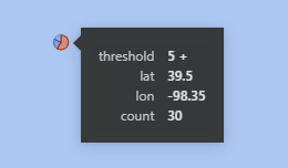
I normally would use the "Threshold" attribute for the legend, but if I do so the tooltip attribute summarizations in the case of many overlapping points results in a sum of the "Counts" calculating incorrectly. For example, in the above image the correct "Count" for this point taken June 29th was 5, but when using "Threshold" as the legend the sum of counts displays incorrectly for June 29th as 30:
Is there a solution for fixing this issue?
Thank you in advance
- Mark as New
- Bookmark
- Subscribe
- Mute
- Subscribe to RSS Feed
- Permalink
- Report Inappropriate Content
Please provide sanitized sample data that fully covers your issue. If you paste the data into a table in your post or use one of the file services it will be easier to assist you. I cannot use screenshots of your source data.
Please show the expected outcome based on the sample data you provided. Screenshots of the expected outcome are ok.
https://community.powerbi.com/t5/Desktop/How-to-Get-Your-Question-Answered-Quickly/m-p/1447523
- Mark as New
- Bookmark
- Subscribe
- Mute
- Subscribe to RSS Feed
- Permalink
- Report Inappropriate Content
Please find a mock table of the dataset that covers my issue below:
| count | short_date | threshold | lat | lon |
| 5 | 2021-08-02 | "5 +" | 39.5 | -98.35 |
| 3 | 2021-07-20 | "2 - 3" | 39.5 | -98.35 |
| 5 | 2021-07-13 | "5 +" | 39.5 | -98.35 |
| 5 | 2021-06-29 | "5 +" | 39.5 | -98.35 |
| 4 | 2021-06-08 | "4" | 39.5 | -98.35 |
| 4 | 2021-06-15 | "4" | 39.5 | -98.35 |
| 3 | 2021-08-10 | "2 - 3" | 39.5 | -98.35 |
| 8 | 2021-08-24 | "5 +" | 39.5 | -98.35 |
| 3 | 2021-06-22 | "2 - 3" | 39.5 | -98.35 |
| 4 | 2021-06-03 | "4" | 39.5 | -98.35 |
| 7 | 2021-08-31 | "5 +" | 39.5 | -98.35 |
I don't have a screenshot of an expected outcome, but rather looking for potential input on how to appropriately handle the occurence of these overlapping points. I desire to be able to use the threshold attribute as the legend to color the bubble points. In my second screenshot above, the user would be led to believe that on June 29th there was a count of 30 that occured. This would be incorrect as on that date only a count of 5 was logged and the 30 is a product of summing the count across multiple dates that the user cannot identify currently as is.
- Mark as New
- Bookmark
- Subscribe
- Mute
- Subscribe to RSS Feed
- Permalink
- Report Inappropriate Content
It depends which part of the pie chart you hover over.
Helpful resources

Fabric Data Days
Advance your Data & AI career with 50 days of live learning, contests, hands-on challenges, study groups & certifications and more!

Power BI Monthly Update - October 2025
Check out the October 2025 Power BI update to learn about new features.


