FabCon is coming to Atlanta
Join us at FabCon Atlanta from March 16 - 20, 2026, for the ultimate Fabric, Power BI, AI and SQL community-led event. Save $200 with code FABCOMM.
Register now!- Power BI forums
- Get Help with Power BI
- Desktop
- Service
- Report Server
- Power Query
- Mobile Apps
- Developer
- DAX Commands and Tips
- Custom Visuals Development Discussion
- Health and Life Sciences
- Power BI Spanish forums
- Translated Spanish Desktop
- Training and Consulting
- Instructor Led Training
- Dashboard in a Day for Women, by Women
- Galleries
- Data Stories Gallery
- Themes Gallery
- Contests Gallery
- Quick Measures Gallery
- Notebook Gallery
- Translytical Task Flow Gallery
- TMDL Gallery
- R Script Showcase
- Webinars and Video Gallery
- Ideas
- Custom Visuals Ideas (read-only)
- Issues
- Issues
- Events
- Upcoming Events
Calling all Data Engineers! Fabric Data Engineer (Exam DP-700) live sessions are back! Starting October 16th. Sign up.
- Power BI forums
- Forums
- Get Help with Power BI
- Service
- How to do cumulative line chart in power bi
- Subscribe to RSS Feed
- Mark Topic as New
- Mark Topic as Read
- Float this Topic for Current User
- Bookmark
- Subscribe
- Printer Friendly Page
- Mark as New
- Bookmark
- Subscribe
- Mute
- Subscribe to RSS Feed
- Permalink
- Report Inappropriate Content
How to do cumulative line chart in power bi
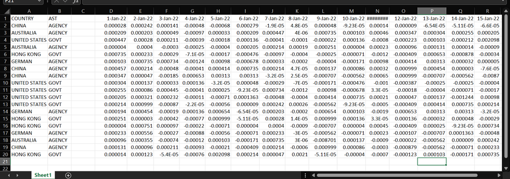
Hi, i am still new to power bi and i want to do cumulative line chart . Below is my data(from 1 jan to 30 june) and i need to do cumulative weekly/quarterly/monthly line chart based on country and ast. What i know for now is that in power bi can select only one column, not same as in excel can select for example from 1 jan to 1 feb.
Is there any alternative ways to do, or how do i arrange it in excel so that easier to do in power bi? Thanks in advance.
Solved! Go to Solution.
- Mark as New
- Bookmark
- Subscribe
- Mute
- Subscribe to RSS Feed
- Permalink
- Report Inappropriate Content
@camelia_ - Please transpose the data in Power query and you can create the line charts.
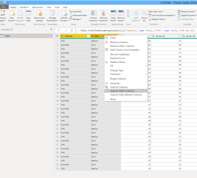
1) Go to Power Query editor. Select the two columns - Country and Ast. Right click and select 'Unpivot other columns'.
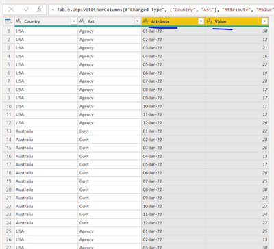
2. Your table will now look like below. Rename the column 'Attribute' to 'Date'.
3. Close and apply changes
4. Create your Line chart as you desire.
Did I answer your question? Mark my post as a solution! If not, please feel free to ask me.
Also, I would ❤ Kudos if my solution helped. It is a token of appreciation!
Thank you very much !
- Mark as New
- Bookmark
- Subscribe
- Mute
- Subscribe to RSS Feed
- Permalink
- Report Inappropriate Content
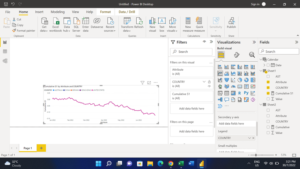
hi @gauthamboppana , thanks for the solution now i am able to do the cumulative line chart. Is just that why I get the same for all country? The chart suppose to have different line for each country.
And also, i want to do weekly cumulative line chart, i try to use this
Week Number = WEEKNUM ( 'Calendar'[Date] )
but it can't detect the date in the calendar table.
Helpful resources

FabCon Global Hackathon
Join the Fabric FabCon Global Hackathon—running virtually through Nov 3. Open to all skill levels. $10,000 in prizes!

Power BI Monthly Update - September 2025
Check out the September 2025 Power BI update to learn about new features.


