FabCon is coming to Atlanta
Join us at FabCon Atlanta from March 16 - 20, 2026, for the ultimate Fabric, Power BI, AI and SQL community-led event. Save $200 with code FABCOMM.
Register now!- Power BI forums
- Get Help with Power BI
- Desktop
- Service
- Report Server
- Power Query
- Mobile Apps
- Developer
- DAX Commands and Tips
- Custom Visuals Development Discussion
- Health and Life Sciences
- Power BI Spanish forums
- Translated Spanish Desktop
- Training and Consulting
- Instructor Led Training
- Dashboard in a Day for Women, by Women
- Galleries
- Data Stories Gallery
- Themes Gallery
- Contests Gallery
- QuickViz Gallery
- Quick Measures Gallery
- Visual Calculations Gallery
- Notebook Gallery
- Translytical Task Flow Gallery
- TMDL Gallery
- R Script Showcase
- Webinars and Video Gallery
- Ideas
- Custom Visuals Ideas (read-only)
- Issues
- Issues
- Events
- Upcoming Events
The Power BI Data Visualization World Championships is back! Get ahead of the game and start preparing now! Learn more
- Power BI forums
- Forums
- Get Help with Power BI
- Service
- Re: How to disable the automatic inline hierarchy?...
- Subscribe to RSS Feed
- Mark Topic as New
- Mark Topic as Read
- Float this Topic for Current User
- Bookmark
- Subscribe
- Printer Friendly Page
- Mark as New
- Bookmark
- Subscribe
- Mute
- Subscribe to RSS Feed
- Permalink
- Report Inappropriate Content
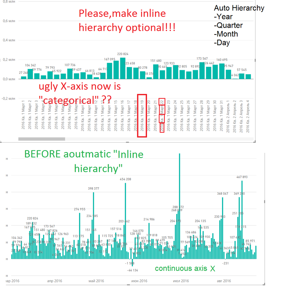
How to disable the automatic inline hierarchy???
- Mark as New
- Bookmark
- Subscribe
- Mute
- Subscribe to RSS Feed
- Permalink
- Report Inappropriate Content
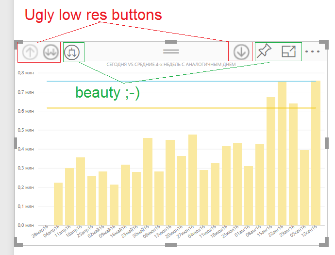
Thanks @LanceDelano! Seems, last service build 13.0.1605.489 works exactly as you promised!
But i'm have some question about buttons image quality. (see picture. This screenshot was made from Edge with 200% zoom)
- Mark as New
- Bookmark
- Subscribe
- Mute
- Subscribe to RSS Feed
- Permalink
- Report Inappropriate Content
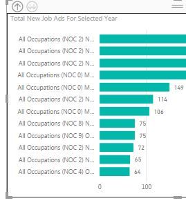
All my report labels on hierarchy field looks bad all of sudden. I believe this is because of new inline feature you guys are discussing. Can you please confirm if this is same issue which powerbi team has said they would fix.
Here is my before and after image on how the labels look. "All occupation" is the top level of hierarchy(level 1) and even if i am at lowest level (3 level down) the labels are "Level 1" + "Level 2" + "Level 3"... while earlier it used to show only the label at which level i was drilling to.
- Mark as New
- Bookmark
- Subscribe
- Mute
- Subscribe to RSS Feed
- Permalink
- Report Inappropriate Content
@sshekar7 yes this is the same issue in this thread. There's also thread in the actual issues forum, but there's more feedback from Microsoft on this thread regarding updates. No ETA yet, but they say it should be soon.
- Mark as New
- Bookmark
- Subscribe
- Mute
- Subscribe to RSS Feed
- Permalink
- Report Inappropriate Content
cool.. thanks.. glad i did not break my head trying to fix this myself.
- Mark as New
- Bookmark
- Subscribe
- Mute
- Subscribe to RSS Feed
- Permalink
- Report Inappropriate Content
I don't see the other issue with this inline hierarhy update described above: The measures used in visual are calculated to the item in the top of the hierarhy despite being drilled down to more detailed view.
Example:
We have a Team and Product Managers in that team. We have "Wow factor" target per product. We create a mesure to calculate the targets:
PM_A: 100 wows
PM_B: 200 wows
Team_A: 300 wows
When I put Team_A above PMs in visual and then drill down, the tooltip shows me that PM_A has a WOW target of 300
It destroys informational value of most of the dashboards we publish to our colleagues
- Mark as New
- Bookmark
- Subscribe
- Mute
- Subscribe to RSS Feed
- Permalink
- Report Inappropriate Content
Not exactly sure how you've written your measure. There are lots of ways to author these kinds of measures. However, the point is that a simple aggregate (e.g., SUM, AVG, etc.) with no Calculate or other mucking with the filter context will automatically filter the data to be at the leaf level of the hierarchy. So, say a measure of Average NPS (Net Promoter Score) that is calculated as you go down a hierarchy (Say Region and then Product) will absolutely work correctly. At a leaf level (Say Washington State and then Product A) the data will be filtered to WA and then Product A and the aggregate (Avg) will aggregate over that data. When you move up to just Region you would be able to see the Avg NPS for WA.
All that said, we are finally very very close to publishing an update that will give the old button the old behavior and a separate new button that will enable the new behavior. As Alex mentioned on a different response, there were some issues in terms of how these features worked with other parts of the product that we had to work through. That is all done now and we've begun the update process. Again, I don't want to give a specific day (since delays seem to inevitably happen) but process wise now it's a matter of getting it posted and aligned with the service.
- Mark as New
- Bookmark
- Subscribe
- Mute
- Subscribe to RSS Feed
- Permalink
- Report Inappropriate Content
Thanks @LanceDelano! Seems, last service build 13.0.1605.489 works exactly as you promised!
But i'm have some question about buttons image quality. (see picture. This screenshot was made from Edge with 200% zoom)
- Mark as New
- Bookmark
- Subscribe
- Mute
- Subscribe to RSS Feed
- Permalink
- Report Inappropriate Content
Yep. I said it would were very close. Please let us know what you think of the functionality.
On the icons, Yes, the ones you are calling beautiful are font icons. The others are bitmaps. We would like all of the icons in these kinds of areas to be font icons because they scale much better and thus look better on all resolutions. The bitmap icons are generally from an earlier time in the product. We would like to replace the older bitmap icons. We'll get there.
- Mark as New
- Bookmark
- Subscribe
- Mute
- Subscribe to RSS Feed
- Permalink
- Report Inappropriate Content
Great.. it solved the label issues i have having.. Thanks Lance.
- Mark as New
- Bookmark
- Subscribe
- Mute
- Subscribe to RSS Feed
- Permalink
- Report Inappropriate Content
Solution is rolled out for Power BI Service and new Desktop installer is available on the Download center.
More details in the blog post here: https://powerbi.microsoft.com/en-us/blog/august-power-bi-desktop-update-updated-drill-experience/
Alex.
- Mark as New
- Bookmark
- Subscribe
- Mute
- Subscribe to RSS Feed
- Permalink
- Report Inappropriate Content
@AlexGorev, While this subject is hot, why not add a third drill down that Drills down the same as the old drill down as well as filters the rest of the page?!?!? That would be amazing! The basic idea has 2,000+ votes and no updates in a long time. Link Below...
- Mark as New
- Bookmark
- Subscribe
- Mute
- Subscribe to RSS Feed
- Permalink
- Report Inappropriate Content
Great reminder, Mike! And also while the subject is still at the forefront, it would be a nice enhancement if a user hovered over the up or down arrow if a tooltip popped up to let the user know what the next level would reveal (or to give the dashboard author that ability). I have always found that space is always at a premium in dashboard report tabs and currently I have to either use a text box to let a user know what will be uncovered or let them just find out for themselves (if I don't want a very long and awkwark visual title).
Again, great job and thanks! Your attentiveness is a great sign of things to come!
- Mark as New
- Bookmark
- Subscribe
- Mute
- Subscribe to RSS Feed
- Permalink
- Report Inappropriate Content
Hi @AlexGorev, @LanceDelano, @Amanda and all folks on this thread.
I'm really glad with the result of this implementation in Power BI. Now we have two options and much more flexibility.
It was nice to see everybody working together from the start and now being able to see the improvement online.
Soon we are getting close to the end of the month and a new Power BI Desktop release is coming and we will be synchronized again.
This collaboration shows that this community is very useful and really get things done.
Thanks again for listening to us!
- Mark as New
- Bookmark
- Subscribe
- Mute
- Subscribe to RSS Feed
- Permalink
- Report Inappropriate Content
- Mark as New
- Bookmark
- Subscribe
- Mute
- Subscribe to RSS Feed
- Permalink
- Report Inappropriate Content
Hi @AlexGorev. Thanks for the heads up! Now I downloaded and updated Power BI Desktop and everything is fine like before. Thanks again!!!
- Mark as New
- Bookmark
- Subscribe
- Mute
- Subscribe to RSS Feed
- Permalink
- Report Inappropriate Content
Hi @AlexGorev, @LanceDelano, @Amanda and all folks on this thread.
I'm really glad with the result of this implementation in Power BI. Now we have two options and much more flexibility.
It was nice to see everybody working together from the start and now being able to see the improvement online.
Soon we are getting close to the end of the month and a new Power BI Desktop release is coming and we will be synchronized again.
This collaboration shows that this community is very useful and really get things done.
Thanks again for listening to us!
- Mark as New
- Bookmark
- Subscribe
- Mute
- Subscribe to RSS Feed
- Permalink
- Report Inappropriate Content
- Mark as New
- Bookmark
- Subscribe
- Mute
- Subscribe to RSS Feed
- Permalink
- Report Inappropriate Content
who every come up with the automatic inline hierarchy function is a moreon!!!!!!!!!!!!!!
diable it when the next update.
Learn how Tableau to their things ok?
- Mark as New
- Bookmark
- Subscribe
- Mute
- Subscribe to RSS Feed
- Permalink
- Report Inappropriate Content
@Amanda and @LanceDelano,
I've found an additional Issue with this update that is pretty significant. When focusing on a visual that has drill down information, it's not providing the proper filtering to visuals that are linked to it. I know you guys are working on it but it needs to be quick, my teams are losing faith in the product. See below for an example:


- Mark as New
- Bookmark
- Subscribe
- Mute
- Subscribe to RSS Feed
- Permalink
- Report Inappropriate Content
![]()
![]()
![]()
resilience required from this .... Not enough to Frown anymore.
- Mark as New
- Bookmark
- Subscribe
- Mute
- Subscribe to RSS Feed
- Permalink
- Report Inappropriate Content
Hi everyone! Thanks for the feedback. This is very helpful for us! I just want to let everyone know we hear you and are looking into this, both ways to improve the experience and giving y'all finer control over how the feature works.
@zapppsr The fact that you are lossing your legend is a bug, we are looking into it right now and working on a fix.
@Tishchenko, would you mind sending me your pbix file so we can investigate a bit more? You can send it to amac@microsoft.com. If you can't share it with me, could you send me some images that include the fieldwell of the column chart?
Helpful resources

Power BI Dataviz World Championships
The Power BI Data Visualization World Championships is back! Get ahead of the game and start preparing now!

Power BI Monthly Update - November 2025
Check out the November 2025 Power BI update to learn about new features.


