FabCon is coming to Atlanta
Join us at FabCon Atlanta from March 16 - 20, 2026, for the ultimate Fabric, Power BI, AI and SQL community-led event. Save $200 with code FABCOMM.
Register now!- Power BI forums
- Get Help with Power BI
- Desktop
- Service
- Report Server
- Power Query
- Mobile Apps
- Developer
- DAX Commands and Tips
- Custom Visuals Development Discussion
- Health and Life Sciences
- Power BI Spanish forums
- Translated Spanish Desktop
- Training and Consulting
- Instructor Led Training
- Dashboard in a Day for Women, by Women
- Galleries
- Data Stories Gallery
- Themes Gallery
- Contests Gallery
- QuickViz Gallery
- Quick Measures Gallery
- Visual Calculations Gallery
- Notebook Gallery
- Translytical Task Flow Gallery
- TMDL Gallery
- R Script Showcase
- Webinars and Video Gallery
- Ideas
- Custom Visuals Ideas (read-only)
- Issues
- Issues
- Events
- Upcoming Events
Get Fabric Certified for FREE during Fabric Data Days. Don't miss your chance! Request now
- Power BI forums
- Forums
- Get Help with Power BI
- Service
- Conditional Formatting Data Colors for Negative Nu...
- Subscribe to RSS Feed
- Mark Topic as New
- Mark Topic as Read
- Float this Topic for Current User
- Bookmark
- Subscribe
- Printer Friendly Page
- Mark as New
- Bookmark
- Subscribe
- Mute
- Subscribe to RSS Feed
- Permalink
- Report Inappropriate Content
Conditional Formatting Data Colors for Negative Numbers
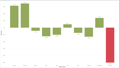
I am trying to configure my visualization online so that negative percentages are red and positive are green. I feel like I have the conditional formatting set right but the visual is wrong.
Solved! Go to Solution.
- Mark as New
- Bookmark
- Subscribe
- Mute
- Subscribe to RSS Feed
- Permalink
- Report Inappropriate Content
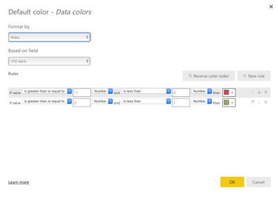
hi @Dalla_Terra - You can try the option to not set the values for the upper and lower limits highted in the below screenshot.
Just leave these values BLANK and Power BI will idenitify the limits based on the range of values available in your data.
Please mark the above comment as a solution to help others find it more quickly. Also please provide a 👍 if my comment helped with solving your issue. Thanks!
Proud to be a Super User!
- Mark as New
- Bookmark
- Subscribe
- Mute
- Subscribe to RSS Feed
- Permalink
- Report Inappropriate Content
Thanks @Sumanth_23 this worked beautifully and it was a very simple solve, much appreciated!
- Mark as New
- Bookmark
- Subscribe
- Mute
- Subscribe to RSS Feed
- Permalink
- Report Inappropriate Content
@Dalla_Terra - Happy to help! 🙂
Proud to be a Super User!
- Mark as New
- Bookmark
- Subscribe
- Mute
- Subscribe to RSS Feed
- Permalink
- Report Inappropriate Content
Hi @Dalla_Terra ,
Try to create a measure like this then apply it to conditional formatting:
IF([YTD VAR%]>0,"green","red")
Best Regards,
Liang
If this post helps, then please consider Accept it as the solution to help the other members find it more quickly.
- Mark as New
- Bookmark
- Subscribe
- Mute
- Subscribe to RSS Feed
- Permalink
- Report Inappropriate Content
Thanks for the help. I like to creative approach but I didn't try it because I wanted to avoid creating another measure on top of the percent measure I was already using.
- Mark as New
- Bookmark
- Subscribe
- Mute
- Subscribe to RSS Feed
- Permalink
- Report Inappropriate Content
HI @Dalla_Terra ,
I think that the issue may be in the formula, your conditional formatting is set to "number" and you data is set to "percent". I think that you need to modify the color to be less than -9999 and less than 0. And the other one be greater/equal to 0 and less than 99999. OR, change those to percentages. If you change to percentages, just make sure that your data really is a percentage.
I would appreciate Kudos if my response was helpful. I would also appreciate it if you would Mark this As a Solution if it solved the problem. Thanks!
Did I answer your question? Mark my post as a solution!
Proud to be a Datanaut!
Private message me for consulting or training needs.
- Mark as New
- Bookmark
- Subscribe
- Mute
- Subscribe to RSS Feed
- Permalink
- Report Inappropriate Content
Thanks for the reply. I tried your appraoch but it would not accept me changing the number to a percent with the inputs your recommended. I appreciate the help.
Helpful resources

Power BI Monthly Update - November 2025
Check out the November 2025 Power BI update to learn about new features.

Fabric Data Days
Advance your Data & AI career with 50 days of live learning, contests, hands-on challenges, study groups & certifications and more!


