- Power BI forums
- Updates
- News & Announcements
- Get Help with Power BI
- Desktop
- Service
- Report Server
- Power Query
- Mobile Apps
- Developer
- DAX Commands and Tips
- Custom Visuals Development Discussion
- Health and Life Sciences
- Power BI Spanish forums
- Translated Spanish Desktop
- Power Platform Integration - Better Together!
- Power Platform Integrations (Read-only)
- Power Platform and Dynamics 365 Integrations (Read-only)
- Training and Consulting
- Instructor Led Training
- Dashboard in a Day for Women, by Women
- Galleries
- Community Connections & How-To Videos
- COVID-19 Data Stories Gallery
- Themes Gallery
- Data Stories Gallery
- R Script Showcase
- Webinars and Video Gallery
- Quick Measures Gallery
- 2021 MSBizAppsSummit Gallery
- 2020 MSBizAppsSummit Gallery
- 2019 MSBizAppsSummit Gallery
- Events
- Ideas
- Custom Visuals Ideas
- Issues
- Issues
- Events
- Upcoming Events
- Community Blog
- Power BI Community Blog
- Custom Visuals Community Blog
- Community Support
- Community Accounts & Registration
- Using the Community
- Community Feedback
Register now to learn Fabric in free live sessions led by the best Microsoft experts. From Apr 16 to May 9, in English and Spanish.
- Power BI forums
- Forums
- Get Help with Power BI
- Service
- Re: Can't enlarge the Power BI main navigation bar...
- Subscribe to RSS Feed
- Mark Topic as New
- Mark Topic as Read
- Float this Topic for Current User
- Bookmark
- Subscribe
- Printer Friendly Page
- Mark as New
- Bookmark
- Subscribe
- Mute
- Subscribe to RSS Feed
- Permalink
- Report Inappropriate Content
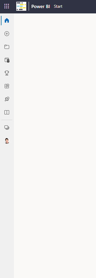
Can't enlarge the Power BI main navigation bar anymore
The hamburger button is lost. How do I get back the full size navigation bar in Power BI web app home screen?

Solved! Go to Solution.
- Mark as New
- Bookmark
- Subscribe
- Mute
- Subscribe to RSS Feed
- Permalink
- Report Inappropriate Content
You can't. This is a change to the Power BI UI made by Microsoft. It may be tempoary, and you can revert back to the old UI by setting an Admin switch. But eventually this will become the new UI for Power BI.
see: Power BI user interface experiments | Burningsuit
Hope this helps
Stuart
- Mark as New
- Bookmark
- Subscribe
- Mute
- Subscribe to RSS Feed
- Permalink
- Report Inappropriate Content
And that exactly the problem we have, Training on Power BI we need all our tenants to look the same, or they get horribly confused. This "experimental" UI is applied seemingly randomly throughout a tenant, so some get it some don't. The solution I've found is to unset the "user experience experiments" switch in Power BI admin (as detailed in my blog, link above) then at least everyone in the tenant gets the same UI, until such time as there is a permanent change.
Have fun!
Stuart
- Mark as New
- Bookmark
- Subscribe
- Mute
- Subscribe to RSS Feed
- Permalink
- Report Inappropriate Content
You can't. This is a change to the Power BI UI made by Microsoft. It may be tempoary, and you can revert back to the old UI by setting an Admin switch. But eventually this will become the new UI for Power BI.
see: Power BI user interface experiments | Burningsuit
Hope this helps
Stuart
- Mark as New
- Bookmark
- Subscribe
- Mute
- Subscribe to RSS Feed
- Permalink
- Report Inappropriate Content
OK, I can live with that. I was just wondering because one of my customers still has the hamburger icon in their tenant and for a training I wanted my UI to look as identical as possible to their UI.
Thank you!
- Mark as New
- Bookmark
- Subscribe
- Mute
- Subscribe to RSS Feed
- Permalink
- Report Inappropriate Content
And that exactly the problem we have, Training on Power BI we need all our tenants to look the same, or they get horribly confused. This "experimental" UI is applied seemingly randomly throughout a tenant, so some get it some don't. The solution I've found is to unset the "user experience experiments" switch in Power BI admin (as detailed in my blog, link above) then at least everyone in the tenant gets the same UI, until such time as there is a permanent change.
Have fun!
Stuart
- Mark as New
- Bookmark
- Subscribe
- Mute
- Subscribe to RSS Feed
- Permalink
- Report Inappropriate Content
- Mark as New
- Bookmark
- Subscribe
- Mute
- Subscribe to RSS Feed
- Permalink
- Report Inappropriate Content
Even my boss in the same tenant still has this button 😀
Helpful resources

Microsoft Fabric Learn Together
Covering the world! 9:00-10:30 AM Sydney, 4:00-5:30 PM CET (Paris/Berlin), 7:00-8:30 PM Mexico City

Power BI Monthly Update - April 2024
Check out the April 2024 Power BI update to learn about new features.

| User | Count |
|---|---|
| 56 | |
| 19 | |
| 18 | |
| 18 | |
| 9 |
