New Offer! Become a Certified Fabric Data Engineer
Check your eligibility for this 50% exam voucher offer and join us for free live learning sessions to get prepared for Exam DP-700.
Get Started- Power BI forums
- Get Help with Power BI
- Desktop
- Service
- Report Server
- Power Query
- Mobile Apps
- Developer
- DAX Commands and Tips
- Custom Visuals Development Discussion
- Health and Life Sciences
- Power BI Spanish forums
- Translated Spanish Desktop
- Training and Consulting
- Instructor Led Training
- Dashboard in a Day for Women, by Women
- Galleries
- Community Connections & How-To Videos
- COVID-19 Data Stories Gallery
- Themes Gallery
- Data Stories Gallery
- R Script Showcase
- Webinars and Video Gallery
- Quick Measures Gallery
- 2021 MSBizAppsSummit Gallery
- 2020 MSBizAppsSummit Gallery
- 2019 MSBizAppsSummit Gallery
- Events
- Ideas
- Custom Visuals Ideas
- Issues
- Issues
- Events
- Upcoming Events
Don't miss out! 2025 Microsoft Fabric Community Conference, March 31 - April 2, Las Vegas, Nevada. Use code MSCUST for a $150 discount. Prices go up February 11th. Register now.
- Power BI forums
- Forums
- Get Help with Power BI
- Service
- Re: Additional value within a gauge chart
- Subscribe to RSS Feed
- Mark Topic as New
- Mark Topic as Read
- Float this Topic for Current User
- Bookmark
- Subscribe
- Printer Friendly Page
- Mark as New
- Bookmark
- Subscribe
- Mute
- Subscribe to RSS Feed
- Permalink
- Report Inappropriate Content
Additional value within a gauge chart
Hi there,
is there a possibility to add a second value with another color within a gauge chart.
I use the gauge chart to dispaly the actual sales volume and would like to add our pipeline sales volume with another color in the same chart. Is there a possibility for that or do you have a suggestion for another chart to display these values?
Bestr regards,
Daniel
Solved! Go to Solution.
- Mark as New
- Bookmark
- Subscribe
- Mute
- Subscribe to RSS Feed
- Permalink
- Report Inappropriate Content
Hi @danielvt,
I am afraid that there is no method to display both values in different colors in Gauge chart.
Instead, it is appropriate to use the DialGauge custom visual in your scenario.
Thanks,
Lydia Zhang
If this post helps, then please consider Accept it as the solution to help the other members find it more quickly.
- Mark as New
- Bookmark
- Subscribe
- Mute
- Subscribe to RSS Feed
- Permalink
- Report Inappropriate Content
Hi @danielvt,
What do you want to display in the visualization? A Gauge chart is used to display a single value that measures progress toward a goal/KPI. If you intend to use pipeline sales to represent your target value, you can add it in Gauge chart and format its color using Data colors option.
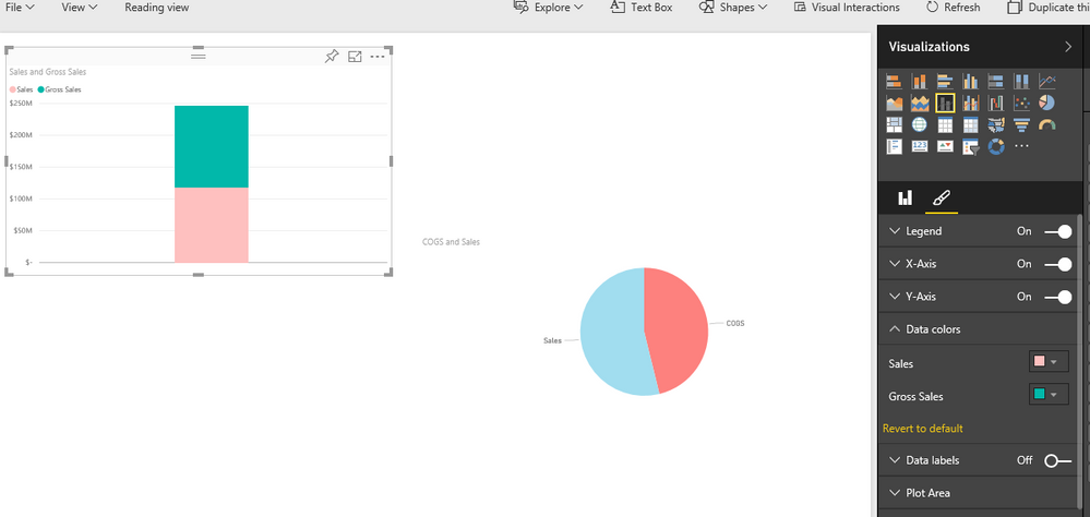
However, if there is no relationship between actual sales and pipeline sales, and you just want to display them in a visualization with different colors, you can create pie chart, line and stacked column chart and so on, then change colors of different data areas. There is an example for your reference.
Thanks,
Lydia Zhang
If this post helps, then please consider Accept it as the solution to help the other members find it more quickly.
- Mark as New
- Bookmark
- Subscribe
- Mute
- Subscribe to RSS Feed
- Permalink
- Report Inappropriate Content
Hi Lydia,
thank you very much for you answer.
I search for a solution to display the two sales volumes within the same chart.
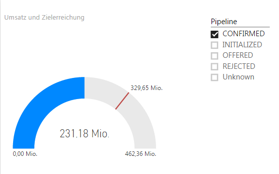
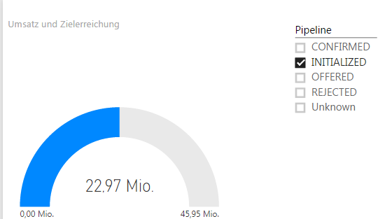
My first idea was to use a slicer for the filtering, so I the user can decide if the confirmed sales
volume, the initialized sales volume or both should be displayed.
Confirmed
Initialized
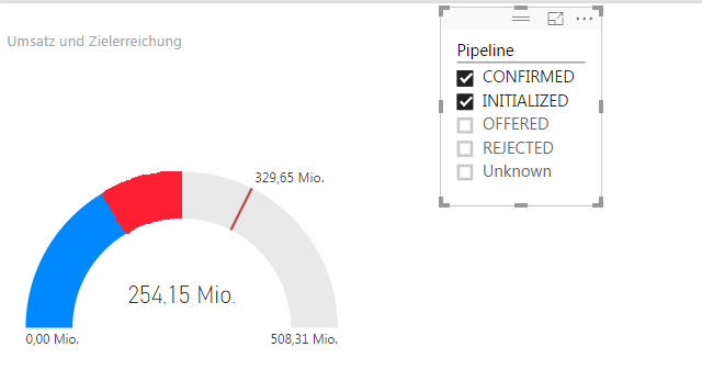
A perfect solution would be if both values are selected if they could dipslayed maybe in differend colors
with a separate description, like the following mockup.
Thanks,
Daniel
- Mark as New
- Bookmark
- Subscribe
- Mute
- Subscribe to RSS Feed
- Permalink
- Report Inappropriate Content
Hi @danielvt,
I am afraid that there is no method to display both values in different colors in Gauge chart.
Instead, it is appropriate to use the DialGauge custom visual in your scenario.
Thanks,
Lydia Zhang
If this post helps, then please consider Accept it as the solution to help the other members find it more quickly.
Helpful resources
| User | Count |
|---|---|
| 25 | |
| 22 | |
| 11 | |
| 10 | |
| 9 |
| User | Count |
|---|---|
| 48 | |
| 30 | |
| 20 | |
| 17 | |
| 15 |


