FabCon is coming to Atlanta
Join us at FabCon Atlanta from March 16 - 20, 2026, for the ultimate Fabric, Power BI, AI and SQL community-led event. Save $200 with code FABCOMM.
Register now!- Power BI forums
- Get Help with Power BI
- Desktop
- Service
- Report Server
- Power Query
- Mobile Apps
- Developer
- DAX Commands and Tips
- Custom Visuals Development Discussion
- Health and Life Sciences
- Power BI Spanish forums
- Translated Spanish Desktop
- Training and Consulting
- Instructor Led Training
- Dashboard in a Day for Women, by Women
- Galleries
- Data Stories Gallery
- Themes Gallery
- Contests Gallery
- Quick Measures Gallery
- Notebook Gallery
- Translytical Task Flow Gallery
- TMDL Gallery
- R Script Showcase
- Webinars and Video Gallery
- Ideas
- Custom Visuals Ideas (read-only)
- Issues
- Issues
- Events
- Upcoming Events
Calling all Data Engineers! Fabric Data Engineer (Exam DP-700) live sessions are back! Starting October 16th. Sign up.
- Power BI forums
- Forums
- Get Help with Power BI
- Report Server
- Display issues with multi-row cards when viewing r...
- Subscribe to RSS Feed
- Mark Topic as New
- Mark Topic as Read
- Float this Topic for Current User
- Bookmark
- Subscribe
- Printer Friendly Page
- Mark as New
- Bookmark
- Subscribe
- Mute
- Subscribe to RSS Feed
- Permalink
- Report Inappropriate Content
Display issues with multi-row cards when viewing report on Mac via Report Server
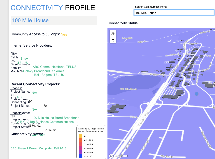
I've been working on a project that is supposed to display internet connectivity investments in BC. Part of my report uses a series of cards to list the investment details, and the entire report is published on an on-premises Power BI report server. Right now I'm using a series of individual multi-row cards so that I can control how the text is justified within the card, the text colour and avoid any cross-platform compatibility issues that may come from using 3rd party visualizations (more on that in a second).
One of my managers uses a Macbook Pro to do her work, and for some reason when she or any other mac user goes to view the report on the report server (using Chrome), every card is moved down by ~20 pixels and the formatting does not look right at all. I've attached a snapshot of what is shown when my report is viewed on a mac via the report server. It should also be noted that this only happens on this page of the report, maybe because the cards are too close together?
Any ideas? Should I be using a different font? Is there a different visualization I should be using? Thanks again.
Helpful resources

FabCon Global Hackathon
Join the Fabric FabCon Global Hackathon—running virtually through Nov 3. Open to all skill levels. $10,000 in prizes!

Power BI Monthly Update - September 2025
Check out the September 2025 Power BI update to learn about new features.

| User | Count |
|---|---|
| 11 | |
| 3 | |
| 3 | |
| 3 | |
| 2 |

