FabCon is coming to Atlanta
Join us at FabCon Atlanta from March 16 - 20, 2026, for the ultimate Fabric, Power BI, AI and SQL community-led event. Save $200 with code FABCOMM.
Register now!- Power BI forums
- Get Help with Power BI
- Desktop
- Service
- Report Server
- Power Query
- Mobile Apps
- Developer
- DAX Commands and Tips
- Custom Visuals Development Discussion
- Health and Life Sciences
- Power BI Spanish forums
- Translated Spanish Desktop
- Training and Consulting
- Instructor Led Training
- Dashboard in a Day for Women, by Women
- Galleries
- Data Stories Gallery
- Themes Gallery
- Contests Gallery
- QuickViz Gallery
- Quick Measures Gallery
- Visual Calculations Gallery
- Notebook Gallery
- Translytical Task Flow Gallery
- TMDL Gallery
- R Script Showcase
- Webinars and Video Gallery
- Ideas
- Custom Visuals Ideas (read-only)
- Issues
- Issues
- Events
- Upcoming Events
View all the Fabric Data Days sessions on demand. View schedule
- Power BI forums
- Forums
- Get Help with Power BI
- Report Server
- Re: Combo charts, multiple charts
- Subscribe to RSS Feed
- Mark Topic as New
- Mark Topic as Read
- Float this Topic for Current User
- Bookmark
- Subscribe
- Printer Friendly Page
- Mark as New
- Bookmark
- Subscribe
- Mute
- Subscribe to RSS Feed
- Permalink
- Report Inappropriate Content
Combo charts, multiple charts
Hi everyone,
The current native Line & Clustered Column Chart does not seem to allow data fields e.g. a data category in the Column Series, or, am I doing something wrong?
Your ideas are most welcome.
Thanks & regards,
Yogesh
Solved! Go to Solution.
- Mark as New
- Bookmark
- Subscribe
- Mute
- Subscribe to RSS Feed
- Permalink
- Report Inappropriate Content
Hi @Anonymous ,
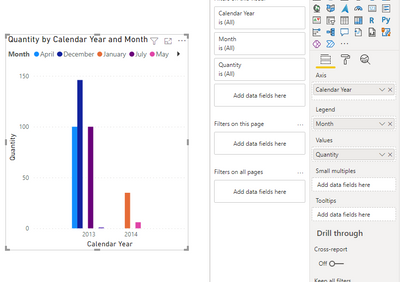
Don't seem to quite understand your confusion. According to my test, the following cluster column chart puts the month field in the legend and counts the sum aggregated values for each month in each year.
Also you can read related blog for more details.
Clustered column chart in Power BI - Power BI Docs
Bookmarks and Buttons: Making Power BI Charts Even More Interactive - RADACAD
Is it possible to further describe your problem and provide the desired results. I will answer you as soon as possible. Looking forward to your reply.
Best Regards,
Henry
If this post helps, then please consider Accept it as the solution to help the other members find it more quickly.
- Mark as New
- Bookmark
- Subscribe
- Mute
- Subscribe to RSS Feed
- Permalink
- Report Inappropriate Content
Hi everyone,
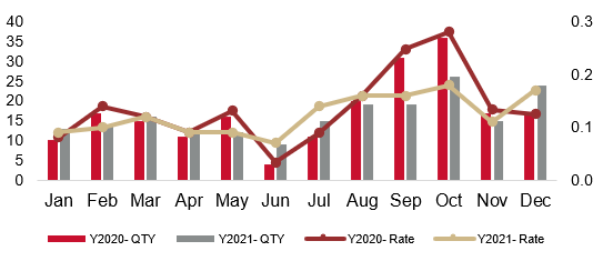
I would like to visualize two bars (e.g. quantity) and two lines (e.g. rate) for comparing two years.
But I only can plot one line. How to plot the second line?
Kindly assist. Thanks!
Example from Excel:
- Mark as New
- Bookmark
- Subscribe
- Mute
- Subscribe to RSS Feed
- Permalink
- Report Inappropriate Content
Hi @Anonymous ,
Don't seem to quite understand your confusion. According to my test, the following cluster column chart puts the month field in the legend and counts the sum aggregated values for each month in each year.
Also you can read related blog for more details.
Clustered column chart in Power BI - Power BI Docs
Bookmarks and Buttons: Making Power BI Charts Even More Interactive - RADACAD
Is it possible to further describe your problem and provide the desired results. I will answer you as soon as possible. Looking forward to your reply.
Best Regards,
Henry
If this post helps, then please consider Accept it as the solution to help the other members find it more quickly.
Helpful resources

Power BI Monthly Update - November 2025
Check out the November 2025 Power BI update to learn about new features.

Fabric Data Days
Advance your Data & AI career with 50 days of live learning, contests, hands-on challenges, study groups & certifications and more!

| User | Count |
|---|---|
| 7 | |
| 2 | |
| 2 | |
| 2 | |
| 1 |
| User | Count |
|---|---|
| 13 | |
| 6 | |
| 3 | |
| 3 | |
| 2 |


