Join us at the 2025 Microsoft Fabric Community Conference
March 31 - April 2, 2025, in Las Vegas, Nevada. Use code MSCUST for a $150 discount! Early bird discount ends December 31.
Register Now- Power BI forums
- Get Help with Power BI
- Desktop
- Service
- Report Server
- Power Query
- Mobile Apps
- Developer
- DAX Commands and Tips
- Custom Visuals Development Discussion
- Health and Life Sciences
- Power BI Spanish forums
- Translated Spanish Desktop
- Training and Consulting
- Instructor Led Training
- Dashboard in a Day for Women, by Women
- Galleries
- Community Connections & How-To Videos
- COVID-19 Data Stories Gallery
- Themes Gallery
- Data Stories Gallery
- R Script Showcase
- Webinars and Video Gallery
- Quick Measures Gallery
- 2021 MSBizAppsSummit Gallery
- 2020 MSBizAppsSummit Gallery
- 2019 MSBizAppsSummit Gallery
- Events
- Ideas
- Custom Visuals Ideas
- Issues
- Issues
- Events
- Upcoming Events
Be one of the first to start using Fabric Databases. View on-demand sessions with database experts and the Microsoft product team to learn just how easy it is to get started. Watch now
- Power BI forums
- Forums
- Get Help with Power BI
- Report Server
- Re: Bubble chart error
- Subscribe to RSS Feed
- Mark Topic as New
- Mark Topic as Read
- Float this Topic for Current User
- Bookmark
- Subscribe
- Printer Friendly Page
- Mark as New
- Bookmark
- Subscribe
- Mute
- Subscribe to RSS Feed
- Permalink
- Report Inappropriate Content
Bubble chart error
Hi, community!
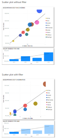
I didn't understand why does this graph doesn't show the corresponding value when I select a specific year.
Look:
Now, Im going to select 2015 and just one name will be shown:
It happens exactly the same for whatever year I select. I didn't understood. Somebody can help me?
I appreciate any help.
Thanks!
- Mark as New
- Bookmark
- Subscribe
- Mute
- Subscribe to RSS Feed
- Permalink
- Report Inappropriate Content
Hi @HenriqueReis ,
Designed to do just that.
Not only Bubble chart.Refer the below:
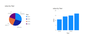
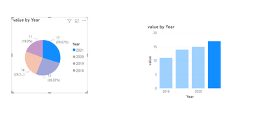
When click part of visual:(You can only do highlighting, but you cannot change the visual effect, if you want to change the visual effect you still need to use filter or slicer)
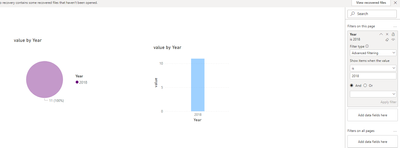
Filter:
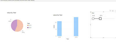
Slicer:
Refer:
https://docs.microsoft.com/en-us/power-bi/visuals/power-bi-visualization-slicers
Did I answer your question? Mark my post as a solution!
Best Regards
Lucien
- Mark as New
- Bookmark
- Subscribe
- Mute
- Subscribe to RSS Feed
- Permalink
- Report Inappropriate Content
Hi, thanks for answer.
But so why the scatter plot graph change?
Best regards!
- Mark as New
- Bookmark
- Subscribe
- Mute
- Subscribe to RSS Feed
- Permalink
- Report Inappropriate Content
Can you please share the name of this custom visual. Also possible if you can share the sample file/data.
Did I answer your question? Mark my post as a solution! Appreciate your Kudos!!
Proud to be a Super User!
- Mark as New
- Bookmark
- Subscribe
- Mute
- Subscribe to RSS Feed
- Permalink
- Report Inappropriate Content
Hi, of sure:
The import visual is: Impact Bubble Chart
The data used:
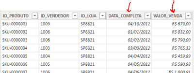
Some days from 2012 to 2015 + sold value on the data graph:
And in the bubble chart I used (same table) the name of who sold, units sold (x-axis) and amount (y-axis):
There's a correct relation between those tables:
Thank you!
- Mark as New
- Bookmark
- Subscribe
- Mute
- Subscribe to RSS Feed
- Permalink
- Report Inappropriate Content
Instead of using "Highlight" interaction between filter. You should use "Filter" in interaction. I hope this will resolve the issue for you.
Did I answer your question? Mark my post as a solution! Appreciate your Kudos!!
Proud to be a Super User!
- Mark as New
- Bookmark
- Subscribe
- Mute
- Subscribe to RSS Feed
- Permalink
- Report Inappropriate Content
Hi, thans for your answer.
But thats exctly what do I wanna know:
Why the "highlights" didn't work?
Regards!
Helpful resources
| User | Count |
|---|---|
| 2 | |
| 1 | |
| 1 | |
| 1 | |
| 1 |


