Get Fabric or SQL Certified for Free.
Get certified for free when you join Fabric Data Days 2026 and dive into Fabric, Power BI, SQL, AI, and other essential data skills.
Join now- Power BI forums
- Get Help with Power BI
- Desktop
- Service
- Report Server
- Power Query
- Mobile Apps
- Developer
- DAX Commands and Tips
- Custom Visuals Development Discussion
- Health and Life Sciences
- Power BI Spanish forums
- Translated Spanish Desktop
- Training and Consulting
- Instructor Led Training
- Dashboard in a Day for Women, by Women
- Galleries
- Data Stories Gallery
- Themes Gallery
- Contests Gallery
- QuickViz Gallery
- Quick Measures Gallery
- Visual Calculations Gallery
- Notebook Gallery
- Translytical Task Flow Gallery
- TMDL Gallery
- R Script Showcase
- Webinars and Video Gallery
- Ideas
- Custom Visuals Ideas (read-only)
- Issues
- Issues
- Events
- Upcoming Events
July 7 - July 17 | Round 2 of the Power BI Dataviz World Championships. Don't miss your chance! Learn more
- Power BI forums
- Galleries
- R Script Showcase
- Variable Width Column Chart
Your file has been submitted successfully. We’re processing it now - please check back in a few minutes to view your report.


- Mark as New
- Bookmark
- Subscribe
- Mute
- Subscribe to RSS Feed
- Permalink
- Report Inappropriate Content
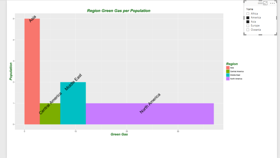
Variable Width Column Chart
Data comparison is one the main aim of many charts in Power BI. However, there is a specific data comparison chart in R "Variable Width Column Chart " which we can change the widgh of bars based on our data. I have explained the whole process of creating this chart in power bi in the below link
http://radacad.com/variable-width-column-chart-writing-r-codes-inside-power-bi-part-4
also the file and code a reavailabe for use.
eyJrIjoiNWU1ZmY0OTAtYjQ1Yi00M2U4LWE1NjgtZmQ0MzEzNjNiMGVjIiwidCI6ImNjODBmOGQ2LTNjMzUtNGRhNC1iMGY4LWNiZWFkYjAwNDY3ZSIsImMiOjEwfQ
- Mark as New
- Bookmark
- Subscribe
- Mute
- Subscribe to RSS Feed
- Permalink
- Report Inappropriate Content
Nice showcase. Can be easily converted to interactive custom visual
https://github.com/Microsoft/PowerBI-visuals/blob/master/RVisualTutorial/CreateRHTML.md