Get Fabric certified for FREE!
Don't miss your chance to take the Fabric Data Engineer (DP-600) exam for FREE! Find out how by attending the DP-600 session on April 23rd (pacific time), live or on-demand.
Learn more- Power BI forums
- Get Help with Power BI
- Desktop
- Service
- Report Server
- Power Query
- Mobile Apps
- Developer
- DAX Commands and Tips
- Custom Visuals Development Discussion
- Health and Life Sciences
- Power BI Spanish forums
- Translated Spanish Desktop
- Training and Consulting
- Instructor Led Training
- Dashboard in a Day for Women, by Women
- Galleries
- Data Stories Gallery
- Themes Gallery
- Contests Gallery
- QuickViz Gallery
- Quick Measures Gallery
- Visual Calculations Gallery
- Notebook Gallery
- Translytical Task Flow Gallery
- TMDL Gallery
- R Script Showcase
- Webinars and Video Gallery
- Ideas
- Custom Visuals Ideas (read-only)
- Issues
- Issues
- Events
- Upcoming Events
Next up in the FabCon + SQLCon recap series: The roadmap for Microsoft SQL and Maximizing Developer experiences in Fabric. All sessions are available on-demand after the live show. Register now
- Power BI forums
- Galleries
- R Script Showcase
- Mapping With Labels
Your file has been submitted successfully. We’re processing it now - please check back in a few minutes to view your report.
Mapping With Labels
10-05-2016 13:47 PM - last edited 10-10-2016 06:45 AM
- Mark as New
- Bookmark
- Subscribe
- Mute
- Subscribe to RSS Feed
- Permalink
- Report Inappropriate Content
Mapping With Labels
Description
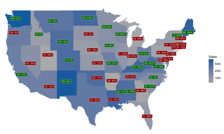
This visual uses ggplot2 mapping functionality to display state level data. Each state is colored based on the current year sales numbers. Grey being lower sales, with darker shades of blue representing higher sales. Each state has a label applied. The label relays it's anem and sales in percent change compared to the prior year. The color of the label denotes if sales increased or decreased (red = decrease, green = increase) vs prior year.
Learn It
If you liked this R script you can visit PowerBI.Tips and follow along with this tutorial on Mapping with data labels in R.
Prerequisites (The sample .pbix files won't work without installing the following)
1. Install R Engine
Power BI does not include the R engine. Therefore, a seperate installation is required to install R on your local computer. You can download R from the Revolution Open download page, and through the CRAN Repository.
2. Install the R packages
Once R engine has been installed you can dowload the package from the Revolution Open Package Downloads Page.
Required R Packages
ggplot2
maps
Tested on
MRO 3.3.1, CRAN 3.3.1


