Get Fabric or SQL Certified for Free.
Get certified for free when you join Fabric Data Days 2026 and dive into Fabric, Power BI, SQL, AI, and other essential data skills.
Join now- Power BI forums
- Get Help with Power BI
- Desktop
- Service
- Report Server
- Power Query
- Mobile Apps
- Developer
- DAX Commands and Tips
- Custom Visuals Development Discussion
- Health and Life Sciences
- Power BI Spanish forums
- Translated Spanish Desktop
- Training and Consulting
- Instructor Led Training
- Dashboard in a Day for Women, by Women
- Galleries
- Data Stories Gallery
- Themes Gallery
- Contests Gallery
- QuickViz Gallery
- Quick Measures Gallery
- Visual Calculations Gallery
- Notebook Gallery
- Translytical Task Flow Gallery
- TMDL Gallery
- R Script Showcase
- Webinars and Video Gallery
- Ideas
- Custom Visuals Ideas (read-only)
- Issues
- Issues
- Events
- Upcoming Events
July 7 - July 17 | Round 2 of the Power BI Dataviz World Championships. Don't miss your chance! Learn more
- Power BI forums
- Galleries
- R Script Showcase
- Re: Funnel plot + online tutorial for R and Custom...
Your file has been submitted successfully. We’re processing it now - please check back in a few minutes to view your report.
Re: Funnel plot + online tutorial for R and Custom R Visuals
03-14-2018 01:35 AM


- Mark as New
- Bookmark
- Subscribe
- Mute
- Subscribe to RSS Feed
- Permalink
- Report Inappropriate Content
Funnel plot + online tutorial for R and Custom R Visuals
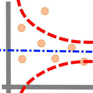
On occasion, we find patterns in statistical noise that lead us to incorrect conclusions about the underlying data.
The funnel plot helps you compare samples, and find true outliers among the measurements with varying precision. It’s widely used for comparing institutional performance and medical data analysis.
In our example, the measurements are rates of certain events (such as births) in populations (such as countries) of given size.
This visual uses a fixed effect model estimator. You can control the visual attributes to suit your needs.
This tutorial will take you from simple R script via R visuals till store-level Interactive R Custom Visual (HTML-based) . Each step is very detailed and includes tips and tricks for developers.
- Mark as New
- Bookmark
- Subscribe
- Mute
- Subscribe to RSS Feed
- Permalink
- Report Inappropriate Content
Thanks for this file. This will kick start my journey on R coding since I was unable to come up with my own interactions. This will be reference point.
- Mark as New
- Bookmark
- Subscribe
- Mute
- Subscribe to RSS Feed
- Permalink
- Report Inappropriate Content
My pleasure 🙂 Good luck, @Anonymous ! And don't hestitate to ask for assitance.
- Mark as New
- Bookmark
- Subscribe
- Mute
- Subscribe to RSS Feed
- Permalink
- Report Inappropriate Content
Thank you !!