FabCon is coming to Atlanta
Join us at FabCon Atlanta from March 16 - 20, 2026, for the ultimate Fabric, Power BI, AI and SQL community-led event. Save $200 with code FABCOMM.
Register now!- Power BI forums
- Get Help with Power BI
- Desktop
- Service
- Report Server
- Power Query
- Mobile Apps
- Developer
- DAX Commands and Tips
- Custom Visuals Development Discussion
- Health and Life Sciences
- Power BI Spanish forums
- Translated Spanish Desktop
- Training and Consulting
- Instructor Led Training
- Dashboard in a Day for Women, by Women
- Galleries
- Data Stories Gallery
- Themes Gallery
- Contests Gallery
- QuickViz Gallery
- Quick Measures Gallery
- Visual Calculations Gallery
- Notebook Gallery
- Translytical Task Flow Gallery
- TMDL Gallery
- R Script Showcase
- Webinars and Video Gallery
- Ideas
- Custom Visuals Ideas (read-only)
- Issues
- Issues
- Events
- Upcoming Events
The Power BI Data Visualization World Championships is back! Get ahead of the game and start preparing now! Learn more
- Power BI forums
- Galleries
- Quick Measures Gallery
- SVG Gauges
Your file has been submitted successfully. We’re processing it now - please check back in a few minutes to view your report.


- Mark as New
- Bookmark
- Subscribe
- Mute
- Subscribe to RSS Feed
- Permalink
- Report Inappropriate Content
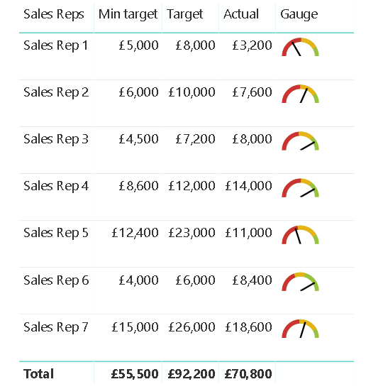
SVG Gauges
With the August 2018 release it's possible to assign a data category to a measure, this allows to make a measure representing an svg chart.
The measure displays 3-position gauge based on input measures.
How to use:
1. Copy the "gauge" measure to your model
2. Define parameters
3. Change color coding if required. You're allowed to use HEX codes or color names
4. Don't forget to add dimension column inside HASONEVALUE function
5. Set the measure data category as "Image URL"
6. Enjoy!
Known issues:
1. Power BI doesn't render svg-images in totals and subtotals, so you should use HASONEVALUE expression in order to prevent showing the measure output in total rows.
2. The gauge column tooltip displays an svg-object code definition by default. Please use visual tooltips in order to eliminate this issue.
eyJrIjoiZjAxZTQ1NTctZjljYy00NTliLWE5YWYtNWNjMzdmY2JhZWY5IiwidCI6ImUwOTY3NDNiLWMyM2QtNGVjOS1hZjI4LWViMGY5OTgxMTcwNCIsImMiOjh9