Get Fabric or SQL Certified for Free.
Get certified for free when you join Fabric Data Days 2026 and dive into Fabric, Power BI, SQL, AI, and other essential data skills.
Join now- Power BI forums
- Get Help with Power BI
- Desktop
- Service
- Report Server
- Power Query
- Mobile Apps
- Developer
- DAX Commands and Tips
- Custom Visuals Development Discussion
- Health and Life Sciences
- Power BI Spanish forums
- Translated Spanish Desktop
- Training and Consulting
- Instructor Led Training
- Dashboard in a Day for Women, by Women
- Galleries
- Data Stories Gallery
- Themes Gallery
- Contests Gallery
- QuickViz Gallery
- Quick Measures Gallery
- Visual Calculations Gallery
- Notebook Gallery
- Translytical Task Flow Gallery
- TMDL Gallery
- R Script Showcase
- Webinars and Video Gallery
- Ideas
- Custom Visuals Ideas (read-only)
- Issues
- Issues
- Events
- Upcoming Events
July 7 - July 17 | Round 2 of the Power BI Dataviz World Championships. Don't miss your chance! Learn more
- Power BI forums
- Galleries
- Quick Measures Gallery
- Row Based Conditional Formatting
Your file has been submitted successfully. We’re processing it now - please check back in a few minutes to view your report.
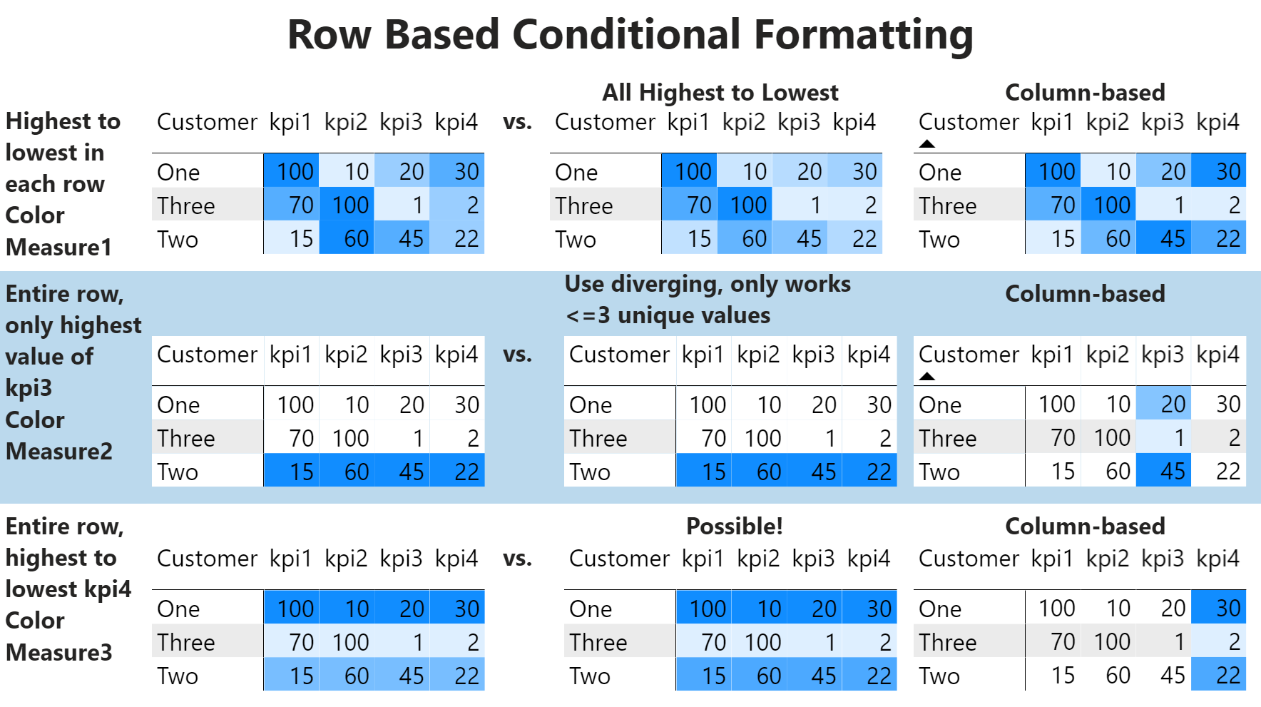
Row Based Conditional Formatting
05-13-2020 13:38 PM - last edited 05-13-2020 14:54 PM


- Mark as New
- Bookmark
- Subscribe
- Mute
- Subscribe to RSS Feed
- Permalink
- Report Inappropriate Content
Row Based Conditional Formatting
Unlike traditional conditional formatting that conditionally formats colors low to high based upon the values in columns or all values in all cells, these measures and pattern conditionally format colors low to high based upon the values within the rows. This is implemented as a variation on the disconnected table trick.
Color Measure1 =
    VAR __Table =
        {
            [kpi1],
            [kpi2],
            [kpi3],
            [kpi4]
        }
RETURN
    COUNTROWS(FILTER(__Table,[Value]<=[KPI to Show]))


Color Measure2 =
    VAR __Customer = MAX('Table'[Customer])
    VAR __Table =
        ADDCOLUMNS(
            DISTINCT(ALL('Table'[Customer])),
            "Value",CALCULATE([kpi3],'KPI'[KPI]="kpi3",'Table'[Customer]=EARLIER([Customer]))
        )
    VAR __Max = MAXX(__Table,[Value])
RETURN
    IF(MAXX(FILTER(__Table,[Value] = __Max),[Customer]) = __Customer,1,0)


Color Measure3 =
    VAR __Customer = MAX('Table'[Customer])
    VAR __Table =
        ADDCOLUMNS(
            DISTINCT(ALL('Table'[Customer])),
            "Value",CALCULATE([kpi4],'KPI'[KPI]="kpi4",'Table'[Customer]=EARLIER([Customer]))
        )
    VAR __Current = [kpi4]
RETURN
    COUNTROWS(FILTER(__Table,[Value]<=__Current))
eyJrIjoiNjVjMDcwMWYtODgzOC00ZWVjLTkxMWItMjk2OGM4YmM5MTdlIiwidCI6IjRhMDQyNzQzLTM3M2EtNDNkMi04MjdiLTAwM2Y0YzdiYTFlNSIsImMiOjN9
Follow on LinkedIn
@ me in replies or I'll lose your thread!!!
Instead of a Kudo, please vote for this idea
Become an expert!: Enterprise DNA
External Tools: MSHGQM
YouTube Channel!: Microsoft Hates Greg
Latest book!: DAX For Humans
DAX is easy, CALCULATE makes DAX hard...