Get Fabric certified for FREE!
Don't miss your chance to take the Fabric Data Engineer (DP-700) exam on us!
Learn more- Power BI forums
- Get Help with Power BI
- Desktop
- Service
- Report Server
- Power Query
- Mobile Apps
- Developer
- DAX Commands and Tips
- Custom Visuals Development Discussion
- Health and Life Sciences
- Power BI Spanish forums
- Translated Spanish Desktop
- Training and Consulting
- Instructor Led Training
- Dashboard in a Day for Women, by Women
- Galleries
- Data Stories Gallery
- Themes Gallery
- Contests Gallery
- QuickViz Gallery
- Quick Measures Gallery
- Visual Calculations Gallery
- Notebook Gallery
- Translytical Task Flow Gallery
- TMDL Gallery
- R Script Showcase
- Webinars and Video Gallery
- Ideas
- Custom Visuals Ideas (read-only)
- Issues
- Issues
- Events
- Upcoming Events
Next up in the FabCon + SQLCon recap series: The roadmap for Microsoft SQL and Maximizing Developer experiences in Fabric. All sessions are available on-demand after the live show. Register now
- Power BI forums
- Forums
- Get Help with Power BI
- Power Query
- reformat a table using Power QUERY
- Subscribe to RSS Feed
- Mark Topic as New
- Mark Topic as Read
- Float this Topic for Current User
- Bookmark
- Subscribe
- Printer Friendly Page
- Mark as New
- Bookmark
- Subscribe
- Mute
- Subscribe to RSS Feed
- Permalink
- Report Inappropriate Content
reformat a table using Power QUERY
| Part Numbers | Supplier Name | Total Cost |
ABC1 | SUP1 | £X |
| ABC2 | SUP1 | £X |
| ABC2 | SUP2 | £X |
| ABC3 | SUP3 | £X |
| ... | ... | ... |
| Part Number | SUP1 | SUP2 | SUP3 | ... |
| ABC1 | £X | £X | £X | ... |
| ABC2 | £X | £X | £X | ... |
| ABC2 | £X | £X | £X | ... |
| ABC3 | £X | £X | £X | ... |

Solved! Go to Solution.
- Mark as New
- Bookmark
- Subscribe
- Mute
- Subscribe to RSS Feed
- Permalink
- Report Inappropriate Content
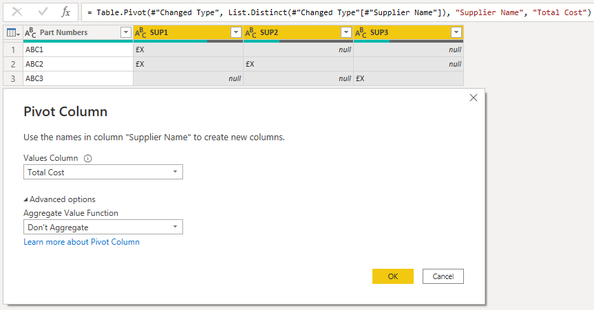
If you pivot the Supplier Name column using Total Cost as the values, you'll get this:
- Mark as New
- Bookmark
- Subscribe
- Mute
- Subscribe to RSS Feed
- Permalink
- Report Inappropriate Content
Hi @Anonymous ,
The direct answer is to select your [Supplier Name] column, then go to Transform tab > Pivot Column and select [Total Cost] as the values to get this output:
However, the real question is WHY you want to do this in PQ?
You're essentially making your data structure WORSE for reporting by doing this.
If you want to report in the format that you've outlined, you should really keep the original format as it is, then report using a matrix visual in PBI.
Pete
Now accepting Kudos! If my post helped you, why not give it a thumbs-up?
Proud to be a Datanaut!
- Mark as New
- Bookmark
- Subscribe
- Mute
- Subscribe to RSS Feed
- Permalink
- Report Inappropriate Content
Thanks guys! appreciate the help!
I am replicating another reporting output and this is how it is displayed- hence the weird request!
- Mark as New
- Bookmark
- Subscribe
- Mute
- Subscribe to RSS Feed
- Permalink
- Report Inappropriate Content
@Anonymous ,
Ok, fair enough.
If you are replicating something else, I recommend you update it while you're there to make it more efficient.
Keeping the original data structure as it is and using the matrix visual to change the report/display format is the efficient way to go.
Pete
Now accepting Kudos! If my post helped you, why not give it a thumbs-up?
Proud to be a Datanaut!
- Mark as New
- Bookmark
- Subscribe
- Mute
- Subscribe to RSS Feed
- Permalink
- Report Inappropriate Content
Hi @Anonymous ,
The direct answer is to select your [Supplier Name] column, then go to Transform tab > Pivot Column and select [Total Cost] as the values to get this output:
However, the real question is WHY you want to do this in PQ?
You're essentially making your data structure WORSE for reporting by doing this.
If you want to report in the format that you've outlined, you should really keep the original format as it is, then report using a matrix visual in PBI.
Pete
Now accepting Kudos! If my post helped you, why not give it a thumbs-up?
Proud to be a Datanaut!
- Mark as New
- Bookmark
- Subscribe
- Mute
- Subscribe to RSS Feed
- Permalink
- Report Inappropriate Content
could you elaborate? an example of what the output you suggest is in power BI?
- Mark as New
- Bookmark
- Subscribe
- Mute
- Subscribe to RSS Feed
- Permalink
- Report Inappropriate Content
@Anonymous ,
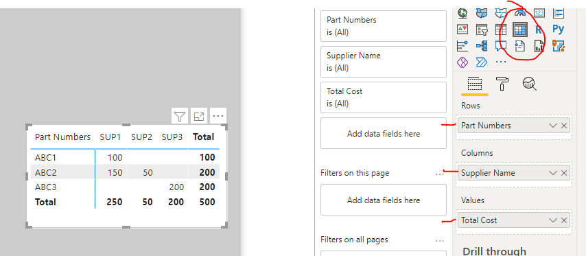
Keep your data in its original format in Power Query, then use a matrix visual like this to display it in the format you're looking for:
Significantly more efficient and 'useable' than the pivot operation in Power Query (that is an especially expensive PQ function).
Pete
Now accepting Kudos! If my post helped you, why not give it a thumbs-up?
Proud to be a Datanaut!
- Mark as New
- Bookmark
- Subscribe
- Mute
- Subscribe to RSS Feed
- Permalink
- Report Inappropriate Content
If you pivot the Supplier Name column using Total Cost as the values, you'll get this:
- Mark as New
- Bookmark
- Subscribe
- Mute
- Subscribe to RSS Feed
- Permalink
- Report Inappropriate Content
JINX! lol
Now accepting Kudos! If my post helped you, why not give it a thumbs-up?
Proud to be a Datanaut!
Helpful resources

New to Fabric Survey
If you have recently started exploring Fabric, we'd love to hear how it's going. Your feedback can help with product improvements.

Power BI DataViz World Championships - June 2026
A new Power BI DataViz World Championship is coming this June! Don't miss out on submitting your entry.

Join our Fabric User Panel
Share feedback directly with Fabric product managers, participate in targeted research studies and influence the Fabric roadmap.

| User | Count |
|---|---|
| 5 | |
| 4 | |
| 3 | |
| 3 | |
| 2 |
| User | Count |
|---|---|
| 7 | |
| 6 | |
| 5 | |
| 5 | |
| 5 |


