FabCon is coming to Atlanta
Join us at FabCon Atlanta from March 16 - 20, 2026, for the ultimate Fabric, Power BI, AI and SQL community-led event. Save $200 with code FABCOMM.
Register now!- Power BI forums
- Get Help with Power BI
- Desktop
- Service
- Report Server
- Power Query
- Mobile Apps
- Developer
- DAX Commands and Tips
- Custom Visuals Development Discussion
- Health and Life Sciences
- Power BI Spanish forums
- Translated Spanish Desktop
- Training and Consulting
- Instructor Led Training
- Dashboard in a Day for Women, by Women
- Galleries
- Data Stories Gallery
- Themes Gallery
- Contests Gallery
- QuickViz Gallery
- Quick Measures Gallery
- Visual Calculations Gallery
- Notebook Gallery
- Translytical Task Flow Gallery
- TMDL Gallery
- R Script Showcase
- Webinars and Video Gallery
- Ideas
- Custom Visuals Ideas (read-only)
- Issues
- Issues
- Events
- Upcoming Events
Vote for your favorite vizzies from the Power BI Dataviz World Championship submissions. Vote now!
- Power BI forums
- Forums
- Get Help with Power BI
- Power Query
- Stacked Bar Chart
- Subscribe to RSS Feed
- Mark Topic as New
- Mark Topic as Read
- Float this Topic for Current User
- Bookmark
- Subscribe
- Printer Friendly Page
- Mark as New
- Bookmark
- Subscribe
- Mute
- Subscribe to RSS Feed
- Permalink
- Report Inappropriate Content
Stacked Bar Chart
Hi
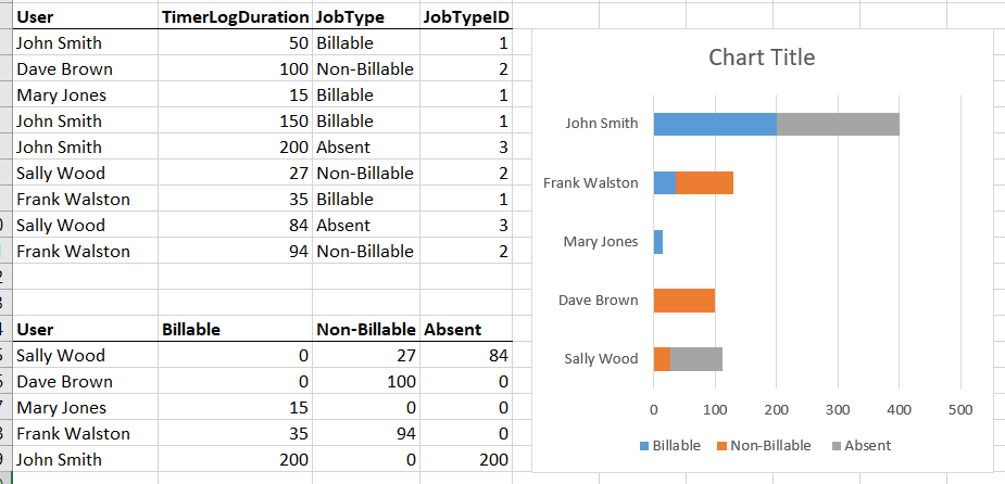
In the below visual, my source data is as it appears in the upper table, but I need to find a way to manipulate the data so it appears like it does in the lower table.
I need to create a stacked bar chart in power bi as in the example below, and I can do that by using the upper table as a source, but I can not find a way to sort it so that the most billable time is sorted first, then the non-billable, then the absence, but I can only get it to sort by total time. With the lower table as a source this is not a problem.
Can anyone enlighten me as to how I can either transform the upper table to the lower one, or how I can get my desired result from the structure in the upper table?
Solved! Go to Solution.
- Mark as New
- Bookmark
- Subscribe
- Mute
- Subscribe to RSS Feed
- Permalink
- Report Inappropriate Content
Hi @Danbert ,
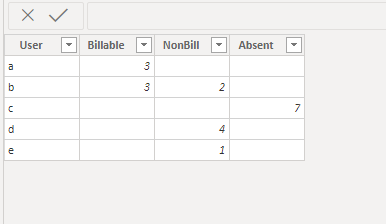
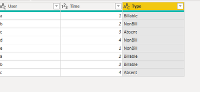
Dummied up a table for you, you will end up with a table like this by selecting the Type Column and Selecting Pivot on the Transform tab. Use Time as the values.
Let me know if you have any questions.
If this solves your issues, please mark it as the solution, so that others can find it easily. Kudos are nice too.
Nathaniel
The picture below shows both the selection for Pivot Column and the resulting table.
Did I answer your question? Mark my post as a solution!
Proud to be a Super User!
- Mark as New
- Bookmark
- Subscribe
- Mute
- Subscribe to RSS Feed
- Permalink
- Report Inappropriate Content
Hi @Danbert ,
Would you copy and paste your first table right into the message so that we can copy and paste it into Power Query? Cannot do that with pictures.
Let me know if you have any questions.
If this solves your issues, please mark it as the solution, so that others can find it easily. Kudos are nice too.
Nathaniel
Did I answer your question? Mark my post as a solution!
Proud to be a Super User!
- Mark as New
- Bookmark
- Subscribe
- Mute
- Subscribe to RSS Feed
- Permalink
- Report Inappropriate Content
Hi @Nathaniel_C , of course, sorry about that. Please see below:
| User | TimerLogDuration | JobType | JobTypeID |
| John Smith | 50 | Billable | 1 |
| Dave Brown | 100 | Non-Billable | 2 |
| Mary Jones | 15 | Billable | 1 |
| John Smith | 150 | Billable | 1 |
| John Smith | 200 | Absent | 3 |
| Sally Wood | 27 | Non-Billable | 2 |
| Frank Walston | 35 | Billable | 1 |
| Sally Wood | 84 | Absent | 3 |
| Frank Walston | 94 | Non-Billable | 2 |
- Mark as New
- Bookmark
- Subscribe
- Mute
- Subscribe to RSS Feed
- Permalink
- Report Inappropriate Content
Hi @Danbert beat you to it with a dummy table. Let me know if this makes sense.😁
Did I answer your question? Mark my post as a solution!
Proud to be a Super User!
- Mark as New
- Bookmark
- Subscribe
- Mute
- Subscribe to RSS Feed
- Permalink
- Report Inappropriate Content
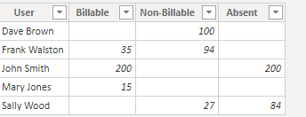
Hi @Danbert
Using your table.
Did I answer your question? Mark my post as a solution!
Proud to be a Super User!
- Mark as New
- Bookmark
- Subscribe
- Mute
- Subscribe to RSS Feed
- Permalink
- Report Inappropriate Content
@Nathaniel_C - that worked perfectly, thanks so much that's saved me a lot of time!
- Mark as New
- Bookmark
- Subscribe
- Mute
- Subscribe to RSS Feed
- Permalink
- Report Inappropriate Content
Hi @Danbert ,
You are very welcome, glad to help!
Did I answer your question? Mark my post as a solution!
Proud to be a Super User!
- Mark as New
- Bookmark
- Subscribe
- Mute
- Subscribe to RSS Feed
- Permalink
- Report Inappropriate Content
@Nathaniel_C, thanks so much for coming back to me so quickly on this. I won't be able to test this until tomorrow but looks exactly like what I'm after. I'll report back tomorrow.
Thanks again.
- Mark as New
- Bookmark
- Subscribe
- Mute
- Subscribe to RSS Feed
- Permalink
- Report Inappropriate Content
Hi @Danbert ,
Dummied up a table for you, you will end up with a table like this by selecting the Type Column and Selecting Pivot on the Transform tab. Use Time as the values.
Let me know if you have any questions.
If this solves your issues, please mark it as the solution, so that others can find it easily. Kudos are nice too.
Nathaniel
The picture below shows both the selection for Pivot Column and the resulting table.
Did I answer your question? Mark my post as a solution!
Proud to be a Super User!
Helpful resources

Power BI Dataviz World Championships
Vote for your favorite vizzies from the Power BI World Championship submissions!

Join our Community Sticker Challenge 2026
If you love stickers, then you will definitely want to check out our Community Sticker Challenge!

Power BI Monthly Update - January 2026
Check out the January 2026 Power BI update to learn about new features.

| User | Count |
|---|---|
| 7 | |
| 5 | |
| 4 | |
| 3 | |
| 3 |
| User | Count |
|---|---|
| 15 | |
| 11 | |
| 11 | |
| 8 | |
| 6 |


