Join us at FabCon Vienna from September 15-18, 2025
The ultimate Fabric, Power BI, SQL, and AI community-led learning event. Save €200 with code FABCOMM.
Get registered- Power BI forums
- Get Help with Power BI
- Desktop
- Service
- Report Server
- Power Query
- Mobile Apps
- Developer
- DAX Commands and Tips
- Custom Visuals Development Discussion
- Health and Life Sciences
- Power BI Spanish forums
- Translated Spanish Desktop
- Training and Consulting
- Instructor Led Training
- Dashboard in a Day for Women, by Women
- Galleries
- Data Stories Gallery
- Themes Gallery
- Contests Gallery
- Quick Measures Gallery
- Notebook Gallery
- Translytical Task Flow Gallery
- TMDL Gallery
- R Script Showcase
- Webinars and Video Gallery
- Ideas
- Custom Visuals Ideas (read-only)
- Issues
- Issues
- Events
- Upcoming Events
Compete to become Power BI Data Viz World Champion! First round ends August 18th. Get started.
- Power BI forums
- Forums
- Get Help with Power BI
- Power Query
- Line chart with each quarter as line
- Subscribe to RSS Feed
- Mark Topic as New
- Mark Topic as Read
- Float this Topic for Current User
- Bookmark
- Subscribe
- Printer Friendly Page
- Mark as New
- Bookmark
- Subscribe
- Mute
- Subscribe to RSS Feed
- Permalink
- Report Inappropriate Content
Line chart with each quarter as line
HI All,
I need to create a line chart daily production for each quarter (Q1, Q2.... – one line for Q1 and one line Q2). So the x-axis will simply be the day of the quarter, not the date but the day. So day 1, day 2, etc so that we can plot the lines similarly. The objective is to compare production day-wise for every quarter .
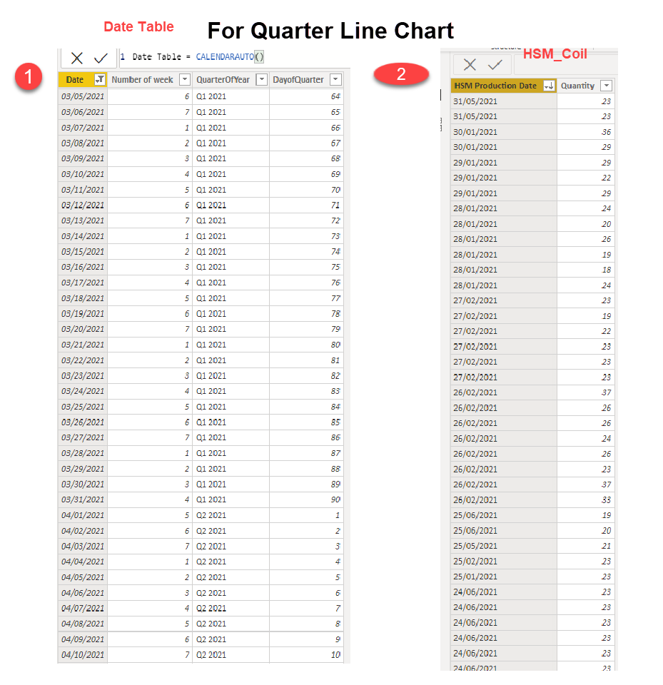
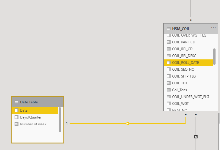
I have data in two tables . Table 1 is a date table in which I have added Day of the quarter. Table 2 is a fact table having date of production and quantity produced . The tables hence have 1 to many relationship.
Question: How an I create a dynamic chart for this? To achive this do I need to create a measure (
for each quarter and then plot them as line on the chart?
How do I address the further quarters, eg Q4 2021, Q1 2022, Q2 2022 etc. ? x
Final Chart required
Thanks for help,
Solved! Go to Solution.
- Mark as New
- Bookmark
- Subscribe
- Mute
- Subscribe to RSS Feed
- Permalink
- Report Inappropriate Content
Hi @Anonymous ,
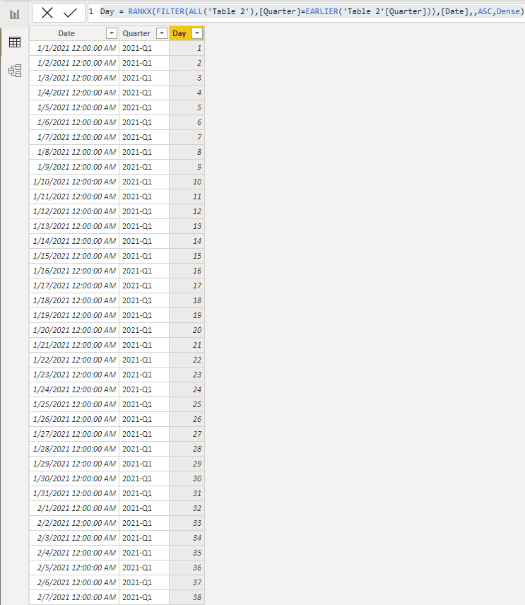
In the calendar table, you can create the calculated column which is the days of the quarter like
Day = RANKX(FILTER(ALL('Table 2'),[Quarter]=EARLIER('Table 2'[Quarter])),[Date],,ASC,Dense)
Best Regards,
Stephen Tao
If this post helps, then please consider Accept it as the solution to help the other members find it more quickly.
- Mark as New
- Bookmark
- Subscribe
- Mute
- Subscribe to RSS Feed
- Permalink
- Report Inappropriate Content
ThankYou. This was helpful.


