FabCon is coming to Atlanta
Join us at FabCon Atlanta from March 16 - 20, 2026, for the ultimate Fabric, Power BI, AI and SQL community-led event. Save $200 with code FABCOMM.
Register now!- Power BI forums
- Get Help with Power BI
- Desktop
- Service
- Report Server
- Power Query
- Mobile Apps
- Developer
- DAX Commands and Tips
- Custom Visuals Development Discussion
- Health and Life Sciences
- Power BI Spanish forums
- Translated Spanish Desktop
- Training and Consulting
- Instructor Led Training
- Dashboard in a Day for Women, by Women
- Galleries
- Data Stories Gallery
- Themes Gallery
- Contests Gallery
- Quick Measures Gallery
- Notebook Gallery
- Translytical Task Flow Gallery
- TMDL Gallery
- R Script Showcase
- Webinars and Video Gallery
- Ideas
- Custom Visuals Ideas (read-only)
- Issues
- Issues
- Events
- Upcoming Events
Join the Fabric FabCon Global Hackathon—running virtually through Nov 3. Open to all skill levels. $10,000 in prizes! Register now.
- Power BI forums
- Forums
- Get Help with Power BI
- Mobile Apps
- Re: Report Tooltips not showing properly
- Subscribe to RSS Feed
- Mark Topic as New
- Mark Topic as Read
- Float this Topic for Current User
- Bookmark
- Subscribe
- Printer Friendly Page
- Mark as New
- Bookmark
- Subscribe
- Mute
- Subscribe to RSS Feed
- Permalink
- Report Inappropriate Content
Report Tooltips not showing properly
In Power BI Desktop, I have created report tooltips for my visuals in order to have control over the information that is shown. However I am finding that when I go to the PowerBI Mobile App (on Windows 10) to present that information, the formatting changes.
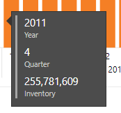
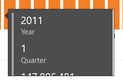
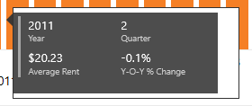
Here are my two examples, first is how the tooltips look on Power BI Desktop:
And then how the same two tooltips look on the Power BI Mobile app used for presenting:
As you can see, my tooltips are pretty simple, just multi-row cards, but I have a formatting error whether I have it all in one column vertically or spread out, but the issue changing from being too zoomed in/text too large, so things get cut off, while in the other type there is white space around the card. I have tried manipulating the tooltip report page size and the size of the card, but no matter the size of either the issues persist. Any ideas?
Solved! Go to Solution.
- Mark as New
- Bookmark
- Subscribe
- Mute
- Subscribe to RSS Feed
- Permalink
- Report Inappropriate Content
Hey @a_norb ,
Thank you for reporting this.
We are looking into it, and I will update this thread once we will identify the issue.
Regards,
Maya
- Mark as New
- Bookmark
- Subscribe
- Mute
- Subscribe to RSS Feed
- Permalink
- Report Inappropriate Content
Hey @a_norb ,
Thank you for reporting this.
We are looking into it, and I will update this thread once we will identify the issue.
Regards,
Maya
- Mark as New
- Bookmark
- Subscribe
- Mute
- Subscribe to RSS Feed
- Permalink
- Report Inappropriate Content
Hey @a_norb ,
A fix to this issue will be available at week of September30th.
There is no need to download new app version to get the fix (but always recommended).
Thank you for reporting the probelm
Maya
- Mark as New
- Bookmark
- Subscribe
- Mute
- Subscribe to RSS Feed
- Permalink
- Report Inappropriate Content
Hi @a_norb ,
I think it is impossible to to custom or manually optimization mobile tooltip layout, it is controlled by mobile app itself.
Maybe you can contact to mobile team to ask the detail of tooltip graph generate.
Regards,
Xiaoxin Sheng


