Get Fabric certified for FREE!
Don't miss your chance to take the Fabric Data Engineer (DP-600) exam for FREE! Find out how by attending the DP-600 session on April 23rd (pacific time), live or on-demand.
Learn more- Power BI forums
- Get Help with Power BI
- Desktop
- Service
- Report Server
- Power Query
- Mobile Apps
- Developer
- DAX Commands and Tips
- Custom Visuals Development Discussion
- Health and Life Sciences
- Power BI Spanish forums
- Translated Spanish Desktop
- Training and Consulting
- Instructor Led Training
- Dashboard in a Day for Women, by Women
- Galleries
- Data Stories Gallery
- Themes Gallery
- Contests Gallery
- QuickViz Gallery
- Quick Measures Gallery
- Visual Calculations Gallery
- Notebook Gallery
- Translytical Task Flow Gallery
- TMDL Gallery
- R Script Showcase
- Webinars and Video Gallery
- Ideas
- Custom Visuals Ideas (read-only)
- Issues
- Issues
- Events
- Upcoming Events
Next up in the FabCon + SQLCon recap series: The roadmap for Microsoft SQL and Maximizing Developer experiences in Fabric. All sessions are available on-demand after the live show. Register now
- Power BI forums
- Forums
- Get Help with Power BI
- Mobile Apps
- Re: Android map tile not interactive.
- Subscribe to RSS Feed
- Mark Topic as New
- Mark Topic as Read
- Float this Topic for Current User
- Bookmark
- Subscribe
- Printer Friendly Page
- Mark as New
- Bookmark
- Subscribe
- Mute
- Subscribe to RSS Feed
- Permalink
- Report Inappropriate Content
Android map tile not interactive.
Unlike other tiles, a map when viewed from the android app does not offer any dynamic feedback.
Maybe if the area of conern could be limited to the area with latitude and longitude, thus would allow users to click on map to see related data such as availble with Pie chart, Donut chart, Scatter chart...
- Mark as New
- Bookmark
- Subscribe
- Mute
- Subscribe to RSS Feed
- Permalink
- Report Inappropriate Content
Same for iOS the map Visualizations unlike charts and pies don't provide any feedback to the user!
Meaning you can't click on a location and see the relevant info. (for both maps and filled maps)
So you basically see the locations but no Info is available for any of them!
- Mark as New
- Bookmark
- Subscribe
- Mute
- Subscribe to RSS Feed
- Permalink
- Report Inappropriate Content
- Mark as New
- Bookmark
- Subscribe
- Mute
- Subscribe to RSS Feed
- Permalink
- Report Inappropriate Content
- Mark as New
- Bookmark
- Subscribe
- Mute
- Subscribe to RSS Feed
- Permalink
- Report Inappropriate Content
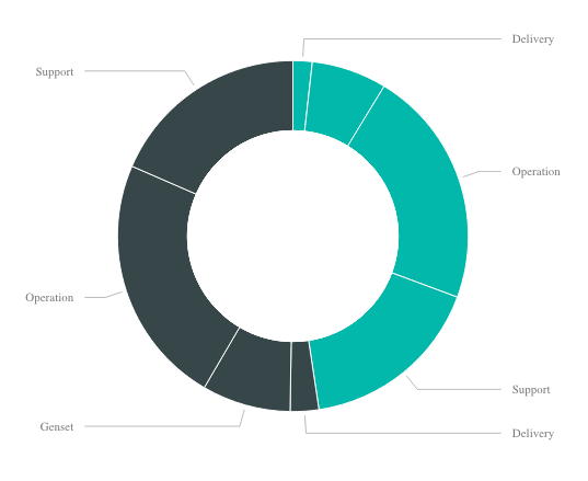
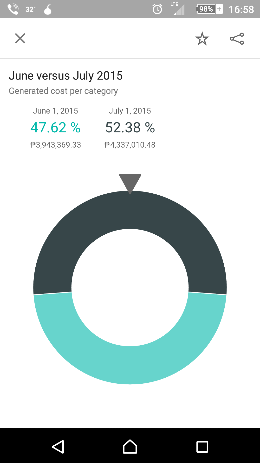
We noticed that a donit chart does not either provide the same level of detail, rendering the tile useless:
Above is the tile created.
And below is what the reader can see from the android:
Helpful resources

New to Fabric Survey
If you have recently started exploring Fabric, we'd love to hear how it's going. Your feedback can help with product improvements.

Power BI DataViz World Championships - June 2026
A new Power BI DataViz World Championship is coming this June! Don't miss out on submitting your entry.


