FabCon is coming to Atlanta
Join us at FabCon Atlanta from March 16 - 20, 2026, for the ultimate Fabric, Power BI, AI and SQL community-led event. Save $200 with code FABCOMM.
Register now!- Power BI forums
- Get Help with Power BI
- Desktop
- Service
- Report Server
- Power Query
- Mobile Apps
- Developer
- DAX Commands and Tips
- Custom Visuals Development Discussion
- Health and Life Sciences
- Power BI Spanish forums
- Translated Spanish Desktop
- Training and Consulting
- Instructor Led Training
- Dashboard in a Day for Women, by Women
- Galleries
- Data Stories Gallery
- Themes Gallery
- Contests Gallery
- Quick Measures Gallery
- Notebook Gallery
- Translytical Task Flow Gallery
- TMDL Gallery
- R Script Showcase
- Webinars and Video Gallery
- Ideas
- Custom Visuals Ideas (read-only)
- Issues
- Issues
- Events
- Upcoming Events
Join the Fabric FabCon Global Hackathon—running virtually through Nov 3. Open to all skill levels. $10,000 in prizes! Register now.
- Power BI forums
- Forums
- Get Help with Power BI
- Developer
- how to show tooltip on map
- Subscribe to RSS Feed
- Mark Topic as New
- Mark Topic as Read
- Float this Topic for Current User
- Bookmark
- Subscribe
- Printer Friendly Page
- Mark as New
- Bookmark
- Subscribe
- Mute
- Subscribe to RSS Feed
- Permalink
- Report Inappropriate Content
how to show tooltip on map
Hello,
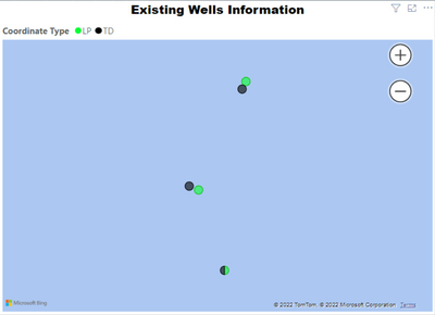
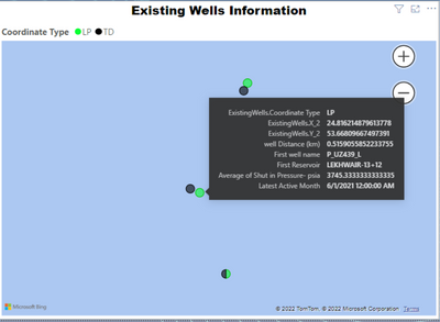
I have a map visual that plots different points per category selected and each point plotted has a pressure value and a date I have seen many videos that say i can create a new column with the values i need to display and put that column in the location field then set the plotted coordinates to average instead of dont summarize.
The problem is that when the coordinates are set to average they are plotted wrong and points who are sometimes close to each other are plotted with each other in the same point not on top of it but i noticed that the tooltip displays the exact information i need. Is there a way where i can always display the tooltip information on the map instead of having to hover over each point and reading its data.
Thank you.
Regards,
Abdalla
- Mark as New
- Bookmark
- Subscribe
- Mute
- Subscribe to RSS Feed
- Permalink
- Report Inappropriate Content
Sorry, standard tooltips are only visible upon user interaction with the visual. Use a different visual, or look into smart narratives etc.
Helpful resources
| User | Count |
|---|---|
| 10 | |
| 4 | |
| 3 | |
| 3 | |
| 3 |


