- Power BI forums
- Get Help with Power BI
- Desktop
- Service
- Report Server
- Power Query
- Mobile Apps
- Developer
- DAX Commands and Tips
- Custom Visuals Development Discussion
- Health and Life Sciences
- Power BI Spanish forums
- Translated Spanish Desktop
- Training and Consulting
- Instructor Led Training
- Dashboard in a Day for Women, by Women
- Galleries
- Data Stories Gallery
- Themes Gallery
- Contests Gallery
- QuickViz Gallery
- Quick Measures Gallery
- Visual Calculations Gallery
- Notebook Gallery
- Translytical Task Flow Gallery
- TMDL Gallery
- R Script Showcase
- Webinars and Video Gallery
- Ideas
- Custom Visuals Ideas (read-only)
- Issues
- Issues
- Events
- Upcoming Events
We've captured the moments from FabCon & SQLCon that everyone is talking about, and we are bringing them to the community, live and on-demand. Starts on April 14th. Register now
- Power BI forums
- Forums
- Get Help with Power BI
- Developer
- Stacked Column Chart Dynamic Start in Y-Axis Issue
- Subscribe to RSS Feed
- Mark Topic as New
- Mark Topic as Read
- Float this Topic for Current User
- Bookmark
- Subscribe
- Printer Friendly Page
- Mark as New
- Bookmark
- Subscribe
- Mute
- Subscribe to RSS Feed
- Permalink
- Report Inappropriate Content
Stacked Column Chart Dynamic Start in Y-Axis Issue
Hello Guys,
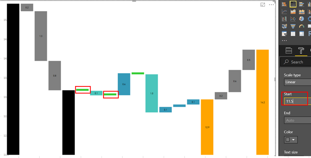
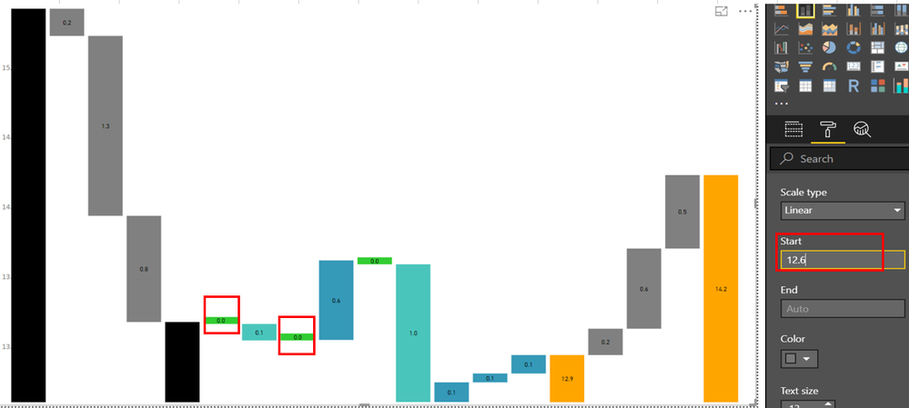
I have a requirement to show in the stacked column chart value of 0.0 when the value in the chart is zero.
One way to do it is to make the chart bigger and adjust the value in the start. However, every month I have a different set of data. So my problem is how to set the start in the Y-axis dynamically. Or any DAX to solve the issue?
At Start 11.5 value of zero in the chart is not showing.
At Start 12.6 value of zero (0.0) in the chart is showing.
Is there a way to set the start dynamically based on the data I passed in the chart since every month data varies.
Any other solution to show the zero? Any other object to use other than stacked column chart to satisfy the requirements.
Thank you in advance for your help. 🙂
Regards,
Phil
- Mark as New
- Bookmark
- Subscribe
- Mute
- Subscribe to RSS Feed
- Permalink
- Report Inappropriate Content
Hi Phil,
Do you use standard Stacked Column Chart?
If so, I suppose it is better to solve your question with DAX because standard visuals are updated rarely.
To get assistance with DAX you can write into Desktop thread.
Kind Regards,
Evgenii Elkin,
Software Engineer
Microsoft Power BI Custom Visuals
pbicvsupport@microsoft.com
Helpful resources

New to Fabric Survey
If you have recently started exploring Fabric, we'd love to hear how it's going. Your feedback can help with product improvements.

Power BI DataViz World Championships - June 2026
A new Power BI DataViz World Championship is coming this June! Don't miss out on submitting your entry.

| User | Count |
|---|---|
| 1 | |
| 1 | |
| 1 | |
| 1 | |
| 1 |
| User | Count |
|---|---|
| 4 | |
| 3 | |
| 2 | |
| 2 | |
| 2 |


