Join us at FabCon Vienna from September 15-18, 2025
The ultimate Fabric, Power BI, SQL, and AI community-led learning event. Save €200 with code FABCOMM.
Get registered- Power BI forums
- Get Help with Power BI
- Desktop
- Service
- Report Server
- Power Query
- Mobile Apps
- Developer
- DAX Commands and Tips
- Custom Visuals Development Discussion
- Health and Life Sciences
- Power BI Spanish forums
- Translated Spanish Desktop
- Training and Consulting
- Instructor Led Training
- Dashboard in a Day for Women, by Women
- Galleries
- Data Stories Gallery
- Themes Gallery
- Contests Gallery
- Quick Measures Gallery
- Notebook Gallery
- Translytical Task Flow Gallery
- TMDL Gallery
- R Script Showcase
- Webinars and Video Gallery
- Ideas
- Custom Visuals Ideas (read-only)
- Issues
- Issues
- Events
- Upcoming Events
Compete to become Power BI Data Viz World Champion! First round ends August 18th. Get started.
- Power BI forums
- Forums
- Get Help with Power BI
- Developer
- Single Data Point Selection for each part of a gra...
- Subscribe to RSS Feed
- Mark Topic as New
- Mark Topic as Read
- Float this Topic for Current User
- Bookmark
- Subscribe
- Printer Friendly Page
- Mark as New
- Bookmark
- Subscribe
- Mute
- Subscribe to RSS Feed
- Permalink
- Report Inappropriate Content
Single Data Point Selection for each part of a graph/chart
Hi,
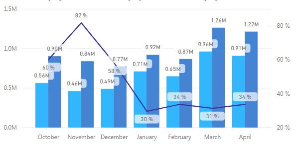
Is there a way to split out the data labels on the Line and Clustered Column chart? All my data points are too close together. I honestly just want the percentage data points to show on the line part of the graph and not anywhere else. If there is not a way to do this, can this be added to the next Power BI Desktop update? Give the option on where data points are turned on (i.e., line, bar1, bar2, etc.). Hoping someone might have suggestions. Thanks!
WWW
- Mark as New
- Bookmark
- Subscribe
- Mute
- Subscribe to RSS Feed
- Permalink
- Report Inappropriate Content
Hi WWW,
i think this isnt possible yet. There has been a similar idea here https://ideas.powerbi.com/forums/265200-power-bi-ideas/suggestions/16839415-data-label You might vote up or create a new one in the idea forum
Alternatively you can position and play with labels however you like by creating custom visuals: https://tsmatz.wordpress.com/2016/09/27/power-bi-custom-visuals-programming/
- Mark as New
- Bookmark
- Subscribe
- Mute
- Subscribe to RSS Feed
- Permalink
- Report Inappropriate Content
@az2451 Thanks for the information, Tom. I'll go make my vote on the site you mentioned and take a look at the other document regarding positioning the labels.
Cheers,
Paul


