FabCon is coming to Atlanta
Join us at FabCon Atlanta from March 16 - 20, 2026, for the ultimate Fabric, Power BI, AI and SQL community-led event. Save $200 with code FABCOMM.
Register now!- Power BI forums
- Get Help with Power BI
- Desktop
- Service
- Report Server
- Power Query
- Mobile Apps
- Developer
- DAX Commands and Tips
- Custom Visuals Development Discussion
- Health and Life Sciences
- Power BI Spanish forums
- Translated Spanish Desktop
- Training and Consulting
- Instructor Led Training
- Dashboard in a Day for Women, by Women
- Galleries
- Data Stories Gallery
- Themes Gallery
- Contests Gallery
- Quick Measures Gallery
- Visual Calculations Gallery
- Notebook Gallery
- Translytical Task Flow Gallery
- TMDL Gallery
- R Script Showcase
- Webinars and Video Gallery
- Ideas
- Custom Visuals Ideas (read-only)
- Issues
- Issues
- Events
- Upcoming Events
Calling all Data Engineers! Fabric Data Engineer (Exam DP-700) live sessions are back! Starting October 16th. Sign up.
- Power BI forums
- Forums
- Get Help with Power BI
- Developer
- Re: Responsive Y-axis in the Small Multiples
- Subscribe to RSS Feed
- Mark Topic as New
- Mark Topic as Read
- Float this Topic for Current User
- Bookmark
- Subscribe
- Printer Friendly Page
- Mark as New
- Bookmark
- Subscribe
- Mute
- Subscribe to RSS Feed
- Permalink
- Report Inappropriate Content
Responsive Y-axis in the Small Multiples
Hello PowerBI Community,
This is my first post here and I hope to find a solution to my problem or a least some leads to explore because I have been searching a few times now and I can't find anything easy to help me.
Feel free to send me link to other messages in the community of people who had the same issue or that could help me.
Introduction:
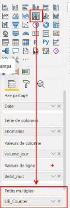
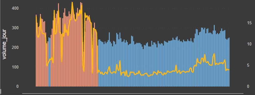
I already created a graphic showing the evolution of consumption per day for different cities (Picture 1). Since I have a hundred cities, I want to generate a graph per city. This is why I started using Small Multiples which gives me what I want : A graphic per City and a simple way to look at all the graphs only by scrolling down.
Picture 1:
My problematic:
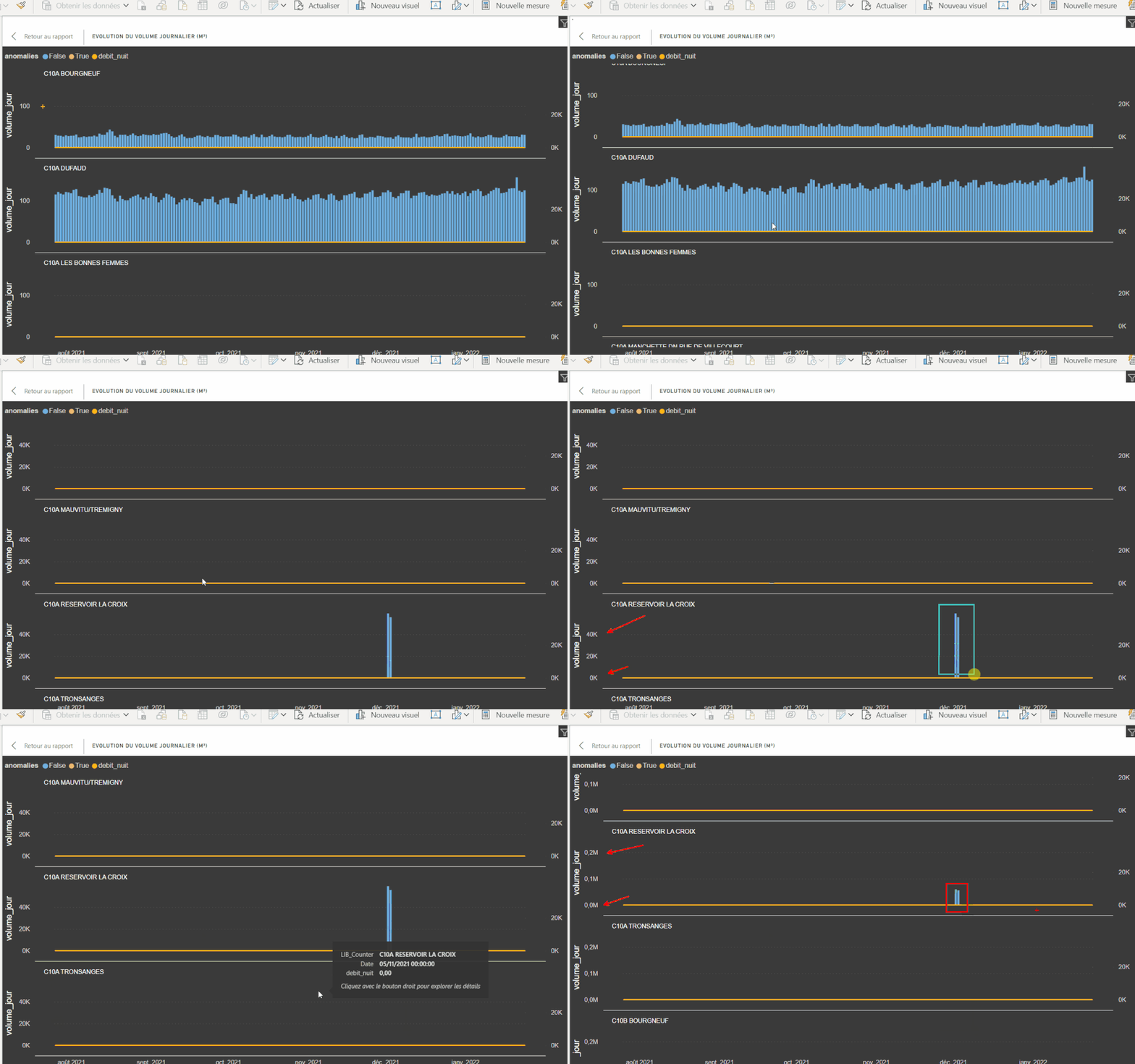
Now, I have a problem because each city don't have the same size and so, don't consume the same amount. But the Y-axis of the graphs automatically updates making most of the graphs unreadable (Picture 2).
Picture 2:
My questions:
- What would be the best way to solve my issue ? I looked at all the options of the graph but couldn't find anything helpful. I understand that the problem comes from the automatic value at the "end" option of the Y-Axis. Changing the value from automatic to a number fix the Y-axis which also don't look good.
- Would the best way to create my own visual ? (I have no experience with that).
Thank you for taking the time to read and comment my post.
I wish you all a good day. 🌞
- Mark as New
- Bookmark
- Subscribe
- Mute
- Subscribe to RSS Feed
- Permalink
- Report Inappropriate Content
Hello again!
I posted my issue as an idea for a futur evolution available in Power BI. Feel free to upvote it 😁
That could help me a lot.
Cheers!
- Mark as New
- Bookmark
- Subscribe
- Mute
- Subscribe to RSS Feed
- Permalink
- Report Inappropriate Content
Hi @mizujou,
According to your description, I think your requirement is related to the feature requests of the custom visual usages. In my opinion, I'd like to suggest you contact to the visual author to report the improve suggestions.
Column chart with small multiples - Power BI visuals (3agsystems.com)
Regards,
Xiaoxin Sheng
- Mark as New
- Bookmark
- Subscribe
- Mute
- Subscribe to RSS Feed
- Permalink
- Report Inappropriate Content
I'll do that! Thanks
Helpful resources

FabCon Global Hackathon
Join the Fabric FabCon Global Hackathon—running virtually through Nov 3. Open to all skill levels. $10,000 in prizes!

Power BI Monthly Update - October 2025
Check out the October 2025 Power BI update to learn about new features.


