FabCon is coming to Atlanta
Join us at FabCon Atlanta from March 16 - 20, 2026, for the ultimate Fabric, Power BI, AI and SQL community-led event. Save $200 with code FABCOMM.
Register now!- Power BI forums
- Get Help with Power BI
- Desktop
- Service
- Report Server
- Power Query
- Mobile Apps
- Developer
- DAX Commands and Tips
- Custom Visuals Development Discussion
- Health and Life Sciences
- Power BI Spanish forums
- Translated Spanish Desktop
- Training and Consulting
- Instructor Led Training
- Dashboard in a Day for Women, by Women
- Galleries
- Data Stories Gallery
- Themes Gallery
- Contests Gallery
- QuickViz Gallery
- Quick Measures Gallery
- Visual Calculations Gallery
- Notebook Gallery
- Translytical Task Flow Gallery
- TMDL Gallery
- R Script Showcase
- Webinars and Video Gallery
- Ideas
- Custom Visuals Ideas (read-only)
- Issues
- Issues
- Events
- Upcoming Events
Learn from the best! Meet the four finalists headed to the FINALS of the Power BI Dataviz World Championships! Register now
- Power BI forums
- Forums
- Get Help with Power BI
- Developer
- R Visual stopped working.
- Subscribe to RSS Feed
- Mark Topic as New
- Mark Topic as Read
- Float this Topic for Current User
- Bookmark
- Subscribe
- Printer Friendly Page
- Mark as New
- Bookmark
- Subscribe
- Mute
- Subscribe to RSS Feed
- Permalink
- Report Inappropriate Content
R Visual stopped working.
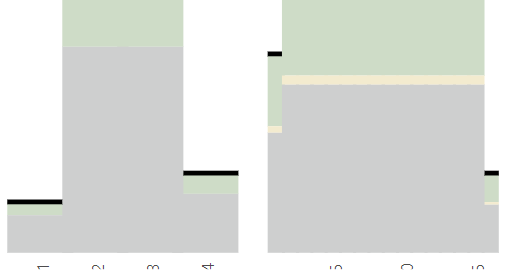
A collegue of mine have developed a Custom R visual that consists if a facet plot. It has worked perfectly for some time now, both in desktop and on the web. It still works in desktop, but not on the web. The plot has dates on the x-axis that are displayed correctly in desktop but not on the web. Has there been some update recently causing this problem? How can the issue be solved?
- Mark as New
- Bookmark
- Subscribe
- Mute
- Subscribe to RSS Feed
- Permalink
- Report Inappropriate Content
Hi, @Anonymous ,
What packages are your colleagues using? GGplot2 or just basic R?
Base on your description, this should be a problem with PowerBI Service itself (maybe caused by some updates recently), but it may be solved by changing the visual margins. You can show part of your R code here.
- Mark as New
- Bookmark
- Subscribe
- Mute
- Subscribe to RSS Feed
- Permalink
- Report Inappropriate Content
Thank you for your answear.
We tried to change the margins but it did not solve the problem.
The following packages are used: ggplot2, dplyr, plotly, tidyr, RColorBrewer, ggthemes, extrafontdb
Part of the facetplot code is provided below:
g<-ggplot(data = totalLong, aes(fill = eval(parse(text="Fill")), x = eval(parse(text=XName)), y = eval(parse(text="y")), text=paste0("Fill: ",Fill,"
","T: ",round(y,0),"
",XName,": ",eval(parse(text=XName))))) + geom_bar(stat="identity", position="stack",width = 1.2) + geom_segment(data = hlineData,aes(x=x,y=segY,xend=xe, yend=ye,fill=NULL,size=TotalLineSize,color=TotalColor,linetype=TotalLineType,text="")) + scale_size_identity() + scale_colour_identity() + scale_linetype_identity() + Theme + ylab(ylabel) + facet_grid(.~eval(parse(text=FacetName)), space = "free_x", scales = "free_x") + theme(strip.background = element_rect(fill = NA), panel.spacing = unit(0.5, "lines"), panel.grid.minor=element_blank(), panel.grid.major=element_blank(), axis.text.x = element_text(angle=90), axis.ticks.x=element_blank(), legend.title=element_blank(), axis.title.x =element_blank(), axis.title =element_text(size = titletextSize, colour = colLabel), axis.text = element_text(size = axisTextSize), legend.text=element_text(size=legendtextSize), panel.background = element_rect(fill="white"), text=element_text(family="Segoe UI"), strip.text.x = element_text(size = 14, family = "Segoe UI"), legend.position=LegendPosition) + paletteTheme + scale_x_discrete(expand=c(0,0)) + scale_y_continuous(limits=c(0,sumTotal+130), breaks=seq(0,sumTotal,100),expand=c(0,0)) p = ggplotly(g,tooltip="text") %>% config(displayModeBar = F) %>% layout(hoverlabel=list(bgcolor="white"))
Helpful resources

Join our Fabric User Panel
Share feedback directly with Fabric product managers, participate in targeted research studies and influence the Fabric roadmap.

Power BI Monthly Update - February 2026
Check out the February 2026 Power BI update to learn about new features.

| User | Count |
|---|---|
| 3 | |
| 2 | |
| 2 | |
| 1 | |
| 1 |
| User | Count |
|---|---|
| 3 | |
| 3 | |
| 2 | |
| 2 | |
| 2 |


