FabCon is coming to Atlanta
Join us at FabCon Atlanta from March 16 - 20, 2026, for the ultimate Fabric, Power BI, AI and SQL community-led event. Save $200 with code FABCOMM.
Register now!- Power BI forums
- Get Help with Power BI
- Desktop
- Service
- Report Server
- Power Query
- Mobile Apps
- Developer
- DAX Commands and Tips
- Custom Visuals Development Discussion
- Health and Life Sciences
- Power BI Spanish forums
- Translated Spanish Desktop
- Training and Consulting
- Instructor Led Training
- Dashboard in a Day for Women, by Women
- Galleries
- Data Stories Gallery
- Themes Gallery
- Contests Gallery
- QuickViz Gallery
- Quick Measures Gallery
- Visual Calculations Gallery
- Notebook Gallery
- Translytical Task Flow Gallery
- TMDL Gallery
- R Script Showcase
- Webinars and Video Gallery
- Ideas
- Custom Visuals Ideas (read-only)
- Issues
- Issues
- Events
- Upcoming Events
The Power BI Data Visualization World Championships is back! Get ahead of the game and start preparing now! Learn more
- Power BI forums
- Forums
- Get Help with Power BI
- Developer
- Organizational heirarchy chart with selected level
- Subscribe to RSS Feed
- Mark Topic as New
- Mark Topic as Read
- Float this Topic for Current User
- Bookmark
- Subscribe
- Printer Friendly Page
- Mark as New
- Bookmark
- Subscribe
- Mute
- Subscribe to RSS Feed
- Permalink
- Report Inappropriate Content
Organizational heirarchy chart with selected level
Dear Community
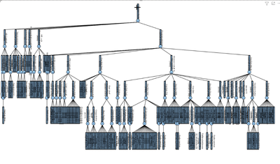
I have come across a problem in PBI heirarchy chart , that it expands to lowest level which makes it impossible to read and too much branches opens up under the each level of heirararchy.
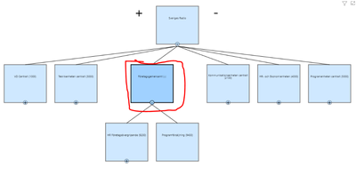
I want that when i click on one box " Org level " the other levels should disappear and chosen one has become new father of the chart. Please see pic below to understand

in above picture, When click on one box, it should only show its relevent levels and all other boxes should disappear
in this above picture , its difficult to see all levels. so thats why i want that the box where i click should only show its relevent heirarchy..
Thanks
/Skiper
Solved! Go to Solution.
- Mark as New
- Bookmark
- Subscribe
- Mute
- Subscribe to RSS Feed
- Permalink
- Report Inappropriate Content
HI @Anonymous,
There are a few of organization hierarchy custom visuals existed in power bi marketplace, which one are you worked? Perhaps you can try to change another version if the current one not suitable for your requirement.
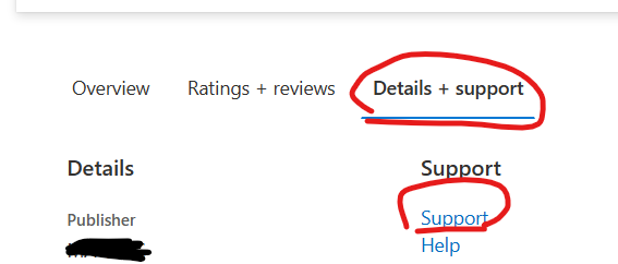
In addition, if you have some suggestions to improve the visual usages, you can try to contact to the visual author by click on the custom visual page -> 'Details + support' -> 'support' option.
Regards,
Xiaoxin Sheng
Helpful resources

Power BI Dataviz World Championships
The Power BI Data Visualization World Championships is back! Get ahead of the game and start preparing now!

| User | Count |
|---|---|
| 4 | |
| 3 | |
| 2 | |
| 1 | |
| 1 |
| User | Count |
|---|---|
| 4 | |
| 4 | |
| 4 | |
| 3 | |
| 3 |


