A new Data Days event is coming soon!
This time we’re going bigger than ever. Fabric, Power BI, SQL, AI and more. We're covering it all. You won't want to miss it.
Learn more- Power BI forums
- Get Help with Power BI
- Desktop
- Service
- Report Server
- Power Query
- Mobile Apps
- Developer
- DAX Commands and Tips
- Custom Visuals Development Discussion
- Health and Life Sciences
- Power BI Spanish forums
- Translated Spanish Desktop
- Training and Consulting
- Instructor Led Training
- Dashboard in a Day for Women, by Women
- Galleries
- Data Stories Gallery
- Themes Gallery
- Contests Gallery
- QuickViz Gallery
- Quick Measures Gallery
- Visual Calculations Gallery
- Notebook Gallery
- Translytical Task Flow Gallery
- TMDL Gallery
- R Script Showcase
- Webinars and Video Gallery
- Ideas
- Custom Visuals Ideas (read-only)
- Issues
- Issues
- Events
- Upcoming Events
Level up your Power BI skills this month - build one visual each week and tell better stories with data! Get started
- Power BI forums
- Forums
- Get Help with Power BI
- Developer
- Number of rows in dataset for R and Python visual ...
- Subscribe to RSS Feed
- Mark Topic as New
- Mark Topic as Read
- Float this Topic for Current User
- Bookmark
- Subscribe
- Printer Friendly Page
- Mark as New
- Bookmark
- Subscribe
- Mute
- Subscribe to RSS Feed
- Permalink
- Report Inappropriate Content
Number of rows in dataset for R and Python visual objects
How many rows are sampled in the 'dataset' preloaded object for R and Python visual objects? I have about 2 million rows in my dataset
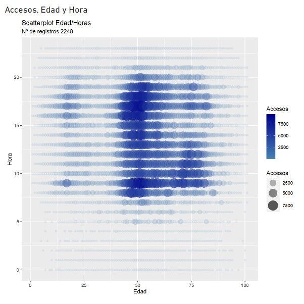
If I insert a ggscatterplot as a R visual object in PowerBI, the number of rows used in my case is 2248,
This is the R Code:
library(ggplot2)

color_palette <- colorRampPalette(c("steelblue", "darkblue"))(length(dataset$Accesos))

ggplot(dataset, aes(x = Edad, y = Hora, size = Accesos, alpha = Accesos, color = Accesos)) +
  geom_point(stroke = NA) +
  scale_size_continuous(range = c(2, 10)) +
  scale_alpha_continuous(range = c(0.1, 0.8)) +
  scale_color_gradientn(colors = color_palette) +
  labs(
      x = "Edad", y = "Hora",
      title = "Scatterplot Edad/Horas",
      subtitle = paste("Nº de registros", nrow(dataset)))
And this is the R visual object result:
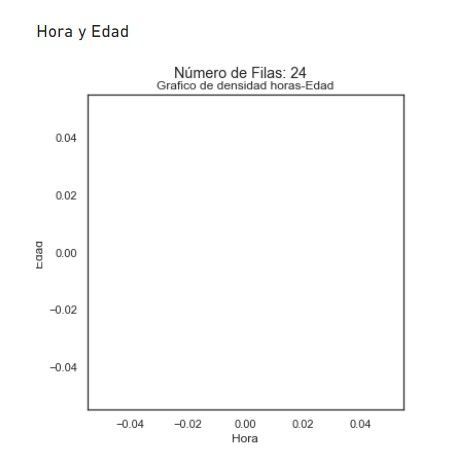
But, if I try to insert a python seaborn density plot as a Python visual object...
The source:
import pandas as pd
import numpy as np
import seaborn as sns
import matplotlib.pyplot as plt

num_filas = len(dataset)

sns.set(style="white")

sns.kdeplot(data=dataset, x='Hora', y='Edad', fill=True, cmap='viridis', thresh=0, levels=100)

plt.xlabel('Hora')
plt.ylabel('Edad')

plt.title("Grafico de densidad horas-Edad")
plt.suptitle(f"Número de Filas: {num_filas}", y=0.95)

plt.show()
The rows included in dataset are just... 24! And, of course, nothing to plot...
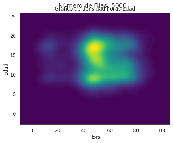
It should look like this (same code, in Google Collab)
Is there someting wrong in my code?
Thanks!
Helpful resources

Power BI Monthly Update - April 2026
Check out the April 2026 Power BI update to learn about new features.

Data Days 2026 coming soon!
Sign up to receive a private message when registration opens and key events begin.

New to Fabric Survey
If you have recently started exploring Fabric, we'd love to hear how it's going. Your feedback can help with product improvements.

| User | Count |
|---|---|
| 4 | |
| 2 | |
| 1 | |
| 1 | |
| 1 |


