Fabric Data Days starts November 4th!
Advance your Data & AI career with 50 days of live learning, dataviz contests, hands-on challenges, study groups & certifications and more!
Get registered- Power BI forums
- Get Help with Power BI
- Desktop
- Service
- Report Server
- Power Query
- Mobile Apps
- Developer
- DAX Commands and Tips
- Custom Visuals Development Discussion
- Health and Life Sciences
- Power BI Spanish forums
- Translated Spanish Desktop
- Training and Consulting
- Instructor Led Training
- Dashboard in a Day for Women, by Women
- Galleries
- Data Stories Gallery
- Themes Gallery
- Contests Gallery
- Quick Measures Gallery
- Visual Calculations Gallery
- Notebook Gallery
- Translytical Task Flow Gallery
- TMDL Gallery
- R Script Showcase
- Webinars and Video Gallery
- Ideas
- Custom Visuals Ideas (read-only)
- Issues
- Issues
- Events
- Upcoming Events
Get Fabric Certified for FREE during Fabric Data Days. Don't miss your chance! Learn more
- Power BI forums
- Forums
- Get Help with Power BI
- Developer
- New tooltip "Report page tooltips", possible for c...
- Subscribe to RSS Feed
- Mark Topic as New
- Mark Topic as Read
- Float this Topic for Current User
- Bookmark
- Subscribe
- Printer Friendly Page
- Mark as New
- Bookmark
- Subscribe
- Mute
- Subscribe to RSS Feed
- Permalink
- Report Inappropriate Content
New tooltip "Report page tooltips", possible for custom ?
Hi all,
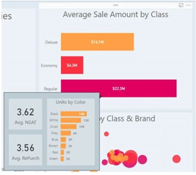
I saw a new kind of tooltip in preview:
How can we use it with a custom chart ? What do we have to do in our tooltip code, like to enable the tooltip field in filters ?
The link for it here.
It said it not enable for custom chart but it was in March, is it the same now ? Do we have a release date for this feature ?
Thanks !
EDIT: It is possible to do it with API V1.12.0 but I didn't understand how we can switch from a default tooltip to a "canvas" tooltip ? In this link, I see what you have to do in capabilities.json but can't understand how the switch is done...
Solved! Go to Solution.
- Mark as New
- Bookmark
- Subscribe
- Mute
- Subscribe to RSS Feed
- Permalink
- Report Inappropriate Content
If you made the same changes listed here the switch will apear if you fill the Tooltip data field of your custom visual.
Ignat Vilesov,
Software Engineer
Microsoft Power BI Custom Visuals
- Mark as New
- Bookmark
- Subscribe
- Mute
- Subscribe to RSS Feed
- Permalink
- Report Inappropriate Content
If you made the same changes listed here the switch will apear if you fill the Tooltip data field of your custom visual.
Ignat Vilesov,
Software Engineer
Microsoft Power BI Custom Visuals
- Mark as New
- Bookmark
- Subscribe
- Mute
- Subscribe to RSS Feed
- Permalink
- Report Inappropriate Content
It works, thanks !
Note that you have to be in desktop to make the new tooltip work, so you have to package your Viz to test it 😉
Helpful resources

Fabric Data Days
Advance your Data & AI career with 50 days of live learning, contests, hands-on challenges, study groups & certifications and more!

Power BI Monthly Update - October 2025
Check out the October 2025 Power BI update to learn about new features.

| User | Count |
|---|---|
| 3 | |
| 2 | |
| 1 | |
| 1 | |
| 1 |

