Get Fabric certified for FREE!
Don't miss your chance to take the Fabric Data Engineer (DP-700) exam on us!
Learn more- Power BI forums
- Get Help with Power BI
- Desktop
- Service
- Report Server
- Power Query
- Mobile Apps
- Developer
- DAX Commands and Tips
- Custom Visuals Development Discussion
- Health and Life Sciences
- Power BI Spanish forums
- Translated Spanish Desktop
- Training and Consulting
- Instructor Led Training
- Dashboard in a Day for Women, by Women
- Galleries
- Data Stories Gallery
- Themes Gallery
- Contests Gallery
- QuickViz Gallery
- Quick Measures Gallery
- Visual Calculations Gallery
- Notebook Gallery
- Translytical Task Flow Gallery
- TMDL Gallery
- R Script Showcase
- Webinars and Video Gallery
- Ideas
- Custom Visuals Ideas (read-only)
- Issues
- Issues
- Events
- Upcoming Events
Next up in the FabCon + SQLCon recap series: The roadmap for Microsoft SQL and Maximizing Developer experiences in Fabric. All sessions are available on-demand after the live show. Register now
- Power BI forums
- Forums
- Get Help with Power BI
- Developer
- Re: Merging Legends for both geom Line and Point
- Subscribe to RSS Feed
- Mark Topic as New
- Mark Topic as Read
- Float this Topic for Current User
- Bookmark
- Subscribe
- Printer Friendly Page
- Mark as New
- Bookmark
- Subscribe
- Mute
- Subscribe to RSS Feed
- Permalink
- Report Inappropriate Content
Merging Legends for both geom Line and Point
I was very new to R Script. If you are able to help my problem that would be really great... Here is my problem...
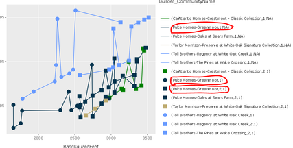
I am able to create custom visual using R Script and make hover over work in that visual by using this below link Link I think It is displaying legend for both line and point as well. This is how it is showing me in the graph
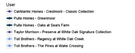
But I would like to show up something like this…. Which represents both the line and point in the same legend name.
Please find the R Script below, Please go through that and can you tell me where I was going wrong….
source('./r_files/flatten_HTML.r')

Library Declarations:

       library(htmlwidgets);library(XML);library(ggplot2);library(plotly);

      Values$Storiesgrouping <- as.character(Values$Storiesgrouping)
      Cols <- as.character(Values$Color)
      names(Cols) <- as.character(Values$Builder_CommunityName)
      Sizs <- as.numeric(Values$Size)
      names(Sizs) <- as.character(Values$Builder_CommunityName)

Actual code:

g <- ggplot(Values, aes(x=BaseSquareFeet, y=BasePriceM,
                        group=Builder_CommunityName, color=Builder_CommunityName))+
  geom_line()+
  geom_point(aes(shape=Storiesgrouping), show.legend=FALSE,size=3)+
  scale_colour_manual(values = Cols)+
  scale_size_manual(values = Sizs)+
  scale_shape_manual(values=c("1"=19, "2"=15, "3+"=17))
plot(g)
- Mark as New
- Bookmark
- Subscribe
- Mute
- Subscribe to RSS Feed
- Permalink
- Report Inappropriate Content
We recommend to send this issue to pbircvsupport@microsoft.com.
This email alias is supported by expirienced R-script developers.
Ignat Vilesov,
Software Engineer
Microsoft Power BI Custom Visuals
Helpful resources

New to Fabric Survey
If you have recently started exploring Fabric, we'd love to hear how it's going. Your feedback can help with product improvements.

Power BI DataViz World Championships - June 2026
A new Power BI DataViz World Championship is coming this June! Don't miss out on submitting your entry.

Join our Fabric User Panel
Share feedback directly with Fabric product managers, participate in targeted research studies and influence the Fabric roadmap.

| User | Count |
|---|---|
| 2 | |
| 1 | |
| 1 | |
| 1 | |
| 1 |


