Fabric Data Days starts November 4th!
Advance your Data & AI career with 50 days of live learning, dataviz contests, hands-on challenges, study groups & certifications and more!
Get registered- Power BI forums
- Get Help with Power BI
- Desktop
- Service
- Report Server
- Power Query
- Mobile Apps
- Developer
- DAX Commands and Tips
- Custom Visuals Development Discussion
- Health and Life Sciences
- Power BI Spanish forums
- Translated Spanish Desktop
- Training and Consulting
- Instructor Led Training
- Dashboard in a Day for Women, by Women
- Galleries
- Data Stories Gallery
- Themes Gallery
- Contests Gallery
- QuickViz Gallery
- Quick Measures Gallery
- Visual Calculations Gallery
- Notebook Gallery
- Translytical Task Flow Gallery
- TMDL Gallery
- R Script Showcase
- Webinars and Video Gallery
- Ideas
- Custom Visuals Ideas (read-only)
- Issues
- Issues
- Events
- Upcoming Events
Get Fabric Certified for FREE during Fabric Data Days. Don't miss your chance! Request now
- Power BI forums
- Forums
- Get Help with Power BI
- Developer
- Re: Merging 2 graphs from different set of slicers...
- Subscribe to RSS Feed
- Mark Topic as New
- Mark Topic as Read
- Float this Topic for Current User
- Bookmark
- Subscribe
- Printer Friendly Page
- Mark as New
- Bookmark
- Subscribe
- Mute
- Subscribe to RSS Feed
- Permalink
- Report Inappropriate Content
Merging 2 graphs from different set of slicers into a stacked column chart
Hi,
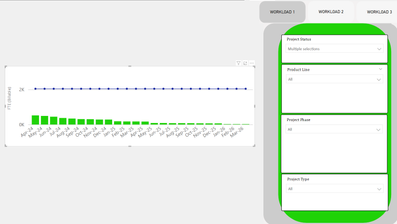
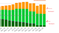
I want to create a new report in PBI where the customer wants to have a report that has 2 graphs/tables ( example given: workload 1 and workload 2) with each has its set of slicers - sort of a template slicers (picture 1). The output of these 2 graphs need to be stacked into one view i.e one stacked column chart (picture 2).
This is so challenging to me, because the 2 graphs/ tables are not fixed, it can be changed by customer at their requirement.
How to do this?
Thank you and regards.
- Mark as New
- Bookmark
- Subscribe
- Mute
- Subscribe to RSS Feed
- Permalink
- Report Inappropriate Content
Hi Rena, Thank you for your respond. However it didnt give the answer im looking for. The report graph from each group slicers (workload 1 and workload 2) need to be combined/stacked in to one main graph (with different colour perhaps). If i need to create a DAX function, how should it be written? Workload 1 and workload 2 are a group of slicers created via bookmarks. Also, im wondering if i need to duplicate my model for each workload?..
- Mark as New
- Bookmark
- Subscribe
- Mute
- Subscribe to RSS Feed
- Permalink
- Report Inappropriate Content
Hi @srt1111 ,
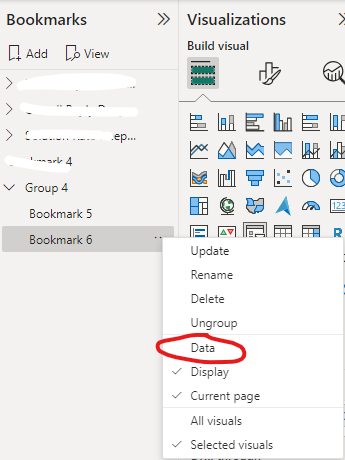
You can get it by creating bookmarks and stacked column chart:
Create page and bookmark navigators - Power BI | Microsoft Learn
Create report bookmarks in Power BI to share insights and build stories - Power BI | Microsoft Learn
Best Regards
Helpful resources

Fabric Data Days
Advance your Data & AI career with 50 days of live learning, contests, hands-on challenges, study groups & certifications and more!

Power BI Monthly Update - October 2025
Check out the October 2025 Power BI update to learn about new features.

| User | Count |
|---|---|
| 5 | |
| 3 | |
| 1 | |
| 1 | |
| 1 |


