Get Fabric certified for FREE!
Don't miss your chance to take the Fabric Data Engineer (DP-700) exam on us!
Learn more- Power BI forums
- Get Help with Power BI
- Desktop
- Service
- Report Server
- Power Query
- Mobile Apps
- Developer
- DAX Commands and Tips
- Custom Visuals Development Discussion
- Health and Life Sciences
- Power BI Spanish forums
- Translated Spanish Desktop
- Training and Consulting
- Instructor Led Training
- Dashboard in a Day for Women, by Women
- Galleries
- Data Stories Gallery
- Themes Gallery
- Contests Gallery
- QuickViz Gallery
- Quick Measures Gallery
- Visual Calculations Gallery
- Notebook Gallery
- Translytical Task Flow Gallery
- TMDL Gallery
- R Script Showcase
- Webinars and Video Gallery
- Ideas
- Custom Visuals Ideas (read-only)
- Issues
- Issues
- Events
- Upcoming Events
We've captured the moments from FabCon & SQLCon that everyone is talking about, and we are bringing them to the community, live and on-demand. Starts on April 14th. Register now
- Power BI forums
- Forums
- Get Help with Power BI
- Developer
- Line chart points from columns
- Subscribe to RSS Feed
- Mark Topic as New
- Mark Topic as Read
- Float this Topic for Current User
- Bookmark
- Subscribe
- Printer Friendly Page
- Mark as New
- Bookmark
- Subscribe
- Mute
- Subscribe to RSS Feed
- Permalink
- Report Inappropriate Content
Line chart points from columns
I have the following SharePoint lists:
Plans:
| Plan | Curve | Description |
| Plan001 | Curve001 | |
| Plan002 | Curve002 |
Curves:
| Curve | ValueA | MeasureA | ValueB | MeasureB |
| Curve001 | 10 | 100 | 50 | 100 |
| Curve002 | 20 | 30 | 40 | 80 |
A User can select a Plan. When it gets selected, I want to draw a lina chart of the corresponding curve, where the datapoints consist of Value (X-Axis) and Measure (Y-Axis).
I managed to get all the values with either measure column or calculation column. But I am not able to draw the chart. I think it is because each field in curve is also a column.
The chart works perfectly when I create a table like this from hand:
| Value | Measure |
| 10 | 100 |
| 50 | 100 |
Is there any way to create such a table automatically when a Plan gets selected? Or do you know any other way how I could achieve this?
Solved! Go to Solution.
- Mark as New
- Bookmark
- Subscribe
- Mute
- Subscribe to RSS Feed
- Permalink
- Report Inappropriate Content
Here is one possible approach
let
    Source = Table.FromRows(Json.Document(Binary.Decompress(Binary.FromText("i45Wci4tKks1MDBU0lEyNAATINIUxozVgSsxAgoZgcSNQYQJiLAAKogFAA==", BinaryEncoding.Base64), Compression.Deflate)), let _t = ((type nullable text) meta [Serialized.Text = true]) in type table [Curve = _t, ValueA = _t, MeasureA = _t, ValueB = _t, MeasureB = _t]),
    #"Changed Type" = Table.TransformColumnTypes(Source,{{"Curve", type text}, {"ValueA", Int64.Type}, {"MeasureA", Int64.Type}, {"ValueB", Int64.Type}, {"MeasureB", Int64.Type}}),
    #"Added Custom" = Table.AddColumn(#"Changed Type", "List", each {{[ValueA],[MeasureA]},{[ValueB],[MeasureB]}}),
    #"Removed Other Columns" = Table.SelectColumns(#"Added Custom",{"Curve", "List"}),
    #"Expanded List" = Table.ExpandListColumn(#"Removed Other Columns", "List"),
    #"Extracted Values" = Table.TransformColumns(#"Expanded List", {"List", each Text.Combine(List.Transform(_, Text.From), "#(tab)"), type text}),
    #"Split Column by Delimiter" = Table.SplitColumn(#"Extracted Values", "List", Splitter.SplitTextByDelimiter("#(tab)", QuoteStyle.Csv), {"x", "y"}),
    #"Changed Type1" = Table.TransformColumnTypes(#"Split Column by Delimiter",{{"x", Int64.Type}, {"y", Int64.Type}})
in
    #"Changed Type1"
- Mark as New
- Bookmark
- Subscribe
- Mute
- Subscribe to RSS Feed
- Permalink
- Report Inappropriate Content
Hi @crizbe ,
I think you can create a relationship between Plan table and Curve table by [Curve] column.
For reference: Create and manage relationships in Power BI Desktop
Then you can create a slicer by [Plan] column from Plan table.
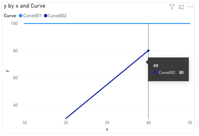
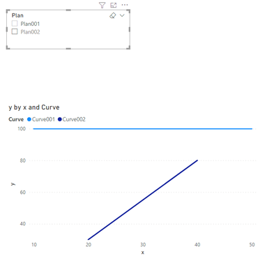
By default:
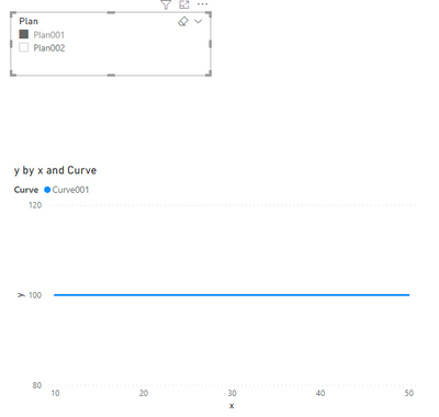
Select Plan001:
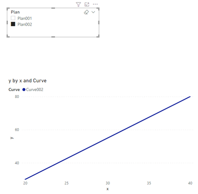
Select Plan002:
Best Regards,
Rico Zhou
If this post helps, then please consider Accept it as the solution to help the other members find it more quickly.
- Mark as New
- Bookmark
- Subscribe
- Mute
- Subscribe to RSS Feed
- Permalink
- Report Inappropriate Content
Yes, usually you would need to unpivot your Curves table - in this case in pairs.
What's the importance of "A" and "B" - does that play any role later?
- Mark as New
- Bookmark
- Subscribe
- Mute
- Subscribe to RSS Feed
- Permalink
- Report Inappropriate Content
Thanks, yes A and B are the X and Y Values of each point in the chart
- Mark as New
- Bookmark
- Subscribe
- Mute
- Subscribe to RSS Feed
- Permalink
- Report Inappropriate Content
Hi @crizbe ,
I agree with lbendlin's reply. Due to we cannot see calculated column or measure created by Dax in Power Query Editor, firstly, you need to calcualte MeasureA and MeasureB by M code in Power Query Editor. Then you can follow lbendlin's step to unpivot your table.
Best Regards,
Rico Zhou
If this post helps, then please consider Accept it as the solution to help the other members find it more quickly.
- Mark as New
- Bookmark
- Subscribe
- Mute
- Subscribe to RSS Feed
- Permalink
- Report Inappropriate Content
Here is one possible approach
let
    Source = Table.FromRows(Json.Document(Binary.Decompress(Binary.FromText("i45Wci4tKks1MDBU0lEyNAATINIUxozVgSsxAgoZgcSNQYQJiLAAKogFAA==", BinaryEncoding.Base64), Compression.Deflate)), let _t = ((type nullable text) meta [Serialized.Text = true]) in type table [Curve = _t, ValueA = _t, MeasureA = _t, ValueB = _t, MeasureB = _t]),
    #"Changed Type" = Table.TransformColumnTypes(Source,{{"Curve", type text}, {"ValueA", Int64.Type}, {"MeasureA", Int64.Type}, {"ValueB", Int64.Type}, {"MeasureB", Int64.Type}}),
    #"Added Custom" = Table.AddColumn(#"Changed Type", "List", each {{[ValueA],[MeasureA]},{[ValueB],[MeasureB]}}),
    #"Removed Other Columns" = Table.SelectColumns(#"Added Custom",{"Curve", "List"}),
    #"Expanded List" = Table.ExpandListColumn(#"Removed Other Columns", "List"),
    #"Extracted Values" = Table.TransformColumns(#"Expanded List", {"List", each Text.Combine(List.Transform(_, Text.From), "#(tab)"), type text}),
    #"Split Column by Delimiter" = Table.SplitColumn(#"Extracted Values", "List", Splitter.SplitTextByDelimiter("#(tab)", QuoteStyle.Csv), {"x", "y"}),
    #"Changed Type1" = Table.TransformColumnTypes(#"Split Column by Delimiter",{{"x", Int64.Type}, {"y", Int64.Type}})
in
    #"Changed Type1"
- Mark as New
- Bookmark
- Subscribe
- Mute
- Subscribe to RSS Feed
- Permalink
- Report Inappropriate Content
Thank you very much. It worked like a charm! I have one slight issue now. How am I able to filter the values now based on selectedValues?
- Mark as New
- Bookmark
- Subscribe
- Mute
- Subscribe to RSS Feed
- Permalink
- Report Inappropriate Content
Hi @crizbe ,
I think you can create a relationship between Plan table and Curve table by [Curve] column.
For reference: Create and manage relationships in Power BI Desktop
Then you can create a slicer by [Plan] column from Plan table.
By default:
Select Plan001:
Select Plan002:
Best Regards,
Rico Zhou
If this post helps, then please consider Accept it as the solution to help the other members find it more quickly.
- Mark as New
- Bookmark
- Subscribe
- Mute
- Subscribe to RSS Feed
- Permalink
- Report Inappropriate Content
Thank you so much! It works as expected now.
Helpful resources

New to Fabric Survey
If you have recently started exploring Fabric, we'd love to hear how it's going. Your feedback can help with product improvements.

Power BI DataViz World Championships - June 2026
A new Power BI DataViz World Championship is coming this June! Don't miss out on submitting your entry.

Join our Fabric User Panel
Share feedback directly with Fabric product managers, participate in targeted research studies and influence the Fabric roadmap.

| User | Count |
|---|---|
| 2 | |
| 1 | |
| 1 | |
| 1 | |
| 1 |


