FabCon is coming to Atlanta
Join us at FabCon Atlanta from March 16 - 20, 2026, for the ultimate Fabric, Power BI, AI and SQL community-led event. Save $200 with code FABCOMM.
Register now!- Power BI forums
- Get Help with Power BI
- Desktop
- Service
- Report Server
- Power Query
- Mobile Apps
- Developer
- DAX Commands and Tips
- Custom Visuals Development Discussion
- Health and Life Sciences
- Power BI Spanish forums
- Translated Spanish Desktop
- Training and Consulting
- Instructor Led Training
- Dashboard in a Day for Women, by Women
- Galleries
- Data Stories Gallery
- Themes Gallery
- Contests Gallery
- QuickViz Gallery
- Quick Measures Gallery
- Visual Calculations Gallery
- Notebook Gallery
- Translytical Task Flow Gallery
- TMDL Gallery
- R Script Showcase
- Webinars and Video Gallery
- Ideas
- Custom Visuals Ideas (read-only)
- Issues
- Issues
- Events
- Upcoming Events
Vote for your favorite vizzies from the Power BI Dataviz World Championship submissions. Vote now!
- Power BI forums
- Forums
- Get Help with Power BI
- Developer
- Line and Clustered Column Chart Assistance
- Subscribe to RSS Feed
- Mark Topic as New
- Mark Topic as Read
- Float this Topic for Current User
- Bookmark
- Subscribe
- Printer Friendly Page
- Mark as New
- Bookmark
- Subscribe
- Mute
- Subscribe to RSS Feed
- Permalink
- Report Inappropriate Content
Line and Clustered Column Chart Assistance
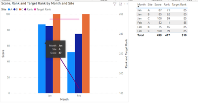
Hello, I am working on creating a line and clustered column chart for custom service rankings by month and site.
The problem I run into is the columns only allow me to select the "count" of the number of rankings, average, median etc... however, in the data I imported (see example below), I already have the values I want for rankings and score. However, the chart is averaging the rankings and score OR counting the number of distinct values I have. How can I get the chart to display exactly the values I have in the chart I imported?
Is it also possible to add a second line for a target rank?
| Site | Month | Score | Rank | Target Rank |
| A | Jan | 87 | 71 | 85 |
| B | Jan | 85 | 62 | 85 |
| C | Jan | 100 | 99 | 85 |
| A | Feb | 52 | 1 | 85 |
| B | Feb | 75 | 85 | 85 |
| C | Feb | 100 | 99 | 85 |
Thank you in advance!
- Mark as New
- Bookmark
- Subscribe
- Mute
- Subscribe to RSS Feed
- Permalink
- Report Inappropriate Content
Hi @datanewbie ,
Yes, even though it is sum or average, as long as your you put site and month into chart. chart will show the numbers you imported. The common way to get the imported value in power bi is max().
Best Regards
Community Support Team _ chenwu zhu
If this post helps, then please consider Accept it as the solution to help the other members find it more quickly.
- Mark as New
- Bookmark
- Subscribe
- Mute
- Subscribe to RSS Feed
- Permalink
- Report Inappropriate Content
Thank you for your help. I was able to get the imported value by using max ( ). However, on the x-value I want the months in chronological order but I noticed for the values where I use the slicer for certain locations if February values are greater than January, it flips the order of the months on the x-axis. How can I overcome this?
Helpful resources

Power BI Dataviz World Championships
Vote for your favorite vizzies from the Power BI World Championship submissions!

Join our Community Sticker Challenge 2026
If you love stickers, then you will definitely want to check out our Community Sticker Challenge!

Power BI Monthly Update - January 2026
Check out the January 2026 Power BI update to learn about new features.

| User | Count |
|---|---|
| 3 | |
| 2 | |
| 2 | |
| 1 | |
| 1 |


