FabCon is coming to Atlanta
Join us at FabCon Atlanta from March 16 - 20, 2026, for the ultimate Fabric, Power BI, AI and SQL community-led event. Save $200 with code FABCOMM.
Register now!- Power BI forums
- Get Help with Power BI
- Desktop
- Service
- Report Server
- Power Query
- Mobile Apps
- Developer
- DAX Commands and Tips
- Custom Visuals Development Discussion
- Health and Life Sciences
- Power BI Spanish forums
- Translated Spanish Desktop
- Training and Consulting
- Instructor Led Training
- Dashboard in a Day for Women, by Women
- Galleries
- Data Stories Gallery
- Themes Gallery
- Contests Gallery
- QuickViz Gallery
- Quick Measures Gallery
- Visual Calculations Gallery
- Notebook Gallery
- Translytical Task Flow Gallery
- TMDL Gallery
- R Script Showcase
- Webinars and Video Gallery
- Ideas
- Custom Visuals Ideas (read-only)
- Issues
- Issues
- Events
- Upcoming Events
The Power BI Data Visualization World Championships is back! Get ahead of the game and start preparing now! Learn more
- Power BI forums
- Forums
- Get Help with Power BI
- Developer
- How to create a bar chart using start and end time...
- Subscribe to RSS Feed
- Mark Topic as New
- Mark Topic as Read
- Float this Topic for Current User
- Bookmark
- Subscribe
- Printer Friendly Page
- Mark as New
- Bookmark
- Subscribe
- Mute
- Subscribe to RSS Feed
- Permalink
- Report Inappropriate Content
How to create a bar chart using start and end times.
I have another questin now. I am trying to create a graph showing how many cars are drving at a certain hour. To do this I have start times and end times in my data. have created a time frequancy graph based on start times, which shows how many cars start at a certain time:
However this only shows the start times. How do I geth this graph to show the time inbetween the stat and the end time. For example:
If a car drove from 10:00 -13:00 using only strta times it adds one point to 10:00. I need it to add a point to 10:00, 11:00 and 12:00. How can I do this?
Solved! Go to Solution.
- Mark as New
- Bookmark
- Subscribe
- Mute
- Subscribe to RSS Feed
- Permalink
- Report Inappropriate Content
Hi @CalleWagenaar ,
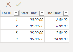
Based on your description, I have created a simple sample:
Please try:
First create a new time table:
Then create a measure:
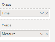
Measure = SUMX('Table',IF([Start Time]<=MAX('Time'[Time])&&[End Time]>=MAX('Time'[Time]),1))Apply it to the visual:
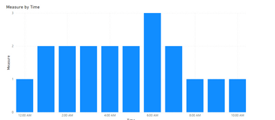
Final output:
Best Regards,
Jianbo Li
If this post helps, then please consider Accept it as the solution to help the other members find it more quickly.
- Mark as New
- Bookmark
- Subscribe
- Mute
- Subscribe to RSS Feed
- Permalink
- Report Inappropriate Content
This doesn't work for me, when I follow the step there are no errors. However when I try to create the graph it is blank.
- Mark as New
- Bookmark
- Subscribe
- Mute
- Subscribe to RSS Feed
- Permalink
- Report Inappropriate Content
I exactly followed your steps with your exact data and there is still no resut
- Mark as New
- Bookmark
- Subscribe
- Mute
- Subscribe to RSS Feed
- Permalink
- Report Inappropriate Content
In Power Query you can use List.Generate to create the time series for each car (with hourly granularity), from Start date/hour to end date/hour. Then you can use these calculated data points in your visual.
Helpful resources

Power BI Dataviz World Championships
The Power BI Data Visualization World Championships is back! Get ahead of the game and start preparing now!

| User | Count |
|---|---|
| 3 | |
| 3 | |
| 2 | |
| 1 | |
| 1 |


