- Subscribe to RSS Feed
- Mark Topic as New
- Mark Topic as Read
- Float this Topic for Current User
- Bookmark
- Subscribe
- Printer Friendly Page
- Mark as New
- Bookmark
- Subscribe
- Mute
- Subscribe to RSS Feed
- Permalink
- Report Inappropriate Content
How to calculate count of IDs per Average Number of Hours bucket
I am very new to PBI and DAX in general so I'm sorry if this is obvious but I would really appreciate any detailed explanations. I have a table with PersonID and Average Number of Hours per Week in a table that looks like this:
| PersonID | Average Number of Hours per Week |
| 100 | 40 |
| 201 | 35 |
| 302 | 32 |
| 443 | 40 |
| 512 | 40 |
| 643 | 32 |
and I would like to make a table/graph to show this data
| Average Number of Hours Per Week | Count of PersonID |
| 40 | 3 |
| 35 | 1 |
| 32 | 2 |
Solved! Go to Solution.
- Mark as New
- Bookmark
- Subscribe
- Mute
- Subscribe to RSS Feed
- Permalink
- Report Inappropriate Content
Thanks @dm-p I think I managed to find myself to a solution. I ended up exporting the data from the measure I made which did result in a new table with a 1:1 relationship between ID and average hours worked, each of the values becoming implicit measures I believe. I played around enough to get the chart accurate, although there are a few outliers that proved to be true because of weird, but accurate data. Thanks for taking the time to help me out! This community seems really nice
- Mark as New
- Bookmark
- Subscribe
- Mute
- Subscribe to RSS Feed
- Permalink
- Report Inappropriate Content
Hi @nbarta,
Welcome to learning Power BI and DAX!
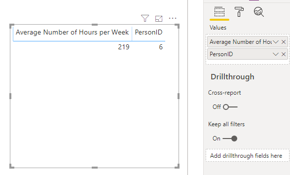
I assume you're getting something like this when you try?
If so, Power BI is treating your Average Number of Hours per Week field as an implicit measure, because it's numeric.
You don't want to change this behaviour, as this is a good candidate for other calculations, but you can change this for the visual that you want to group it in.
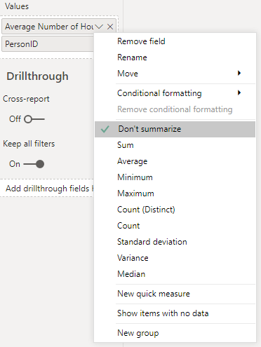
In the fields list, click on the caret (down arrow) next to Average Number of Hours per Week and select Don't summarize, e.g.:
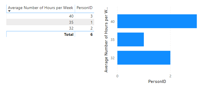
This will tell the visual to group by the unique values rather than aggregate them, and this should give you what you need, e.g.:
Hopefully this should be all you need to proceed.
Just to let you know, if you have any further questions specific to DAX, then it's generally better to post them in the DAX Commands and Tips forum, as it is a lot more heavily frequented than this developer forum and you'll get a much faster answer. The DAX folks don't look in here too often 😉
All the best,
Daniel
If my post solves your challenge, then please consider accepting as a solution to help other forum members find the answer more quickly 🙂
Did I answer your question? Mark my post as a solution!
Proud to be a Super User!
My course: Introduction to Developing Power BI Visuals
On how to ask a technical question, if you really want an answer (courtesy of SQLBI)
- Mark as New
- Bookmark
- Subscribe
- Mute
- Subscribe to RSS Feed
- Permalink
- Report Inappropriate Content
Hi @dm-p Thank you for replying! I'll take that advice and start looking in the other forum more than this one 🙂
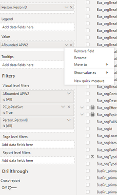
Your suggestion did not quite work for me. I think the issue is that my Average Hours by Week also is a calculated measure:
- Mark as New
- Bookmark
- Subscribe
- Mute
- Subscribe to RSS Feed
- Permalink
- Report Inappropriate Content
Hi @nbarta,
Thanks for coming back. It's good to know whether you're working with a measure or a column - I assumed a column. You won't get the Don't summarize option with a measure as measures are always aggregations and can't work as a grouping like you want in this case.
The challenge you'll have here is that the measure is going to perform as an aggregation of the values for the current row context - without a suitable accompanying column/field in the visual to group by, you're likely to always get a scalar (single) value because there are no rows in the resulting dataset.
The fact that you're using KEEPFILTERS implies that you're wanting this measure to be dynamic based on filter context?
What you want is quite an advanced scenario (at least for me!) and I think it needs a wider audience for input. I would suggest cross-posting this question in the previously-linked DAX forum with as much info as possible and I'm optimistic they can help you much faster than if the question remains open here.
Good luck!
Daniel
Did I answer your question? Mark my post as a solution!
Proud to be a Super User!
My course: Introduction to Developing Power BI Visuals
On how to ask a technical question, if you really want an answer (courtesy of SQLBI)
- Mark as New
- Bookmark
- Subscribe
- Mute
- Subscribe to RSS Feed
- Permalink
- Report Inappropriate Content
Thanks @dm-p I think I managed to find myself to a solution. I ended up exporting the data from the measure I made which did result in a new table with a 1:1 relationship between ID and average hours worked, each of the values becoming implicit measures I believe. I played around enough to get the chart accurate, although there are a few outliers that proved to be true because of weird, but accurate data. Thanks for taking the time to help me out! This community seems really nice
- Mark as New
- Bookmark
- Subscribe
- Mute
- Subscribe to RSS Feed
- Permalink
- Report Inappropriate Content
Hi @nbarta, and it's great that you found an approach that works for you! It might be worth marking your previous post as the solution, just to close-off the thread and allow any followers to see where the resolution ended up.
Glad you're finding the community a nice place to be - it's a great place to learn and network 🙂
All the best,
Daniel
Did I answer your question? Mark my post as a solution!
Proud to be a Super User!
My course: Introduction to Developing Power BI Visuals
On how to ask a technical question, if you really want an answer (courtesy of SQLBI)
Helpful resources

Join us at the Microsoft Fabric Community Conference
March 31 - April 2, 2025, in Las Vegas, Nevada. Use code MSCUST for a $150 discount!

Power BI Monthly Update - January 2025
Check out the January 2025 Power BI update to learn about new features in Reporting, Modeling, and Data Connectivity.

| Subject | Author | Posted | |
|---|---|---|---|
| 01-25-2024 11:03 PM | |||
|
Anonymous
| 03-07-2024 08:14 AM | ||
| 07-17-2024 12:27 PM | |||
| 06-13-2024 04:11 AM | |||
| 03-07-2024 06:33 AM |
| User | Count |
|---|---|
| 6 | |
| 1 | |
| 1 | |
| 1 | |
| 1 |
| User | Count |
|---|---|
| 10 | |
| 2 | |
| 2 | |
| 2 | |
| 2 |
