FabCon is coming to Atlanta
Join us at FabCon Atlanta from March 16 - 20, 2026, for the ultimate Fabric, Power BI, AI and SQL community-led event. Save $200 with code FABCOMM.
Register now!- Power BI forums
- Get Help with Power BI
- Desktop
- Service
- Report Server
- Power Query
- Mobile Apps
- Developer
- DAX Commands and Tips
- Custom Visuals Development Discussion
- Health and Life Sciences
- Power BI Spanish forums
- Translated Spanish Desktop
- Training and Consulting
- Instructor Led Training
- Dashboard in a Day for Women, by Women
- Galleries
- Data Stories Gallery
- Themes Gallery
- Contests Gallery
- QuickViz Gallery
- Quick Measures Gallery
- Visual Calculations Gallery
- Notebook Gallery
- Translytical Task Flow Gallery
- TMDL Gallery
- R Script Showcase
- Webinars and Video Gallery
- Ideas
- Custom Visuals Ideas (read-only)
- Issues
- Issues
- Events
- Upcoming Events
The Power BI Data Visualization World Championships is back! Get ahead of the game and start preparing now! Learn more
- Power BI forums
- Forums
- Get Help with Power BI
- Developer
- How to add dynamic labels to the Power BI map visu...
- Subscribe to RSS Feed
- Mark Topic as New
- Mark Topic as Read
- Float this Topic for Current User
- Bookmark
- Subscribe
- Printer Friendly Page
- Mark as New
- Bookmark
- Subscribe
- Mute
- Subscribe to RSS Feed
- Permalink
- Report Inappropriate Content
How to add dynamic labels to the Power BI map visual
No one of Power BI map visuals is able to show dynamic (filters dependent) labels.
But it is possible to overcome this restriction, to some extent, with custom visual “Icon Map” by Altius: https://powerbi.jamesdales.com/how-to-use-icon-map/
(it is necessary to download visual from https://icon-map.com/, the one that can be installed via Power BI Desktop is too outdated).
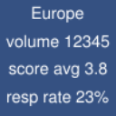
“Icon Map” can show icons (images) instead of bubbles. And URLs of these images can be dynamically calculated via measures, depending on the filters, etc.
Using this approach it is possible to generate images with text “on the fly” using special free online services.
Example:
Some disadvantage is that this method requires sending label’s text to external services. So you need to be sure that there are no secrets in it. Or to install your own service of such kind 🙂
- Mark as New
- Bookmark
- Subscribe
- Mute
- Subscribe to RSS Feed
- Permalink
- Report Inappropriate Content
Hi @pavel_severov ,
Thanks for your sharing, it will help others if they encounter the similar problem with yours. Really appreciate your dedication.
Best Regards
Helpful resources

Power BI Dataviz World Championships
The Power BI Data Visualization World Championships is back! Get ahead of the game and start preparing now!

| User | Count |
|---|---|
| 4 | |
| 2 | |
| 2 | |
| 1 | |
| 1 |
| User | Count |
|---|---|
| 4 | |
| 4 | |
| 4 | |
| 3 | |
| 2 |


