FabCon is coming to Atlanta
Join us at FabCon Atlanta from March 16 - 20, 2026, for the ultimate Fabric, Power BI, AI and SQL community-led event. Save $200 with code FABCOMM.
Register now!- Power BI forums
- Get Help with Power BI
- Desktop
- Service
- Report Server
- Power Query
- Mobile Apps
- Developer
- DAX Commands and Tips
- Custom Visuals Development Discussion
- Health and Life Sciences
- Power BI Spanish forums
- Translated Spanish Desktop
- Training and Consulting
- Instructor Led Training
- Dashboard in a Day for Women, by Women
- Galleries
- Data Stories Gallery
- Themes Gallery
- Contests Gallery
- QuickViz Gallery
- Quick Measures Gallery
- Visual Calculations Gallery
- Notebook Gallery
- Translytical Task Flow Gallery
- TMDL Gallery
- R Script Showcase
- Webinars and Video Gallery
- Ideas
- Custom Visuals Ideas (read-only)
- Issues
- Issues
- Events
- Upcoming Events
The Power BI Data Visualization World Championships is back! Get ahead of the game and start preparing now! Learn more
- Power BI forums
- Forums
- Get Help with Power BI
- Developer
- How to Order wise align clusterd chart
- Subscribe to RSS Feed
- Mark Topic as New
- Mark Topic as Read
- Float this Topic for Current User
- Bookmark
- Subscribe
- Printer Friendly Page
- Mark as New
- Bookmark
- Subscribe
- Mute
- Subscribe to RSS Feed
- Permalink
- Report Inappropriate Content
How to Order wise align clusterd chart
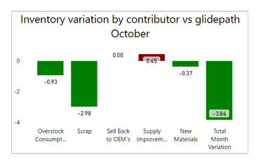
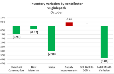
I want to make this graph order wise like below
Solved! Go to Solution.
- Mark as New
- Bookmark
- Subscribe
- Mute
- Subscribe to RSS Feed
- Permalink
- Report Inappropriate Content
Hi @Anonymous ,
I created a sample pbix file(see attachment), please check whether that is what you want.
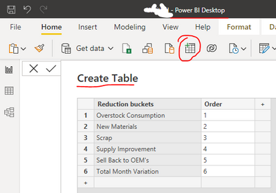
1. Create a sorted table by manual typing. You can also put this sorted table on a cloud-based file (e.g. OneDrive), which makes it easy to maintain and refresh later.
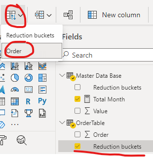
2. Select the field "Reduction buckets" and sort by column "Order"
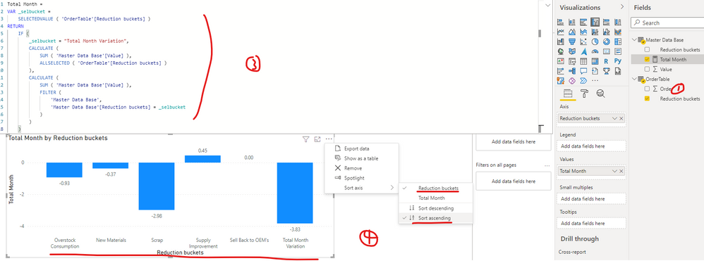
3. Update the formula of your measure [Total Month] as below:
Total Month =
VAR _selbucket =
    SELECTEDVALUE ( 'OrderTable'[Reduction buckets] )
RETURN
    IF (
        _selbucket = "Total Month Variation",
        CALCULATE (
            SUM ( 'Master Data Base'[Value] ),
            ALLSELECTED ( 'OrderTable'[Reduction buckets] )
        ),
        CALCULATE (
            SUM ( 'Master Data Base'[Value] ),
            FILTER (
                'Master Data Base',
                'Master Data Base'[Reduction buckets] = _selbucket
            )
        )
    )
4. Create a clustered column chart(Axis:Reduction buckets of table OrderTable Values: Total Month)
Best Regards
- Mark as New
- Bookmark
- Subscribe
- Mute
- Subscribe to RSS Feed
- Permalink
- Report Inappropriate Content

I want to make this graph order wise like below

Helpful resources

Power BI Dataviz World Championships
The Power BI Data Visualization World Championships is back! Get ahead of the game and start preparing now!

| User | Count |
|---|---|
| 9 | |
| 6 | |
| 4 | |
| 4 | |
| 3 |
