Get Fabric certified for FREE!
Don't miss your chance to take the Fabric Data Engineer (DP-700) exam on us!
Learn more- Power BI forums
- Get Help with Power BI
- Desktop
- Service
- Report Server
- Power Query
- Mobile Apps
- Developer
- DAX Commands and Tips
- Custom Visuals Development Discussion
- Health and Life Sciences
- Power BI Spanish forums
- Translated Spanish Desktop
- Training and Consulting
- Instructor Led Training
- Dashboard in a Day for Women, by Women
- Galleries
- Data Stories Gallery
- Themes Gallery
- Contests Gallery
- QuickViz Gallery
- Quick Measures Gallery
- Visual Calculations Gallery
- Notebook Gallery
- Translytical Task Flow Gallery
- TMDL Gallery
- R Script Showcase
- Webinars and Video Gallery
- Ideas
- Custom Visuals Ideas (read-only)
- Issues
- Issues
- Events
- Upcoming Events
We've captured the moments from FabCon & SQLCon that everyone is talking about, and we are bringing them to the community, live and on-demand. Starts on April 14th. Register now
- Power BI forums
- Forums
- Get Help with Power BI
- Developer
- Export Dynamic Data Labels to Excel
- Subscribe to RSS Feed
- Mark Topic as New
- Mark Topic as Read
- Float this Topic for Current User
- Bookmark
- Subscribe
- Printer Friendly Page
- Mark as New
- Bookmark
- Subscribe
- Mute
- Subscribe to RSS Feed
- Permalink
- Report Inappropriate Content
Export Dynamic Data Labels to Excel
Dear support community,
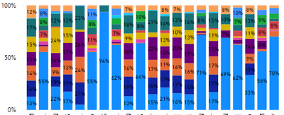
The percentage shown in this chart is Dynamic Data Labels created by Power BI. When user export the data to Excel the percentage data doesn't export. Is there anyway we can export it?
Thank you.
BiDev.
Solved! Go to Solution.
- Mark as New
- Bookmark
- Subscribe
- Mute
- Subscribe to RSS Feed
- Permalink
- Report Inappropriate Content
Hi @AlwaysBI ,
According to your description, you are actually using the field 'Target' with the aggregation(SUM) on the Y-axis. But you are using 100% stacked column chart, and you want to export the data with the percentage values as well. However this is not possible...
Export data from a Power BI visualization - Power BI | Microsoft Learn
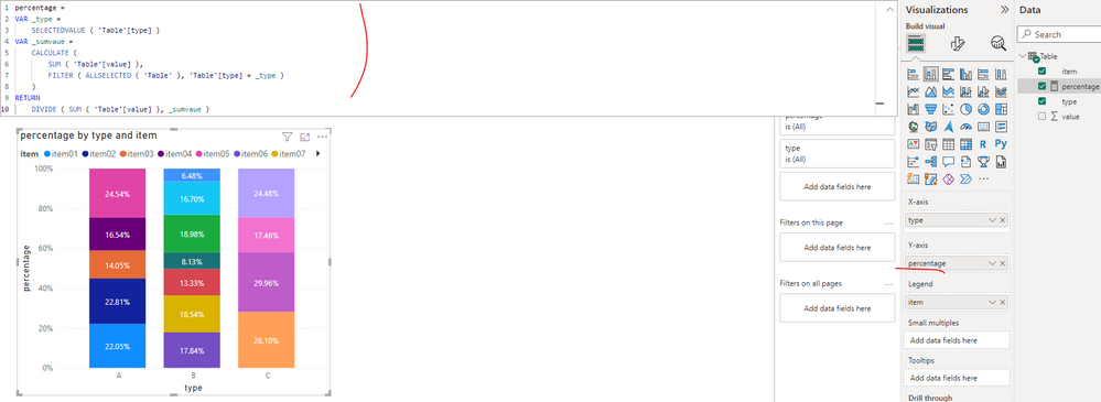
You can do what I did in the pbix file in my previous reply, change the visual type to stacked column chart and create a measure to get the percentage. Then put it on the Y axis to replace the original field (SUM('Table'[Target]))...
percentage =
VAR _location =
    SELECTEDVALUE ( 'Table'[Location] )
VAR _sumtarget =
    CALCULATE (
        SUM ( 'Table'[Target] ),
        FILTER ( ALLSELECTED ( 'Table' ), 'Table'[Location] = _location )
    )
RETURN
    DIVIDE ( SUM ( 'Table'[Target] ), _sumtarget )
Best Regards
- Mark as New
- Bookmark
- Subscribe
- Mute
- Subscribe to RSS Feed
- Permalink
- Report Inappropriate Content
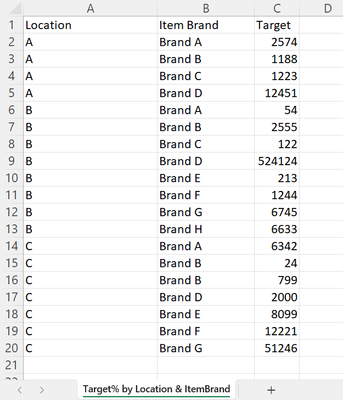
This is a sample of exported data we have.
Basically our data is the exact number instead of percentage, but in BI dashboard, we have the percentage as data labels, we wanted to get the data label percentage as well as the exact number exported if possible.
- Mark as New
- Bookmark
- Subscribe
- Mute
- Subscribe to RSS Feed
- Permalink
- Report Inappropriate Content
Hi @AlwaysBI ,
According to your description, you are actually using the field 'Target' with the aggregation(SUM) on the Y-axis. But you are using 100% stacked column chart, and you want to export the data with the percentage values as well. However this is not possible...
Export data from a Power BI visualization - Power BI | Microsoft Learn
You can do what I did in the pbix file in my previous reply, change the visual type to stacked column chart and create a measure to get the percentage. Then put it on the Y axis to replace the original field (SUM('Table'[Target]))...
percentage =
VAR _location =
    SELECTEDVALUE ( 'Table'[Location] )
VAR _sumtarget =
    CALCULATE (
        SUM ( 'Table'[Target] ),
        FILTER ( ALLSELECTED ( 'Table' ), 'Table'[Location] = _location )
    )
RETURN
    DIVIDE ( SUM ( 'Table'[Target] ), _sumtarget )
Best Regards
- Mark as New
- Bookmark
- Subscribe
- Mute
- Subscribe to RSS Feed
- Permalink
- Report Inappropriate Content
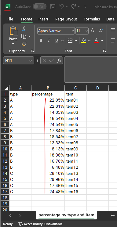
Hi @AlwaysBI ,
I created a sample pbix file(see the attachment), it can export the field with the percentage. How did you set your chart? Could you please provide some raw data in your tables(exclude sensitive data) with Text format and the Fields settings of your visual. It would be helpful to find out the solution. You can refer the following link to share the required info:
How to provide sample data in the Power BI Forum

And It is better if you can share a simplified pbix file. You can refer the following link to upload the file to the community. Thank you.
How to upload PBI in Community
Best Regards
Helpful resources

New to Fabric Survey
If you have recently started exploring Fabric, we'd love to hear how it's going. Your feedback can help with product improvements.

Power BI DataViz World Championships - June 2026
A new Power BI DataViz World Championship is coming this June! Don't miss out on submitting your entry.

Join our Fabric User Panel
Share feedback directly with Fabric product managers, participate in targeted research studies and influence the Fabric roadmap.

| User | Count |
|---|---|
| 2 | |
| 1 | |
| 1 | |
| 1 | |
| 1 |


