Party with Power BI’s own Guy in a Cube
Power BI is turning 10! Tune in for a special live episode on July 24 with behind-the-scenes stories, product evolution highlights, and a sneak peek at what’s in store for the future.
Save the date- Power BI forums
- Get Help with Power BI
- Desktop
- Service
- Report Server
- Power Query
- Mobile Apps
- Developer
- DAX Commands and Tips
- Custom Visuals Development Discussion
- Health and Life Sciences
- Power BI Spanish forums
- Translated Spanish Desktop
- Training and Consulting
- Instructor Led Training
- Dashboard in a Day for Women, by Women
- Galleries
- Webinars and Video Gallery
- Data Stories Gallery
- Themes Gallery
- Contests Gallery
- Quick Measures Gallery
- Notebook Gallery
- Translytical Task Flow Gallery
- R Script Showcase
- Ideas
- Custom Visuals Ideas (read-only)
- Issues
- Issues
- Events
- Upcoming Events
Enhance your career with this limited time 50% discount on Fabric and Power BI exams. Ends August 31st. Request your voucher.
- Power BI forums
- Forums
- Get Help with Power BI
- Developer
- Embedded dashboard not adjusting to screen size/mo...
- Subscribe to RSS Feed
- Mark Topic as New
- Mark Topic as Read
- Float this Topic for Current User
- Bookmark
- Subscribe
- Printer Friendly Page
- Mark as New
- Bookmark
- Subscribe
- Mute
- Subscribe to RSS Feed
- Permalink
- Report Inappropriate Content
Embedded dashboard not adjusting to screen size/mobile
Hi,
I have created my PowerBi reports, I have created the mobile view on PowerBi desktop, I have then embedded the report in an iFrame on my website (with the reportId, GroupId etc.).
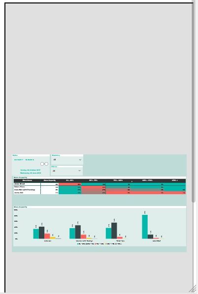
The report displays fine when viewing in a webpage. However if you resize the webpage, the report does not change its view to adjust to the screen, rather it zooms out and remains a rectangular report (jsut very very small).
If I just load the iFrame code into the browser and change the screen size, same issue.
I I load the report url from a mobile device, it also displays the same issues (see image).
If I load the report in app,powerbi and click mobile view it aligns correctly.
I have tried to read up on articles on how to correct but cant seen to find a solution. Can anyone assist?
The above image is an example of how the report displays on a mobile device. Am I setting some wrng parameters in the aspx code for the container or something?
<%@ Page Language="C#" AutoEventWireup="true" Async="true" CodeFile="mypage.aspx.cs" Inherits="_Default" %>

<!DOCTYPE html>

<html xmlns="http://www.w3.org/1999/xhtml">
<head runat="server">
<META name="viewport" content="width=device-width, initial-scale=1.0, maximum-scale=1.0">
<META name="description" content="Syenap">
<META name="author" content="Syenap">

    <script src="https://npmcdn.com/es6-promise@3.2.1"></script>
    <script src="Scripts/jquery-1.10.2.js"></script>
    <script src="Scripts/jquery-1.10.2.min.js"></script>
    <script src="Scripts/powerbi.js"></script>

    <style>
    #reportContainer {
        width: 100%;
        height: 650px;
        background-color: white;
        padding: 0px;
        clear: both;
    }
    .desktop-view iframe, .mobile-view iframe {
        border: none;
    }
</style>
    <script>
        $(document).ready(function () {
            var accessToken = document.getElementById("<%= hdnAccessToken.ClientID %>").value;
            var embedUrl = document.getElementById("<%= hdnEmbedUrl.ClientID %>").value;
            var embedReportId = document.getElementById("<%= hdnEmbedReportId.ClientID %>").value;
             var sectionName = document.getElementById("<%= hdnSectionName.ClientID %>").value;
            var models = window['powerbi-client'].models;
            //debugger
            var config = {
                type: 'report',
                tokenType: models.TokenType.Embed,
                accessToken: accessToken,
                embedUrl: embedUrl,
                id: embedReportId,
				//pageView: "oneColumn",
                permissions: models.Permissions.All,
                settings: {
                    filterPaneEnabled: false,
                    navContentPaneEnabled: false,
                    localeSettings: {
                        language: "en-GB",
                        formatLocale: "en-GB"
                    }
                }//,
                //pageName: sectionName
            };

            var reportContainer = $('#reportContainer')[0];
            var report = powerbi.embed(reportContainer, config);

        });


    </script>

</head>
<body style="vertical-align: top;position: relative;top: 0;">
    <form id="form1" runat="server" style="vertical-align: top;position: relative;top: 0;">
    <div style="vertical-align: top;">
        <asp:HiddenField ID="hdnAccessToken" runat="server"></asp:HiddenField>
        <asp:HiddenField ID="hdnEmbedUrl" runat="server"></asp:HiddenField>
        <asp:HiddenField ID="hdnEmbedReportId" runat="server"></asp:HiddenField>
        <asp:HiddenField ID="hdnSectionName" runat="server"></asp:HiddenField>
        <div id="reportContainer" style="height:650px;width:100%;vertical-align: top;position: relative;top: 0;left:0;"></div>
        <asp:Label Id ="lblMessage" runat="server" />
    </div>
    </form>
</body>
</html>
- Mark as New
- Bookmark
- Subscribe
- Mute
- Subscribe to RSS Feed
- Permalink
- Report Inappropriate Content
Anyone have an answer for this? The internet is surprisingly limited in information...
- Mark as New
- Bookmark
- Subscribe
- Mute
- Subscribe to RSS Feed
- Permalink
- Report Inappropriate Content
Hi Duggy,
I realise this is from a little while back but in order to get your embedded content to use the mobile view you will need to do some magic in your web app to detect the size of the page/frame and when it gets under a certain wide switch your javascript call to render the report using the mobile view instead of the standard landscape one.
You can also get more specific and define a custom layout to apply - it's more complex but allows fine-grained control over the elements that are shown and where they are placed.
There is an article here that has some links off to relevant articles that might help:
https://azure.microsoft.com/en-us/updates/mobile-layout-support/
Hope you get it (or have already got it) sorted!
Helpful resources

Power BI Monthly Update - July 2025
Check out the July 2025 Power BI update to learn about new features.

| User | Count |
|---|---|
| 6 | |
| 6 | |
| 3 | |
| 2 | |
| 2 |
| User | Count |
|---|---|
| 6 | |
| 5 | |
| 4 | |
| 4 | |
| 3 |


