Fabric Data Days starts November 4th!
Advance your Data & AI career with 50 days of live learning, dataviz contests, hands-on challenges, study groups & certifications and more!
Get registered- Power BI forums
- Get Help with Power BI
- Desktop
- Service
- Report Server
- Power Query
- Mobile Apps
- Developer
- DAX Commands and Tips
- Custom Visuals Development Discussion
- Health and Life Sciences
- Power BI Spanish forums
- Translated Spanish Desktop
- Training and Consulting
- Instructor Led Training
- Dashboard in a Day for Women, by Women
- Galleries
- Data Stories Gallery
- Themes Gallery
- Contests Gallery
- Quick Measures Gallery
- Visual Calculations Gallery
- Notebook Gallery
- Translytical Task Flow Gallery
- TMDL Gallery
- R Script Showcase
- Webinars and Video Gallery
- Ideas
- Custom Visuals Ideas (read-only)
- Issues
- Issues
- Events
- Upcoming Events
Join us at FabCon Atlanta from March 16 - 20, 2026, for the ultimate Fabric, Power BI, AI and SQL community-led event. Save $200 with code FABCOMM. Register now.
- Power BI forums
- Forums
- Get Help with Power BI
- Developer
- Date formatting on X-axis
- Subscribe to RSS Feed
- Mark Topic as New
- Mark Topic as Read
- Float this Topic for Current User
- Bookmark
- Subscribe
- Printer Friendly Page
- Mark as New
- Bookmark
- Subscribe
- Mute
- Subscribe to RSS Feed
- Permalink
- Report Inappropriate Content
Date formatting on X-axis
I am having some trouble with dates on the X-axis for an area chart. I am pulling a daily report and target sheet that is broken down by day for a 6-month period. The chart is only pulling randomly selected dates from my query which is omitting the majority of my data. I cannot edit the X-axis scale or formatting (I also need to remove the named day of the week, wasting lots of space). Any thoughts? My X-axis is set to categorical, if I set to continuous it just goes to month/year and omits even more data.
- Mark as New
- Bookmark
- Subscribe
- Mute
- Subscribe to RSS Feed
- Permalink
- Report Inappropriate Content
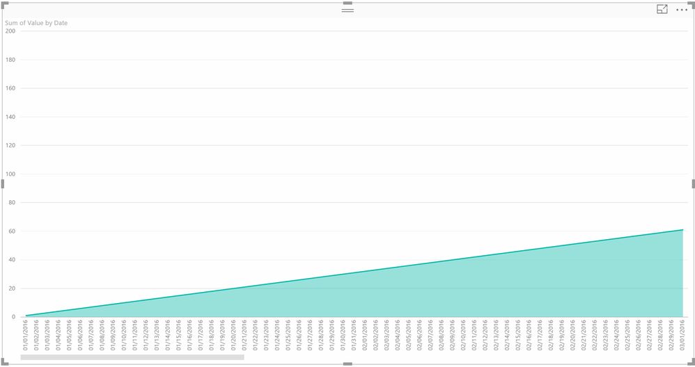
@brianf408, I am with @greggyb on this one, can't reproduce randomly selected dates. Are you on the January update of Power BI Desktop or are you in Desktop? This was posted in Developer forum. I am using standard Area chart visualization in Desktop. I vaguely recall in earlier versions that sometimes if there were lots of dates that things like line charts and such would display a "representative set" of dates in the x-axis but I think that was in Excel with Power Pivot a long time ago and I believe that all of the values were actually there, just not every date displayed in the axis.
You can see screen shot below:
Follow on LinkedIn
@ me in replies or I'll lose your thread!!!
Instead of a Kudo, please vote for this idea
Become an expert!: Enterprise DNA
External Tools: MSHGQM
YouTube Channel!: Microsoft Hates Greg
Latest book!: DAX For Humans
DAX is easy, CALCULATE makes DAX hard...
- Mark as New
- Bookmark
- Subscribe
- Mute
- Subscribe to RSS Feed
- Permalink
- Report Inappropriate Content
Has this changed in Power BI yet?
Power BI does a sampling of data if the number of records being aggregated to present data by x-axis values is too much to show on chart.
The solution is to do aggregation by date and then chart that aggregated data or to reduce the number of records being presented on chart eg 2 months instead of 6 months. Neither is ideal. I want my viz tool to do that work for me.
- Mark as New
- Bookmark
- Subscribe
- Mute
- Subscribe to RSS Feed
- Permalink
- Report Inappropriate Content
I'm not able to reproduce on the excluded labels issue. Do you have any filters on other fields that might be excluding certain days?
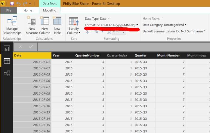
As for the display formatting of the axis labels, you can set the Data Format in the Data Modelling ribbon menu. This will be available whenever you have a field or measure selected, either in the field list on the right side of the screen, or if you go to the Data pane and select the field's column in the table. See image below:
Helpful resources

Fabric Data Days
Advance your Data & AI career with 50 days of live learning, contests, hands-on challenges, study groups & certifications and more!

Power BI Monthly Update - October 2025
Check out the October 2025 Power BI update to learn about new features.

| User | Count |
|---|---|
| 3 | |
| 1 | |
| 1 | |
| 1 | |
| 1 |


