Get certified for free when you join Fabric Data Days 2026 and dive into Fabric, Power BI, SQL, AI, and other essential data skills.
Join nowJuly 28 - August 9 | Final Round of the Power BI Dataviz World Championships. This is your chance. Learn more
Hi All,
I tried searching for this topic thinking it would be popoular. I just couldn't nail the keywords correctly and nothing comes up.
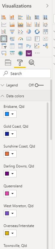
My question is, when you build a custom visual, is there a way to dynamic populate the formatting tab so that you can create some settings/formatting around them? For example, in the diagram below, the data color for each data node can be changed individually.
Is this possible in custom visual? Thank you.
Regards,
Kenneth
Solved! Go to Solution.
Hi @KennethWang
This is possible in custom visuals - there is a specific portion of the tutorial in the sample bar chart repo for it, and this is pretty much the scenario you've added the image for.
This is all covered in the example in more detail but in short, you need to do the following:
If this is all set up accordingly, the colour should be stored in the dataView and retrieved correctly for subsequent updates. If the colour changes back after selection, then there is an issue with the selectionId and you might need to review this to get it to work.
Good luck!
Daniel
Proud to be a Super User!
On how to ask a technical question, if you really want an answer (courtesy of SQLBI)
Hi @KennethWang
This is possible in custom visuals - there is a specific portion of the tutorial in the sample bar chart repo for it, and this is pretty much the scenario you've added the image for.
This is all covered in the example in more detail but in short, you need to do the following:
If this is all set up accordingly, the colour should be stored in the dataView and retrieved correctly for subsequent updates. If the colour changes back after selection, then there is an issue with the selectionId and you might need to review this to get it to work.
Good luck!
Daniel
Proud to be a Super User!
On how to ask a technical question, if you really want an answer (courtesy of SQLBI)
Thank you!
I can't mention enough how much that has helped. It took me a while to get through your points layers by layers and also with reference to the bar chart. I also fell into the SelectionID issue as you have foresighted, mainly because I have multiple Categories and also processed the categories in a way different from the usual bar charts.
You are awesome!
Regards,
Kenneth
Join us in Barcelona for FabCon and SQLCon, the Fabric, Power BI, SQL, and AI community event. Save €200 with code FABCMTY200.
If you love stickers, then you will definitely want to check out our community sticker challenge, Barcelona edition!
Check out the July 2026 Power BI update to learn about new features.
| User | Count |
|---|---|
| 2 | |
| 1 | |
| 1 | |
| 1 | |
| 1 |
| User | Count |
|---|---|
| 4 | |
| 2 | |
| 1 | |
| 1 | |
| 1 |