A new Data Days event is coming soon!
This time we’re going bigger than ever. Fabric, Power BI, SQL, AI and more. We're covering it all. You won't want to miss it.
Learn more- Power BI forums
- Get Help with Power BI
- Desktop
- Service
- Report Server
- Power Query
- Mobile Apps
- Developer
- DAX Commands and Tips
- Custom Visuals Development Discussion
- Health and Life Sciences
- Power BI Spanish forums
- Translated Spanish Desktop
- Training and Consulting
- Instructor Led Training
- Dashboard in a Day for Women, by Women
- Galleries
- Data Stories Gallery
- Themes Gallery
- Contests Gallery
- QuickViz Gallery
- Quick Measures Gallery
- Visual Calculations Gallery
- Notebook Gallery
- Translytical Task Flow Gallery
- TMDL Gallery
- R Script Showcase
- Webinars and Video Gallery
- Ideas
- Custom Visuals Ideas (read-only)
- Issues
- Issues
- Events
- Upcoming Events
Level up your Power BI skills this month - build one visual each week and tell better stories with data! Get started
- Power BI forums
- Forums
- Get Help with Power BI
- Developer
- Create dynamic charts
- Subscribe to RSS Feed
- Mark Topic as New
- Mark Topic as Read
- Float this Topic for Current User
- Bookmark
- Subscribe
- Printer Friendly Page
- Mark as New
- Bookmark
- Subscribe
- Mute
- Subscribe to RSS Feed
- Permalink
- Report Inappropriate Content
Create dynamic charts
Hi all,
I need to implement a dashboard that will present several bar charts based on the number of rows returned in my dataset. As illustration, my dataset is like below:
Category KPI Value
CAT1 KPI A 10
CAT1 KPI B 5
CAT2 KPI C 3
CAT3 KPI D 8
CAT3 KPI E 1
CAT3 KPI F 10
CAT3 KPI G 9
The slicer will contain the list of categories (CAT1, CAT2, CAT3). If the user selects the CAT1 on the slicer, then my dashboard needs to present 2 diferent bar charts for KPI A and KPI B. If the user selects CAT3 then the dashboard will present 4 diferent bar charts.
How to implement that? Do I need to create a custom visual? If so, is there any example to guide me?
Thanks a lot,
Guilherme Soares
- Mark as New
- Bookmark
- Subscribe
- Mute
- Subscribe to RSS Feed
- Permalink
- Report Inappropriate Content
@soaregj wrote:
Hi all,
I need to implement a dashboard that will present several bar charts based on the number of rows returned in my dataset. As illustration, my dataset is like below:
Category KPI Value
CAT1 KPI A 10
CAT1 KPI B 5
CAT2 KPI C 3
CAT3 KPI D 8
CAT3 KPI E 1
CAT3 KPI F 10
CAT3 KPI G 9
The slicer will contain the list of categories (CAT1, CAT2, CAT3). If the user selects the CAT1 on the slicer, then my dashboard needs to present 2 diferent bar charts for KPI A and KPI B. If the user selects CAT3 then the dashboard will present 4 diferent bar charts.
How to implement that? Do I need to create a custom visual? If so, is there any example to guide me?
Thanks a lot,
Guilherme Soares
I don't think it is possible, even with custom visual. The slicer visual is for filtering data and it can't control other visuals shown/hidden.
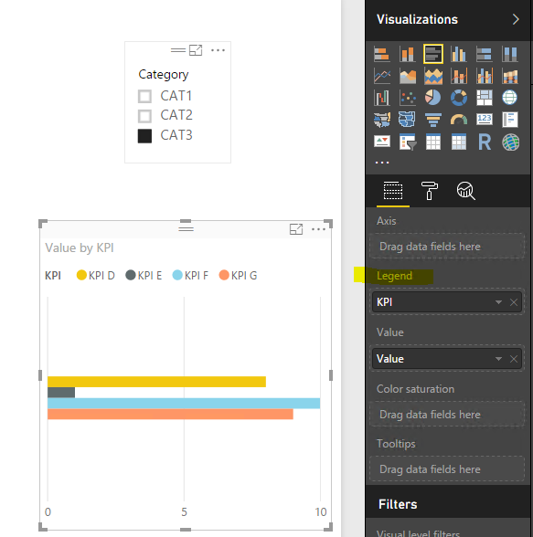
As a workaround, instead of showing different bar charts, show the data in one chart setting the KPI as "Legend" field.
- Mark as New
- Bookmark
- Subscribe
- Mute
- Subscribe to RSS Feed
- Permalink
- Report Inappropriate Content
Thanks @Eric_Zhang. I was probably too simplistic in my example. Sorry for that.
What I need is something like in the link below. Please notice every chart is a KPI and the quantity of KPI's (charts) varies from the location selected in the ChicletSlicer, meaning the charts are dynamically created on the report.
https://drive.google.com/file/d/0B7MRYt91QJPATGd4VEEzeVpzMkE/view
Thanks,
Guilherme
Helpful resources

Power BI Monthly Update - April 2026
Check out the April 2026 Power BI update to learn about new features.

Data Days 2026 coming soon!
Sign up to receive a private message when registration opens and key events begin.

New to Fabric Survey
If you have recently started exploring Fabric, we'd love to hear how it's going. Your feedback can help with product improvements.

| User | Count |
|---|---|
| 4 | |
| 2 | |
| 2 | |
| 1 | |
| 1 |

