FabCon is coming to Atlanta
Join us at FabCon Atlanta from March 16 - 20, 2026, for the ultimate Fabric, Power BI, AI and SQL community-led event. Save $200 with code FABCOMM.
Register now!- Power BI forums
- Get Help with Power BI
- Desktop
- Service
- Report Server
- Power Query
- Mobile Apps
- Developer
- DAX Commands and Tips
- Custom Visuals Development Discussion
- Health and Life Sciences
- Power BI Spanish forums
- Translated Spanish Desktop
- Training and Consulting
- Instructor Led Training
- Dashboard in a Day for Women, by Women
- Galleries
- Data Stories Gallery
- Themes Gallery
- Contests Gallery
- Quick Measures Gallery
- Notebook Gallery
- Translytical Task Flow Gallery
- TMDL Gallery
- R Script Showcase
- Webinars and Video Gallery
- Ideas
- Custom Visuals Ideas (read-only)
- Issues
- Issues
- Events
- Upcoming Events
To celebrate FabCon Vienna, we are offering 50% off select exams. Ends October 3rd. Request your discount now.
- Power BI forums
- Forums
- Get Help with Power BI
- Developer
- Clustered bar chart with bubbles for each bar on a...
- Subscribe to RSS Feed
- Mark Topic as New
- Mark Topic as Read
- Float this Topic for Current User
- Bookmark
- Subscribe
- Printer Friendly Page
- Mark as New
- Bookmark
- Subscribe
- Mute
- Subscribe to RSS Feed
- Permalink
- Report Inappropriate Content
Clustered bar chart with bubbles for each bar on a 2nd y-axis
Hello and thank you for giving this a look.
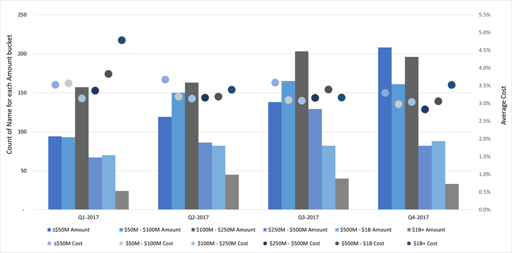
I am trying to re-create the chart I made in Excel below in PowerBI, so far with little success.
Sample pbix file is below. I need to display count of 'Name' for each 'Amount' bucket in the clustered columns on first y-axis. The second y-axis should display average 'Cost' for each bucket in the bubbles/dots. X-axis contains 'Date 1'.
https://1drv.ms/u/s!AgeVqxpmuh7I9QSR6U7kLYAmLwga?e=4jaIjX
Any help will be greatly appreciated.
Cheers!
YevD
Solved! Go to Solution.
- Mark as New
- Bookmark
- Subscribe
- Mute
- Subscribe to RSS Feed
- Permalink
- Report Inappropriate Content
Hi @YevD ,
I can't find the proper visual which same with the one in report page "Stacked chart w XY bubbles". I reupdate your sample pbix file(see the attachment), please check whether that can be used for a workaround... And currently we CAN NOT apply multiple fields on Legend Fields, you can raise a new idea and add your comments there to make this feature coming sooner.
Best Regards
- Mark as New
- Bookmark
- Subscribe
- Mute
- Subscribe to RSS Feed
- Permalink
- Report Inappropriate Content
@Anonymoussorry for taking a while to get back to this. I really appreciate your help!
I actully found an article descirbing how to do this with R.
https://datakuity.com/2020/12/03/r-power-bi-add-target-marker-to-each-column-in-a-grouped-bar-chart/
- Mark as New
- Bookmark
- Subscribe
- Mute
- Subscribe to RSS Feed
- Permalink
- Report Inappropriate Content
Hi @YevD ,
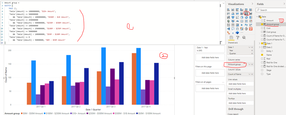
I updated your sample pbix file, please check whether that is what you want, please find the details in the attachment.
Best Regards
- Mark as New
- Bookmark
- Subscribe
- Mute
- Subscribe to RSS Feed
- Permalink
- Report Inappropriate Content
Hi @Anonymous ,
Thank you so much for this. The grouping of amount is eaxactly what I was looking for. Do you know if there is a way to display average of 'Cost' for each bar?
Also, is there a way I can sort the groups in ascending order?
- Mark as New
- Bookmark
- Subscribe
- Mute
- Subscribe to RSS Feed
- Permalink
- Report Inappropriate Content
Hi @YevD ,
I can't find the proper visual which same with the one in report page "Stacked chart w XY bubbles". I reupdate your sample pbix file(see the attachment), please check whether that can be used for a workaround... And currently we CAN NOT apply multiple fields on Legend Fields, you can raise a new idea and add your comments there to make this feature coming sooner.
Best Regards
- Mark as New
- Bookmark
- Subscribe
- Mute
- Subscribe to RSS Feed
- Permalink
- Report Inappropriate Content
@Anonymoussorry for taking a while to get back to this. I really appreciate your help!
I actully found an article descirbing how to do this with R.
https://datakuity.com/2020/12/03/r-power-bi-add-target-marker-to-each-column-in-a-grouped-bar-chart/
- Mark as New
- Bookmark
- Subscribe
- Mute
- Subscribe to RSS Feed
- Permalink
- Report Inappropriate Content
Did the article resolve the problem ?


